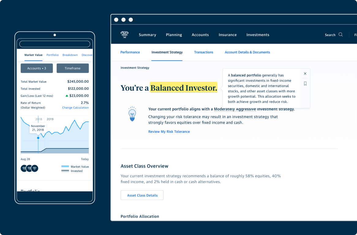
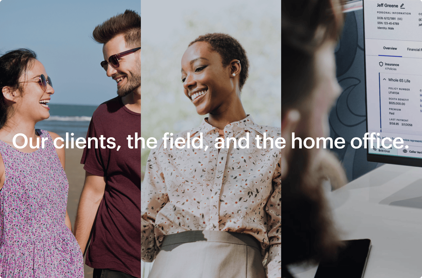
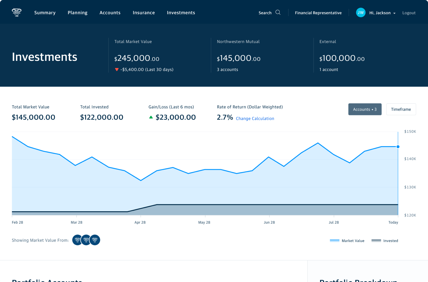
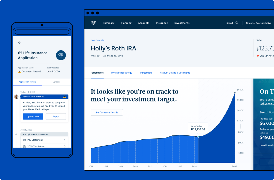
Product design at Northwestern Mutual (NM) traces its roots to NM’s acquisition of Learnvest (LV), a financial planning startup. It grew from a couple dozen designers at the time of the LV’s acquisition to upwards of 60+ as of 2021. The makeup of the team was more diverse than what might be expected at a financial planning company at that time, coming from agencies including R/GA and Huge, tech companies such as AOL and Jet, and a smattering of startups and other financial institutions.
Organization
Northwestern Mutual Product Design Department
My Role
Initiative Lead
The Team
Davo Galavotti, Lan Lam, Tahui Lee
Bolstering recruitment
While the team had experienced rapid growth over the past couple of years, we were reaching a point of not being able to find an adequate number of qualified candidates to fill our open roles. Additionally there were still many organizations within NM that didn’t know of us or what our capabilities were. The need for external exposure to the design community and forging an identity within a large, traditional financial planning company, led to establishment of a product design team identity.
A working group of design directors met and developed a wide range of proposals for our design team name, visual identity, and broader purpose. We ultimately settled on North, a pretty direct nod to Northwestern Mutual, but also referencing the idea of “true north”. We believed that our mission as a team was to create the best experiences for our users and promote design thinking within NM. Ultimately we hoped that good design would help enable the achievement of our clients’ financial goals.
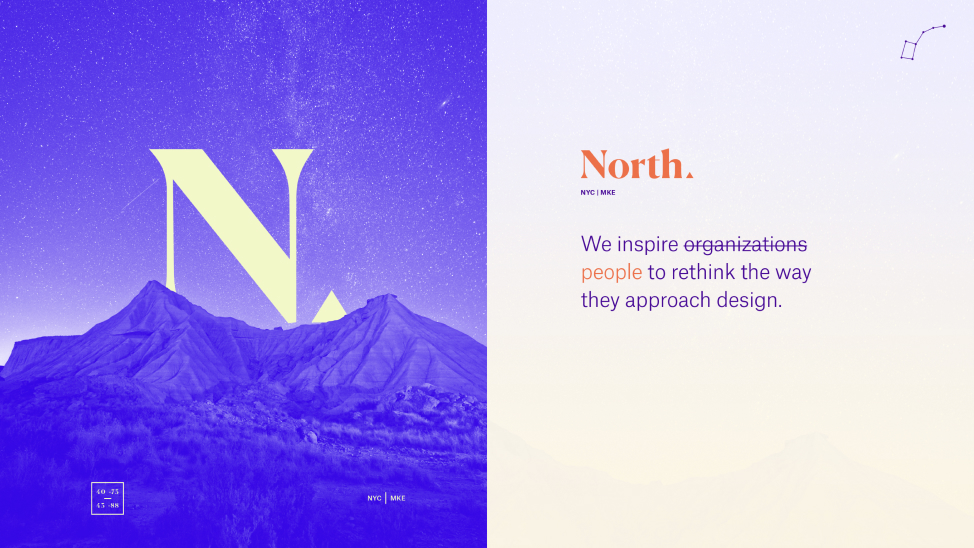
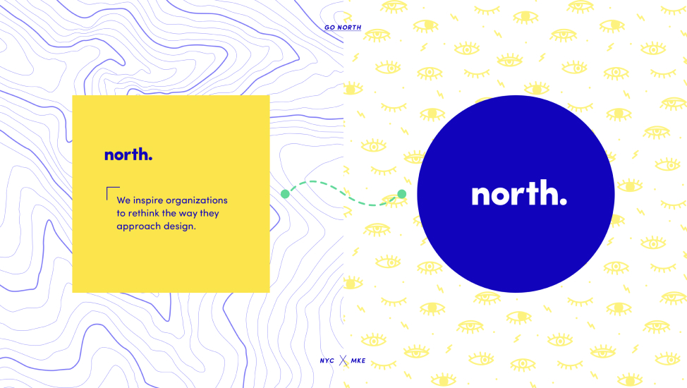
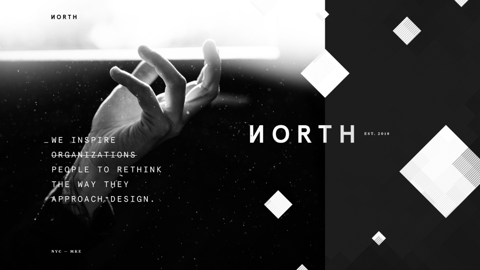
Design identity mood boards
Our team wanted to project an image of a multidisciplinary group of innovative, but down to earth designers and thinkers. We settled upon a wordmark that felt modern and approachable. A reoccurring motif of interchangeable shapes reinforced our model of partnership and adaptability with other organizations within NM. The topographic pattern visualized our notion of a journey to “true north”.
Wordmark animation
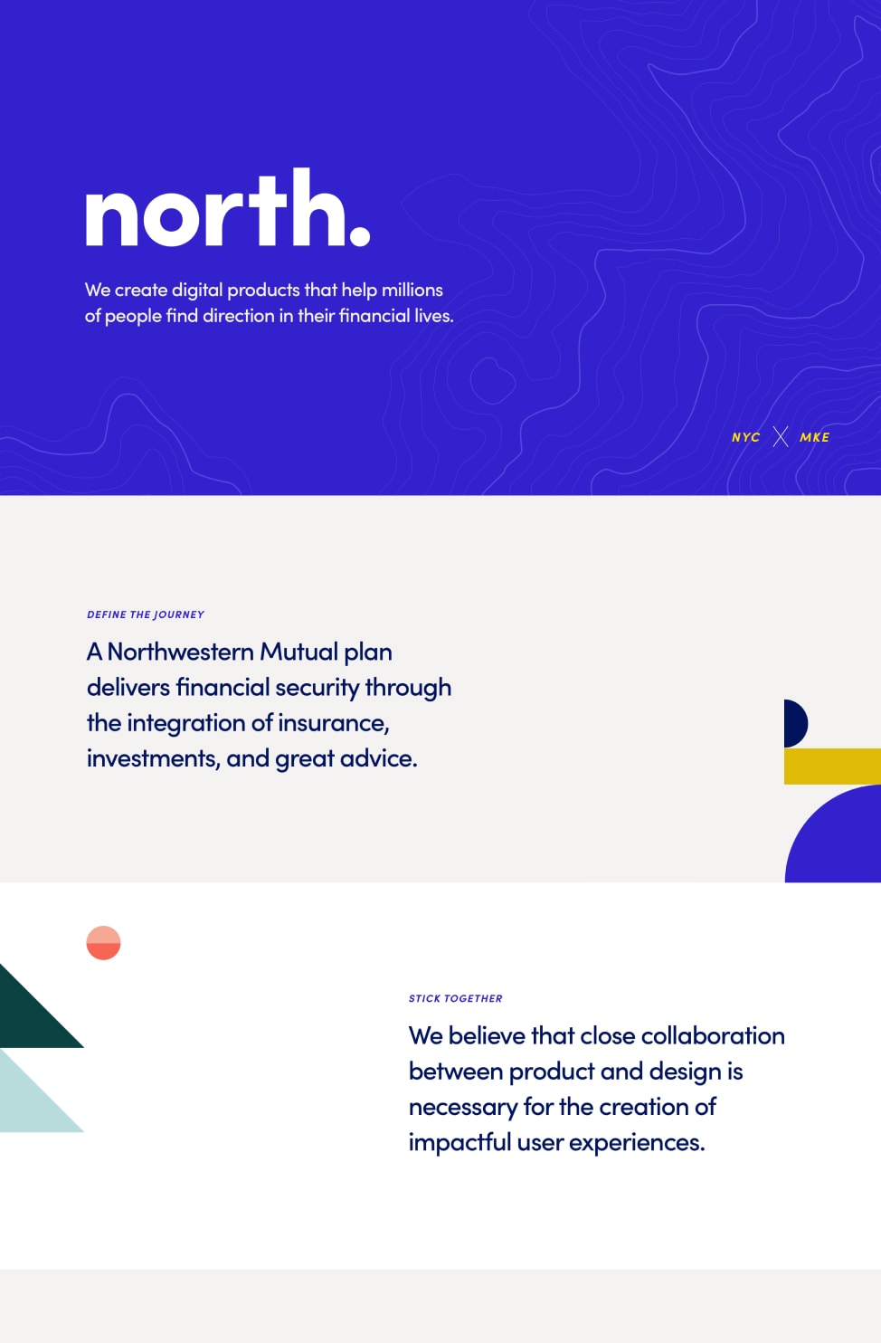
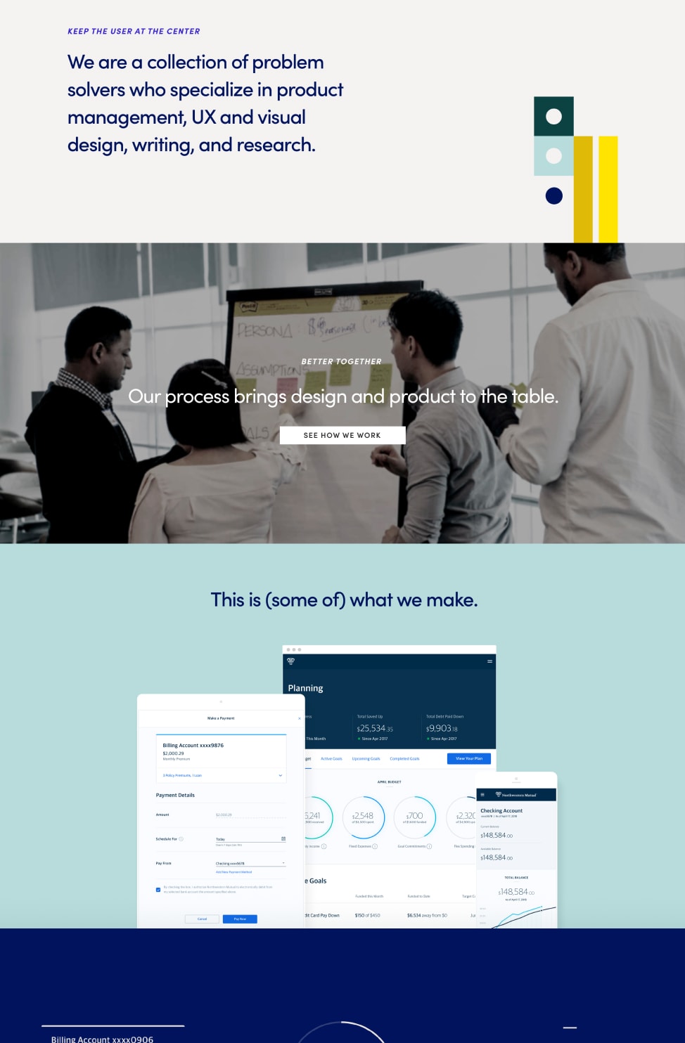
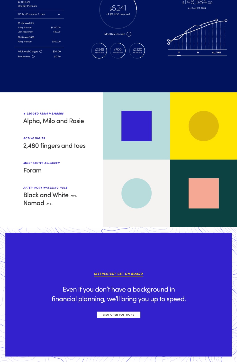
Department recruiting website
We designed a website to be our primary destination for communicating externally to would-be design candidates. We wanted to express what we do as designers at Northwestern Mutual, but also convey our unstuffy (especially for a financial institution) team culture. We hoped that a good first digital impression would bolster our recruitment efforts.
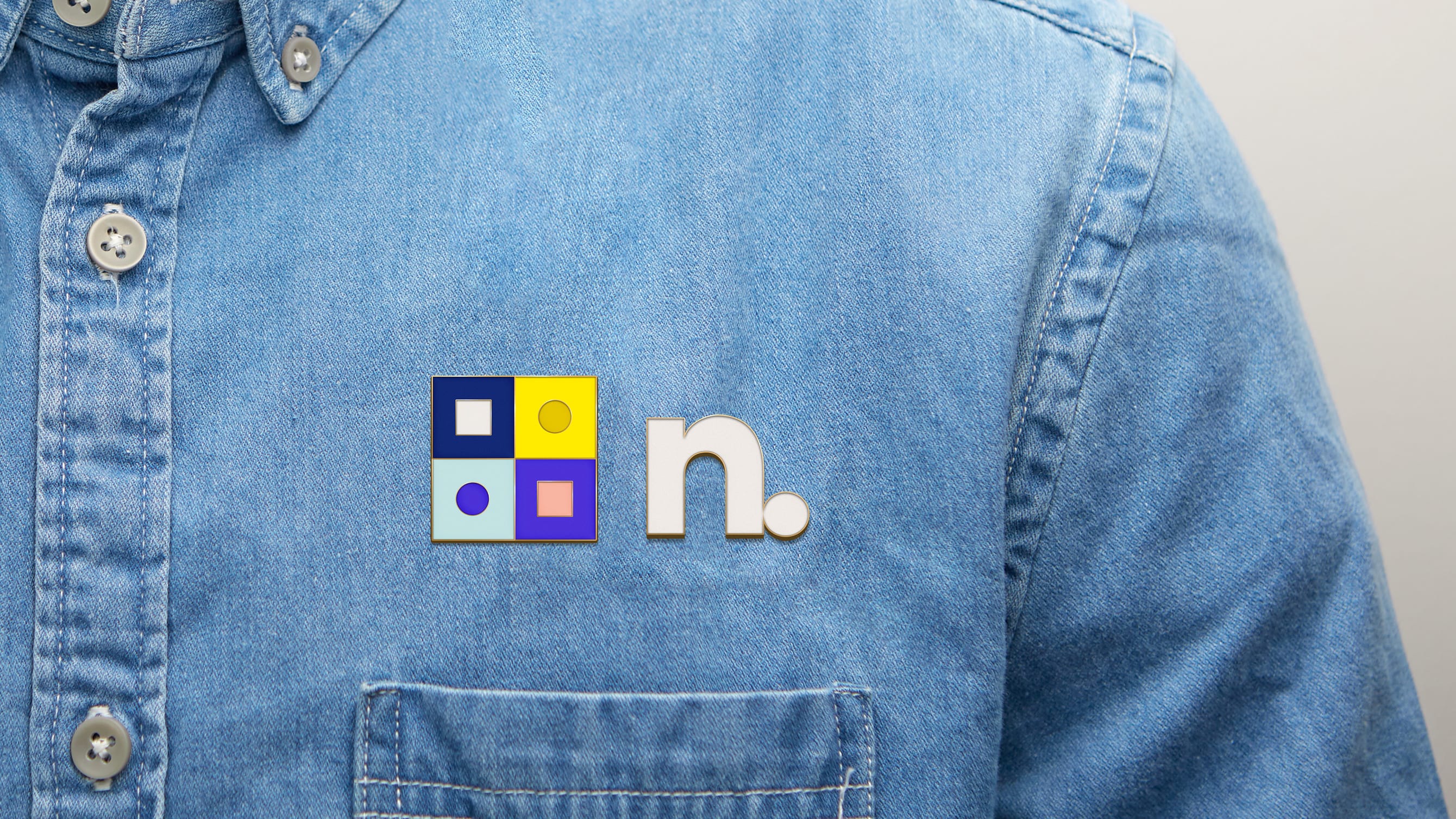
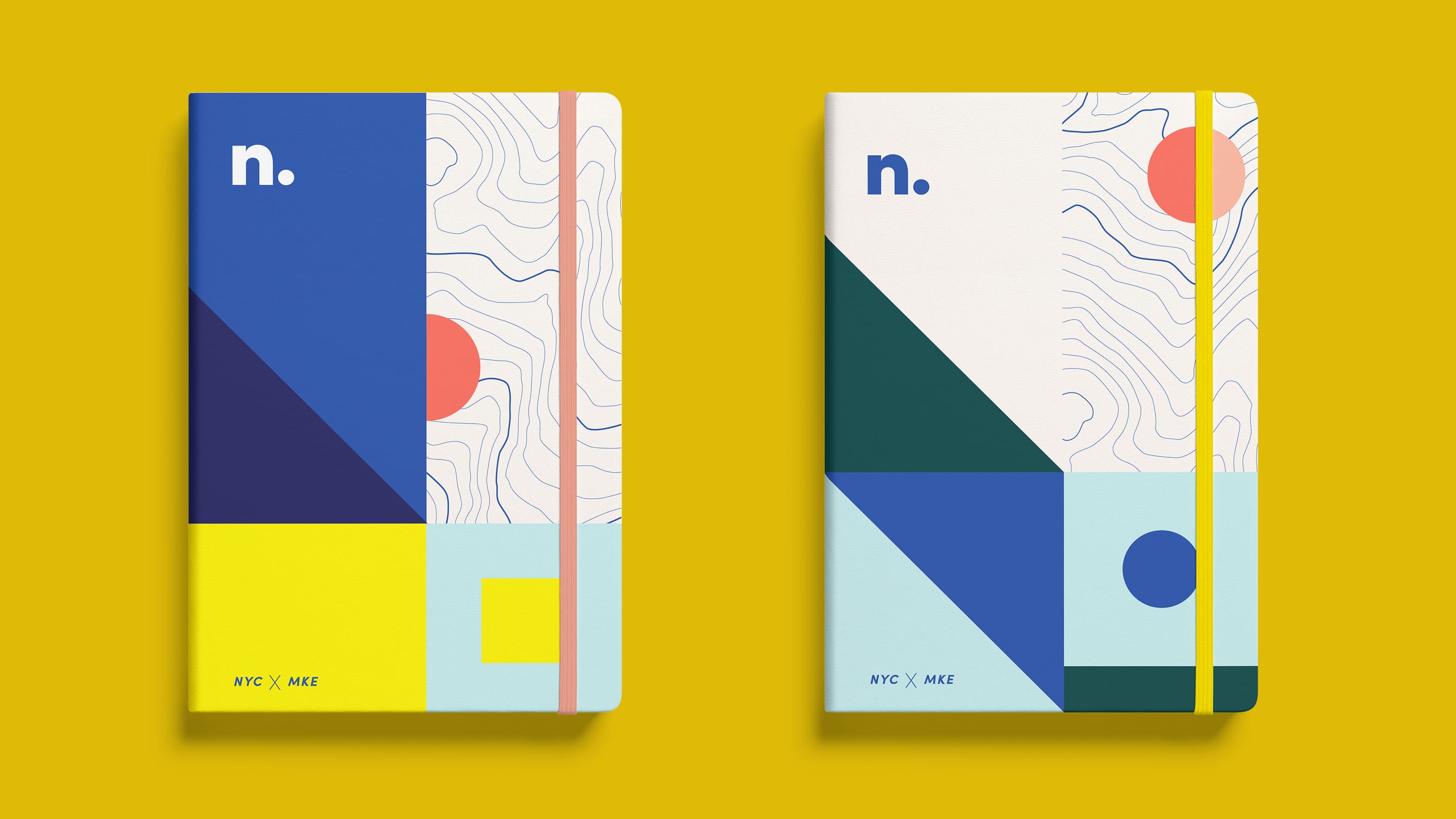
Fun stuff e.g. the obligatory swag
No brand identity exercise would be complete without a collection of fun swag. We wanted physical goods that people would actually want to use, rather than forgotten in the back of their closet or relegated to a junk drawer. Instead of tote bags we opted for sweatshirts, notebooks, and laptop skins.
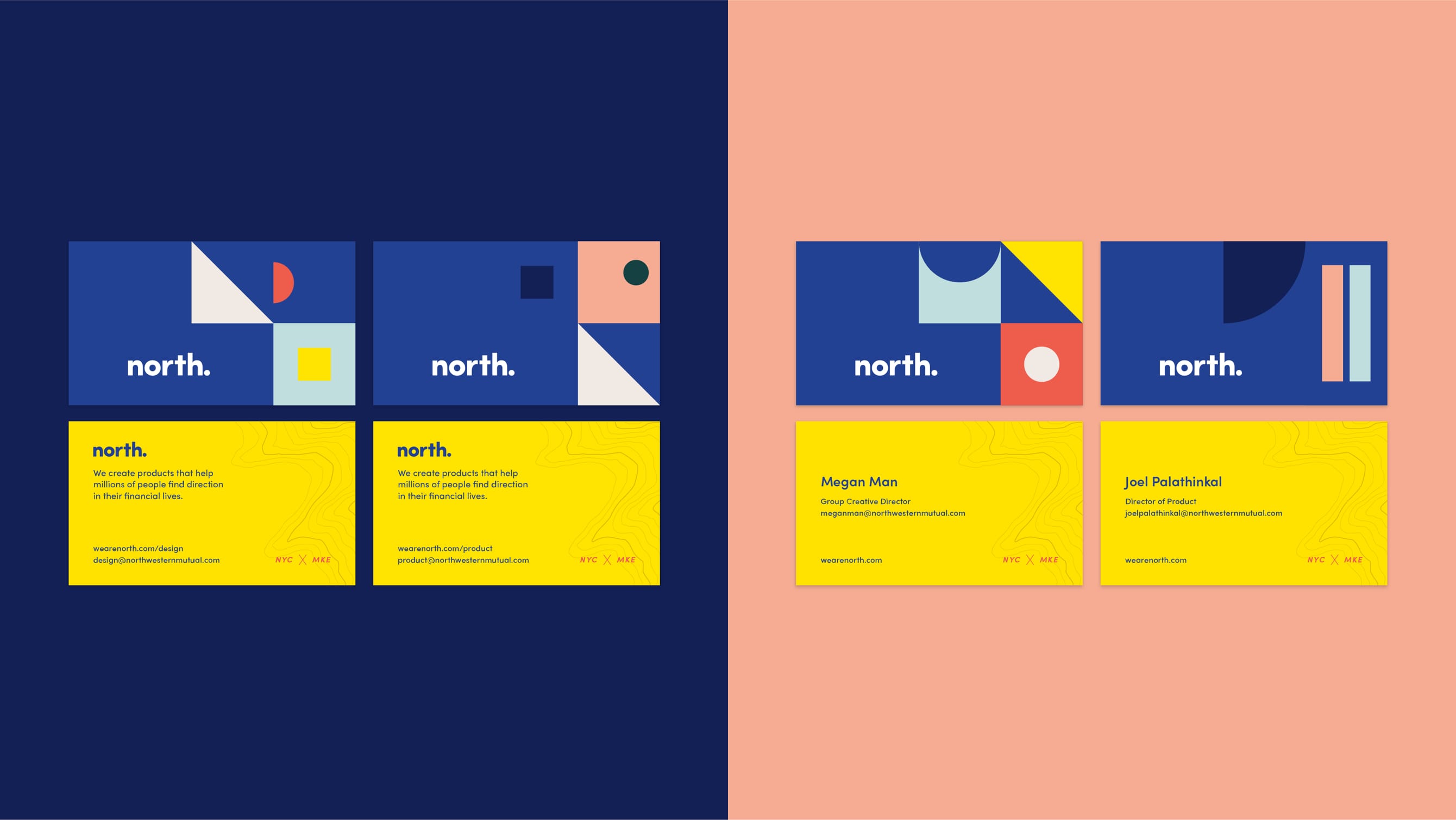
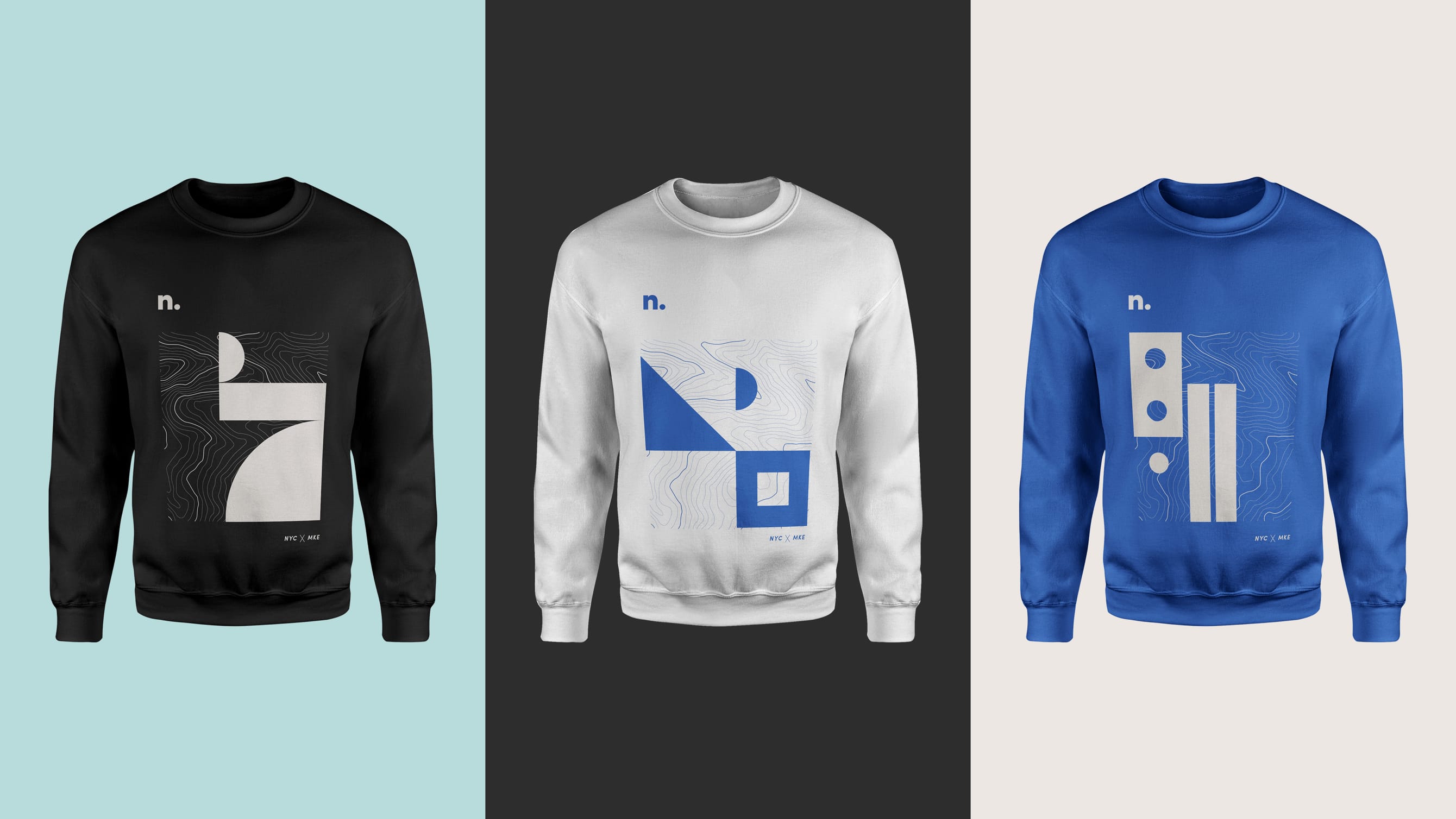
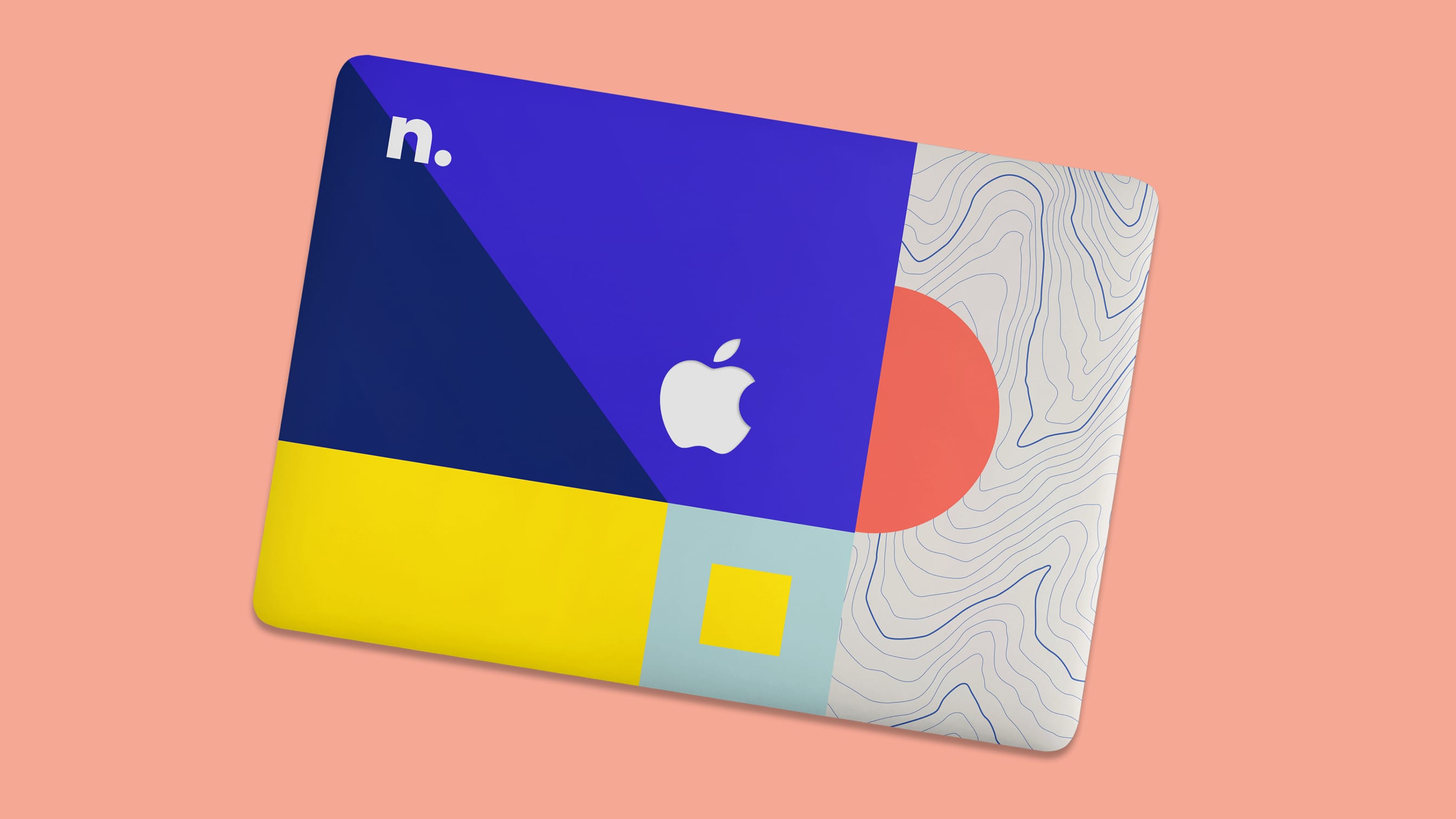
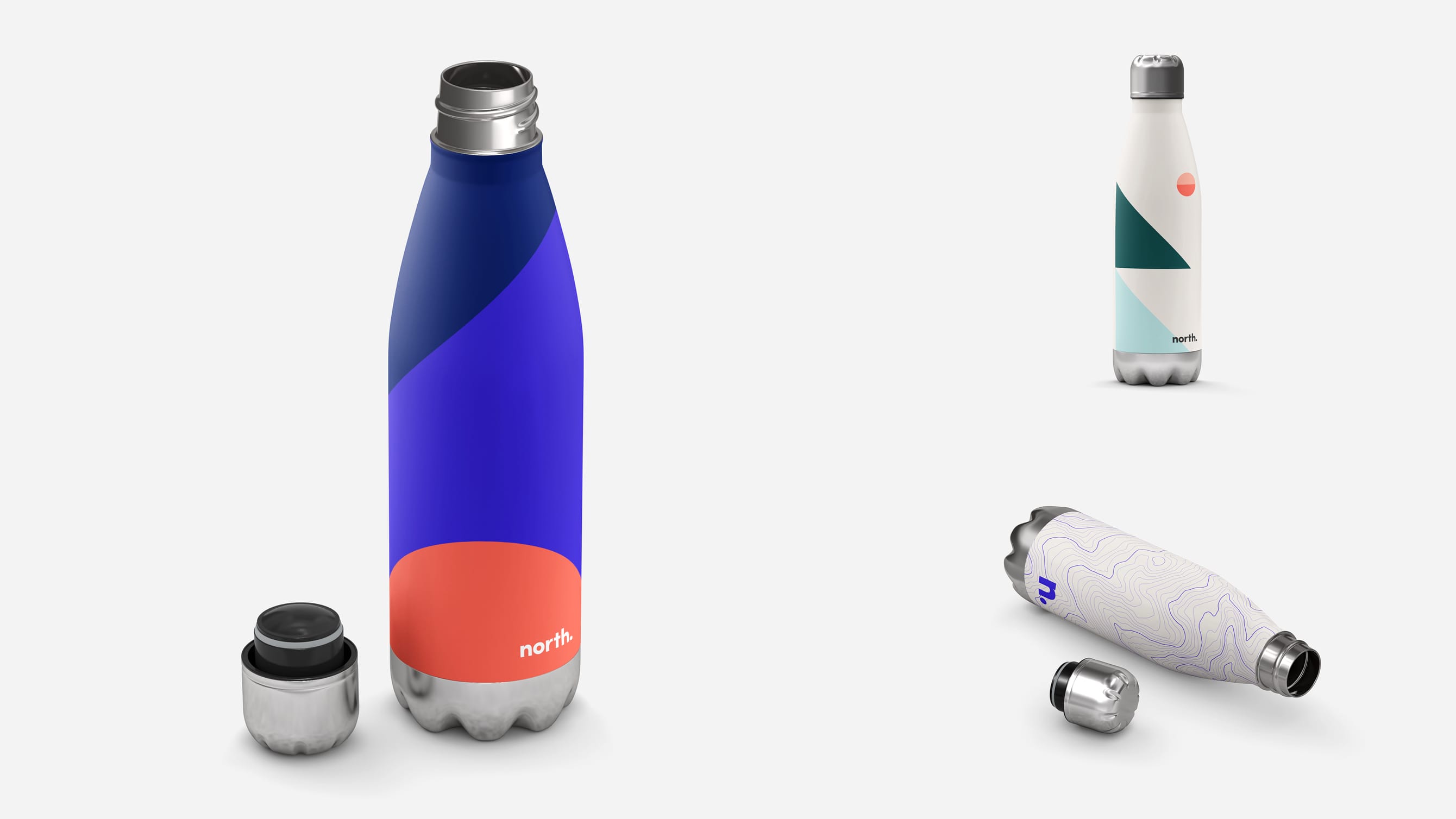
Ultimately, all of the great work on the design team identity was shelved due to circumstances beyond our team’s control. Nonetheless, everyone involved in the initiative was very proud of their contributions. This remains one of my favorite initiatives that I led while at NM.
Related Work
Investments Account Experience
Encouraging financial planning with our investments experience.
Enterprise Experience Design
Supporting end to end product strategy and promoting user understanding.
Related Work
Financial Products and Money Movement
Assorted projects from the product work streams that I led with my design portfolio partner.
Discovery and Prototypes
Transforming the customer experience through exploration and concept evaluation.
Enterprise Experience Design
Supporting end to end product strategy and promoting user understanding.
© 2024 Will Gabrenya
