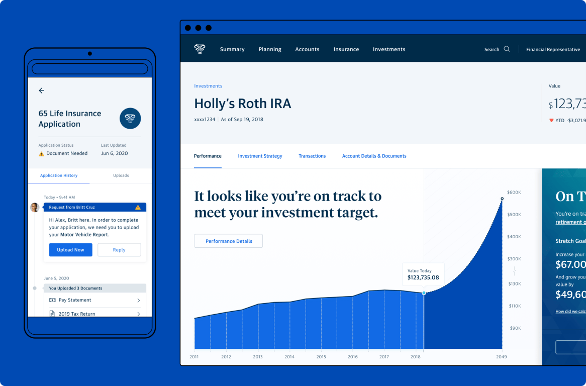
Product design at Northwestern Mutual (NM) traces its roots to NM’s acquisition of Learnvest (LV), a financial planning startup. In addition to product, design, and engineering talent, NM acquired LV’s financial planning algorithm. After the acquisition, the design team ramped up significantly to focus on the transformation of NM’s digital capabilities.
Our focus was to modernize the customer experience (CX) portal by integrating self-service features and elements of the new planning algorithm. A personal client-advisor relationship has always been a cornerstone of NM’s brand, therefore it was very important to create an experience that facilitated that relationship.
Organization
Northwestern Mutual Digital Customer Experience
My Role
Design Manager
The Design Team (varies by project)
Gavin Baradic, Avanti Dabholkar, Taylor Davis, Libby Johnson, Mary Johnston, Kathy Liu, Amanda Pastenkos, Lauryn Paiva, Ha Pham, Jonathan Serrano, Brian Simon, Billy Snow, Ali Tierney, Julie Travia, Limor Zizbrod
Managing at NM
The product design department at NM was essentially subdivided into three smaller groups, each addressing a different primary user audience. I originally came on to co-lead the Financial Products and Money Movement portfolios within the customer experience (CX). This represented roughly half of the product work oriented toward NM’s clients. The other two groups of portfolios addressed the needs of our financial advisors and home office employees.
The Financial Products portfolio included both insurance and investment products which had our teams splitting their time between iterative feature updates and tech platform migrations, as well as brand new functionality and completely overhauled experiences. Similarly, our Money Movement portfolio involved working with another engineering team and product manager. That work consisted of adding additional financial products to the online billing system and iteratively adding more payment features to the platform.
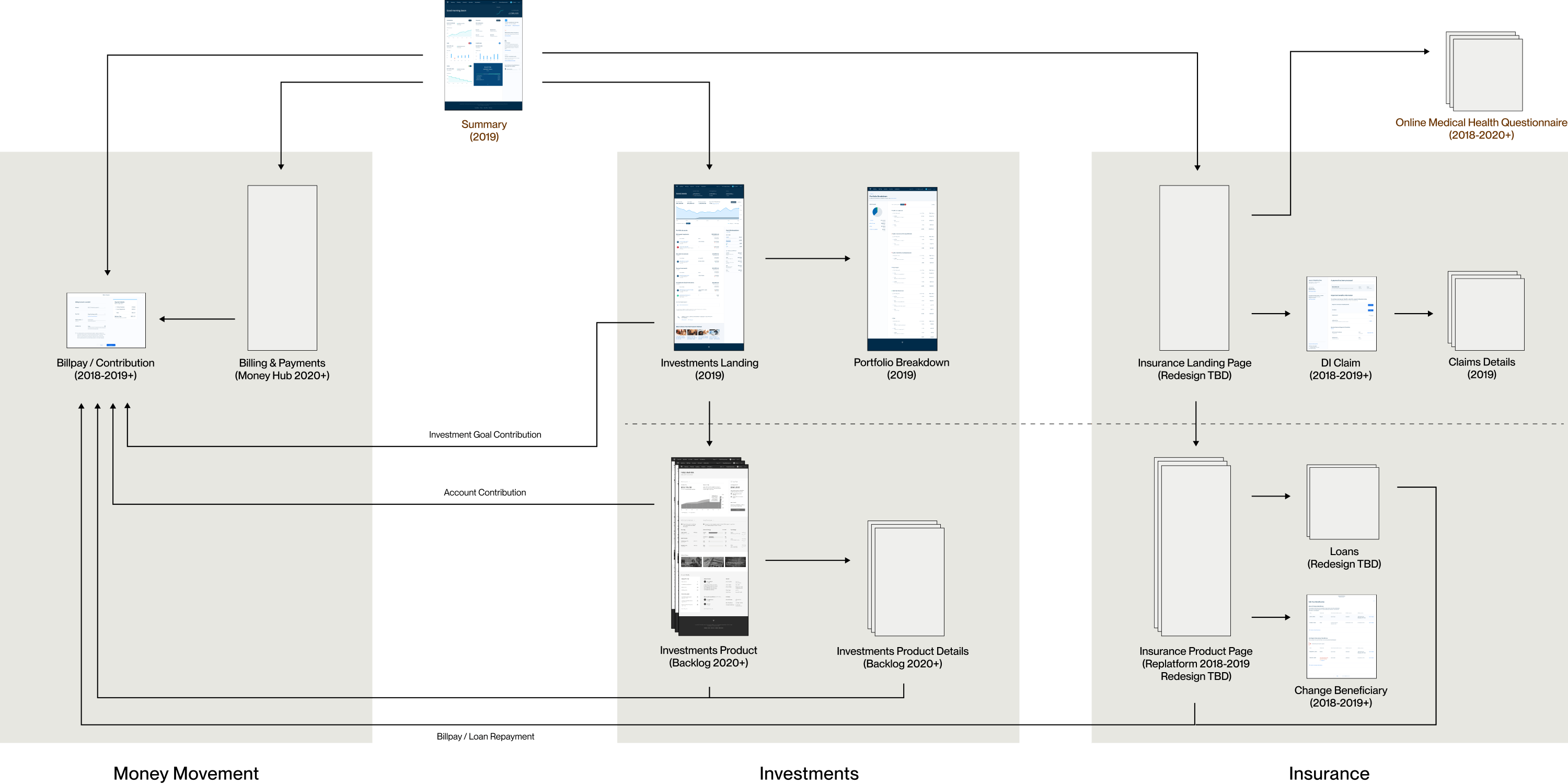
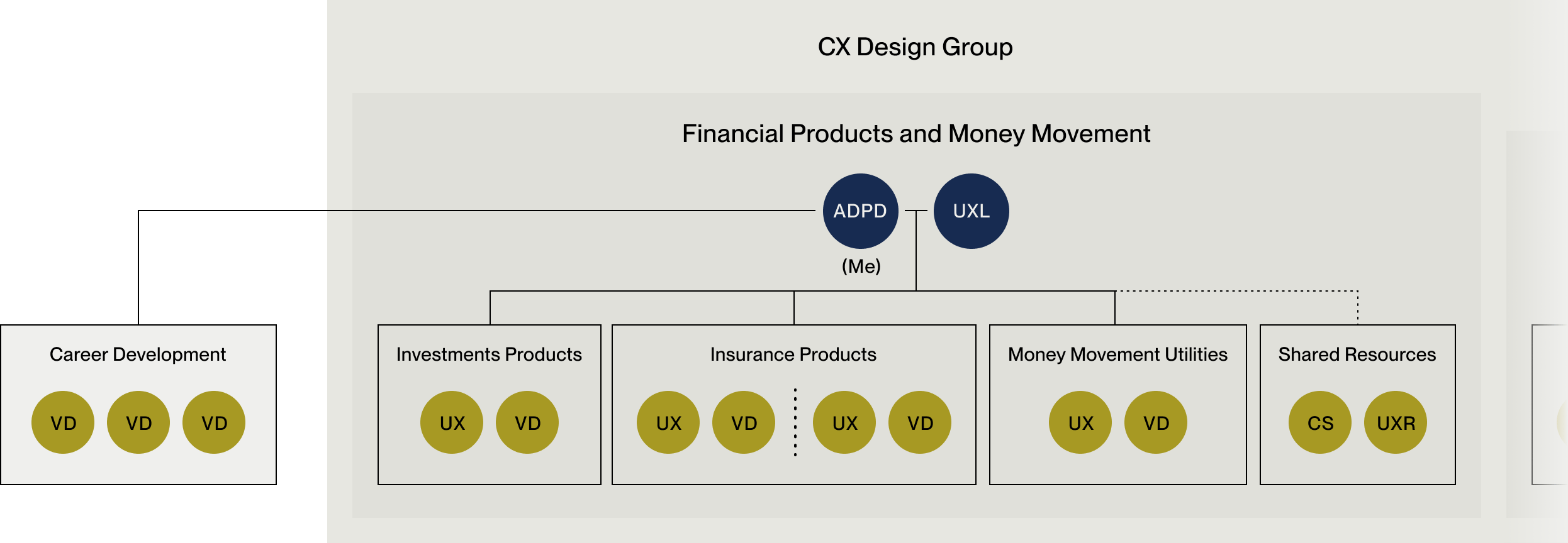
Along with a UX Design Lead, I managed four simultaneous work streams within our portfolio. The design pod for each work stream consisted of a UX and visual designer, plus a shared content strategist and researcher. Due to the many projects in flight, it was a balancing act to ensure regular collaboration and communication occurred while giving my teams the space to own their work and shield them from much of the institutional chaos that was the norm at the time. New rituals (to NM) like regular stand ups, internal design work shares, and weekly syncs with the product managers and engineering teams helped keep projects on track and bolster relationships between team members across our NYC and Milwaukee offices. This resulted in less ambiguity for all team members, earlier identification of edge cases (incredibly common with our rat’s nest of legacy tech and third party systems), and more influence by designers in the product development process.
In addition to managing the day to day project work, I had standing meetings with other team leads within the CX design group. We aimed to align on design patterns, sort out dependencies between our projects, and generally keep the ship moving in the same direction.
Due to the design department being generally structured like an agency, designers tended to be reassigned to, or shared with other teams fairly frequently. In order to provide more stability, regardless of their project team, every designer had a designated career developer. To make things just a little bit more chaotic, a designer’s career developer was usually not who they reported to for project work. The following diagram outlines how this reporting structure looked for me specifically.
Creating utility for our customers
One of NM’s greatest strengths—a focus on cultivating deep customer-advisor relationships, resulted in a lack of comprehensive self-service functionality on their website. Instead NM relied on their financial advisors or the home office call center to handle nearly all account transactions. This was often a hassle for the customers and their advisors, and an ongoing expense for the home office. One of the first priorities for many of the product design teams was to introduce self-service functionality into the site.
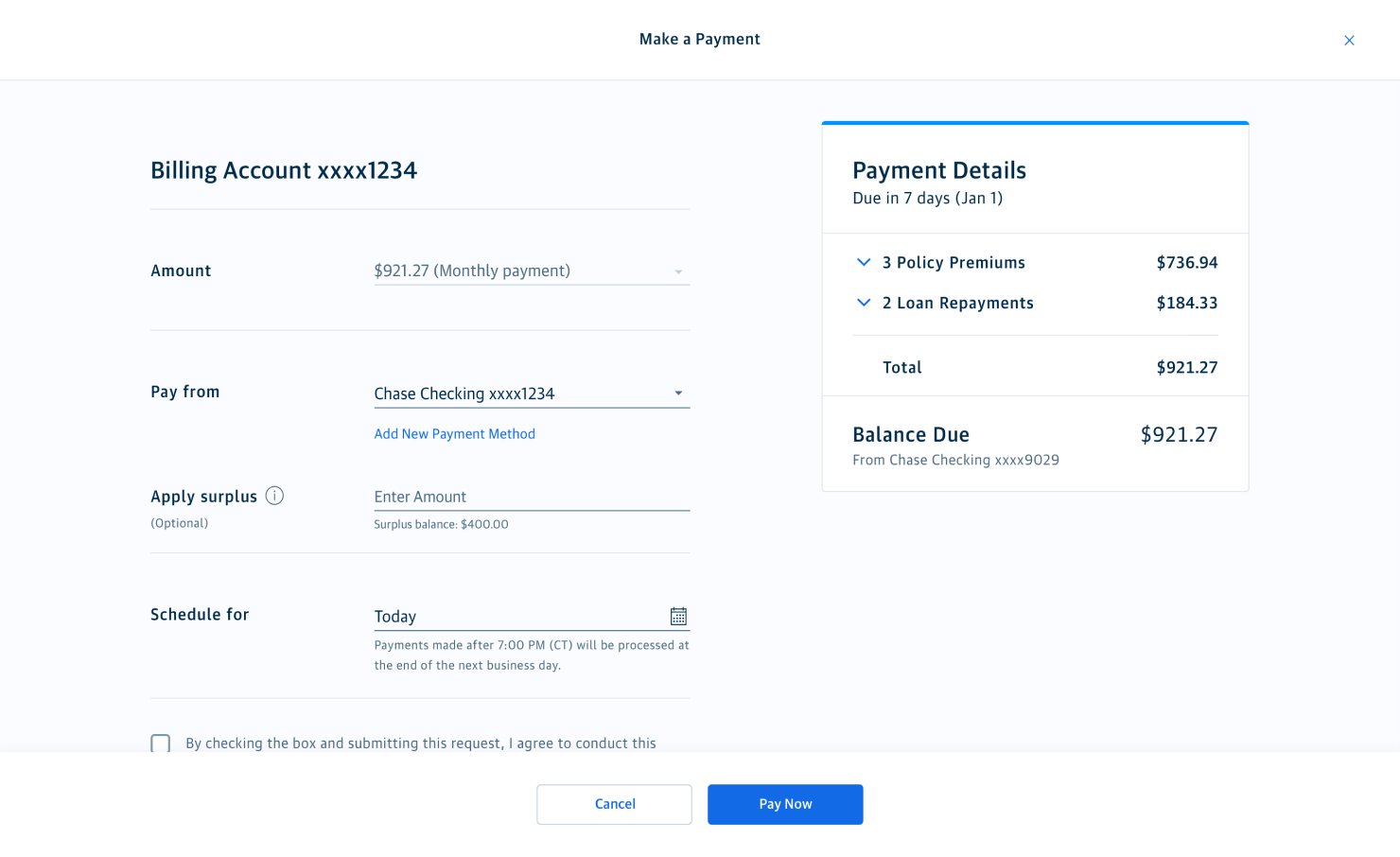
Make a Payment featuring multiple policies
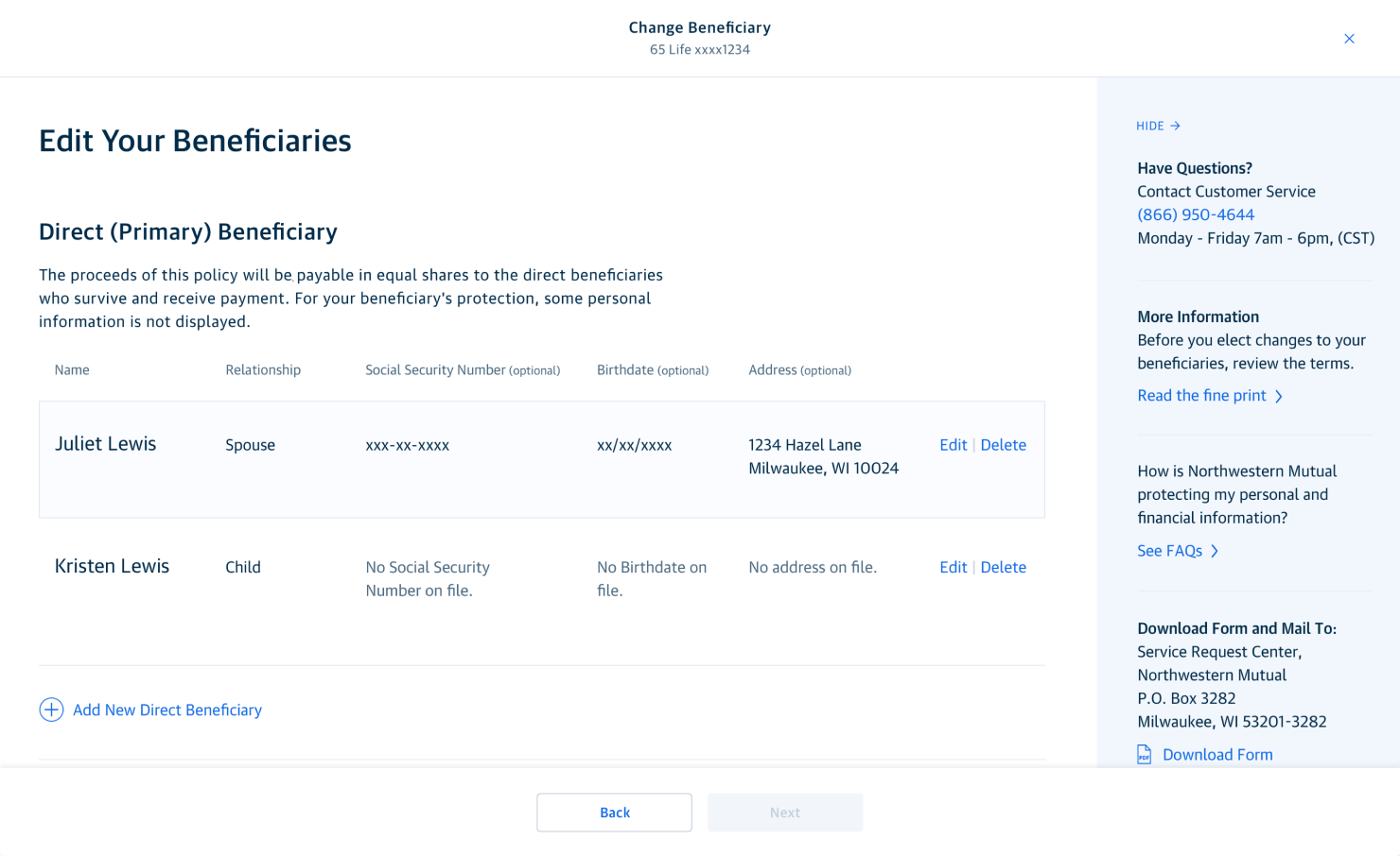
Change Beneficiary for an insurance policy
Two of the higher priority self-service opportunities included online payments and setting beneficiaries and for insurance policies. The systems involved in facilitating these actions were fairly complex and extremely dated, so we needed to work around significant tech debt that fell outside the purview of our engineering teams ability to address at the time. We built takeover utility flows that could be accessed from relevant areas of the site, such as the customer summary page or a product detail page. By leveraging shared design patterns for these focused transactions, we created implementation efficiencies and a consistent experience for the customer.
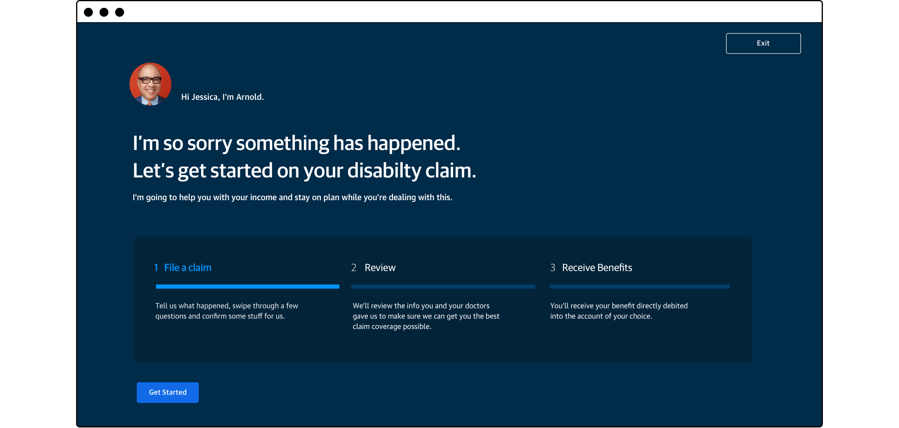
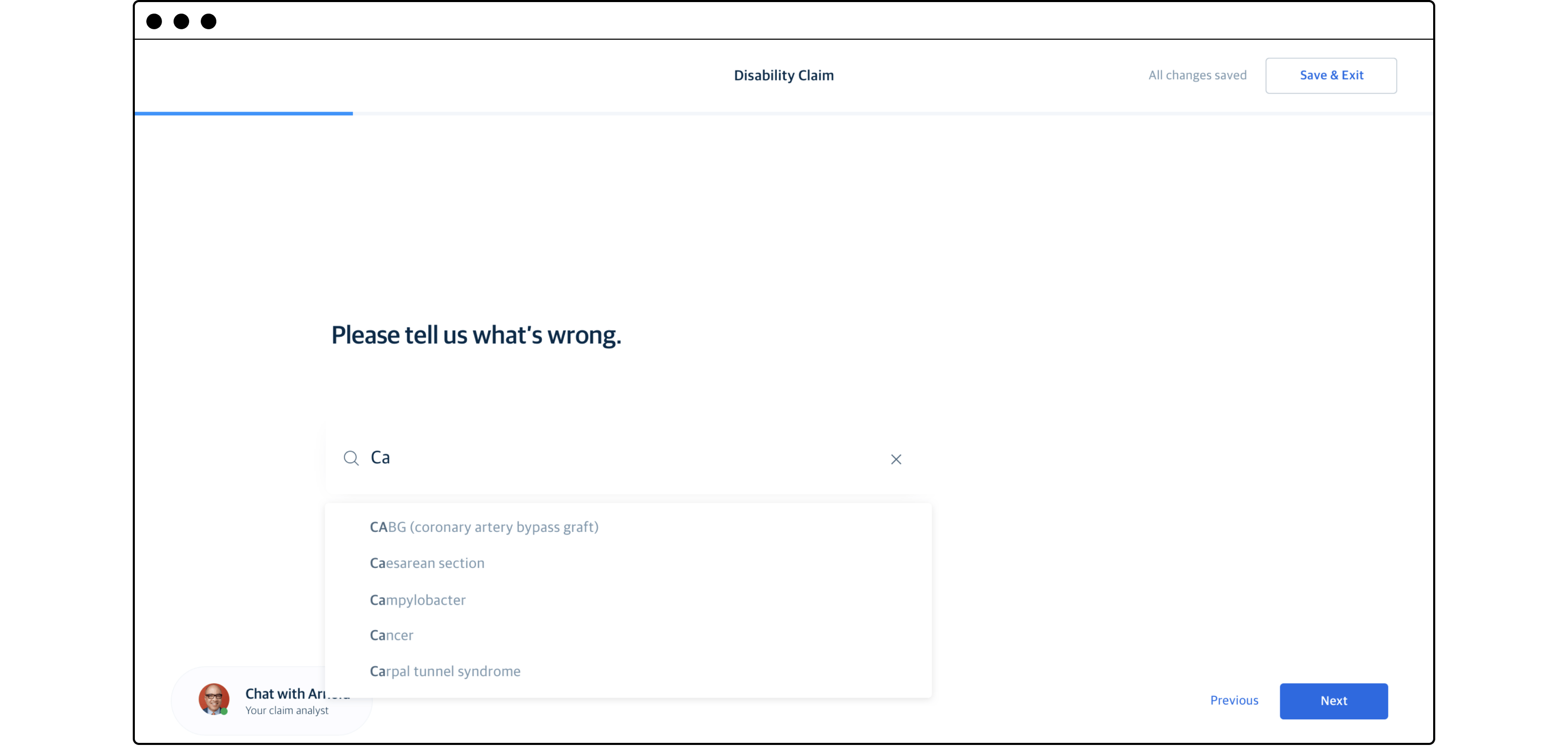
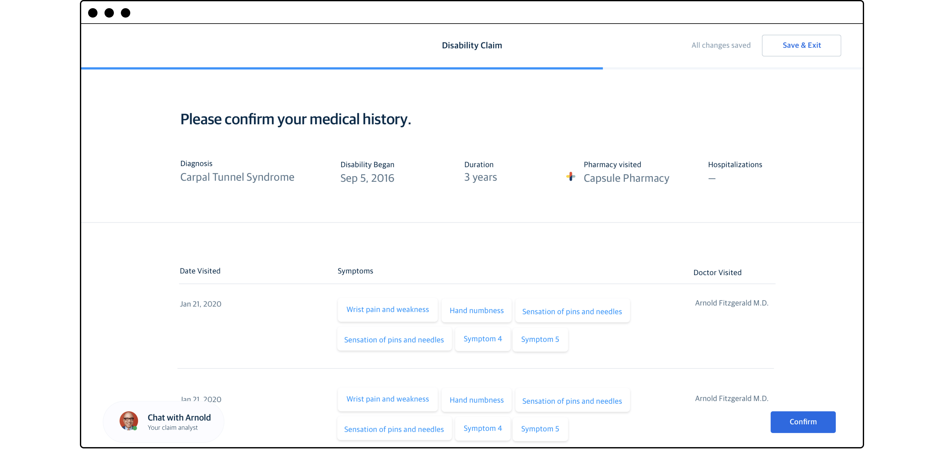
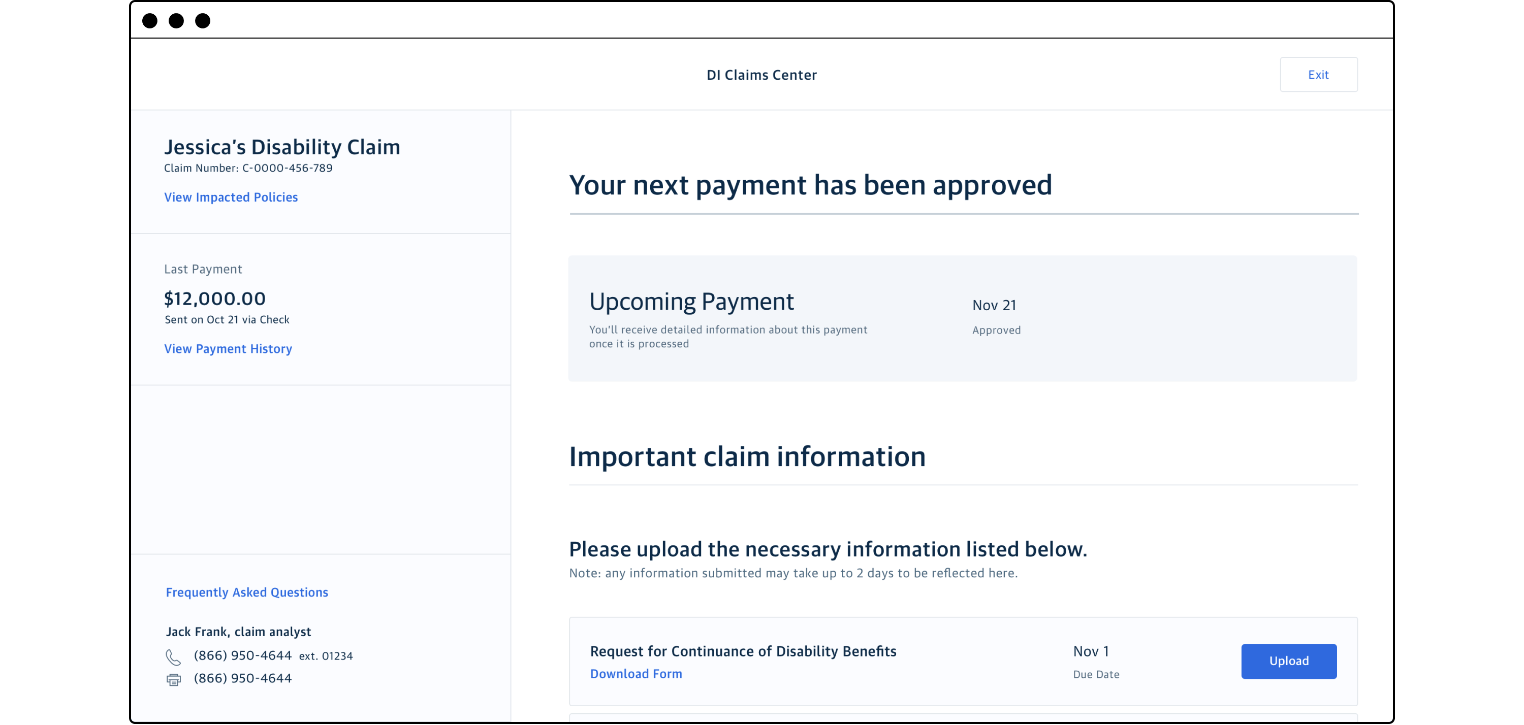
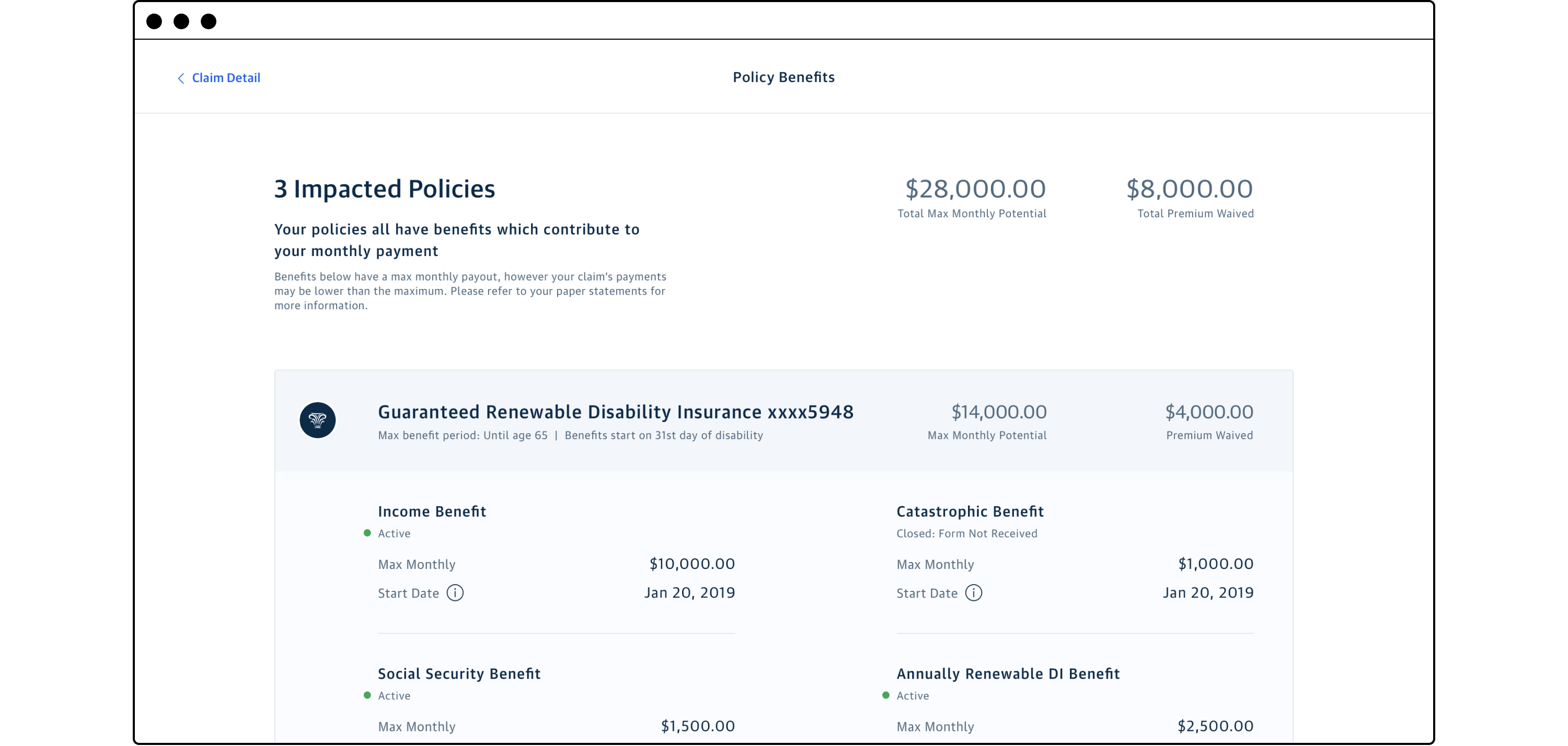
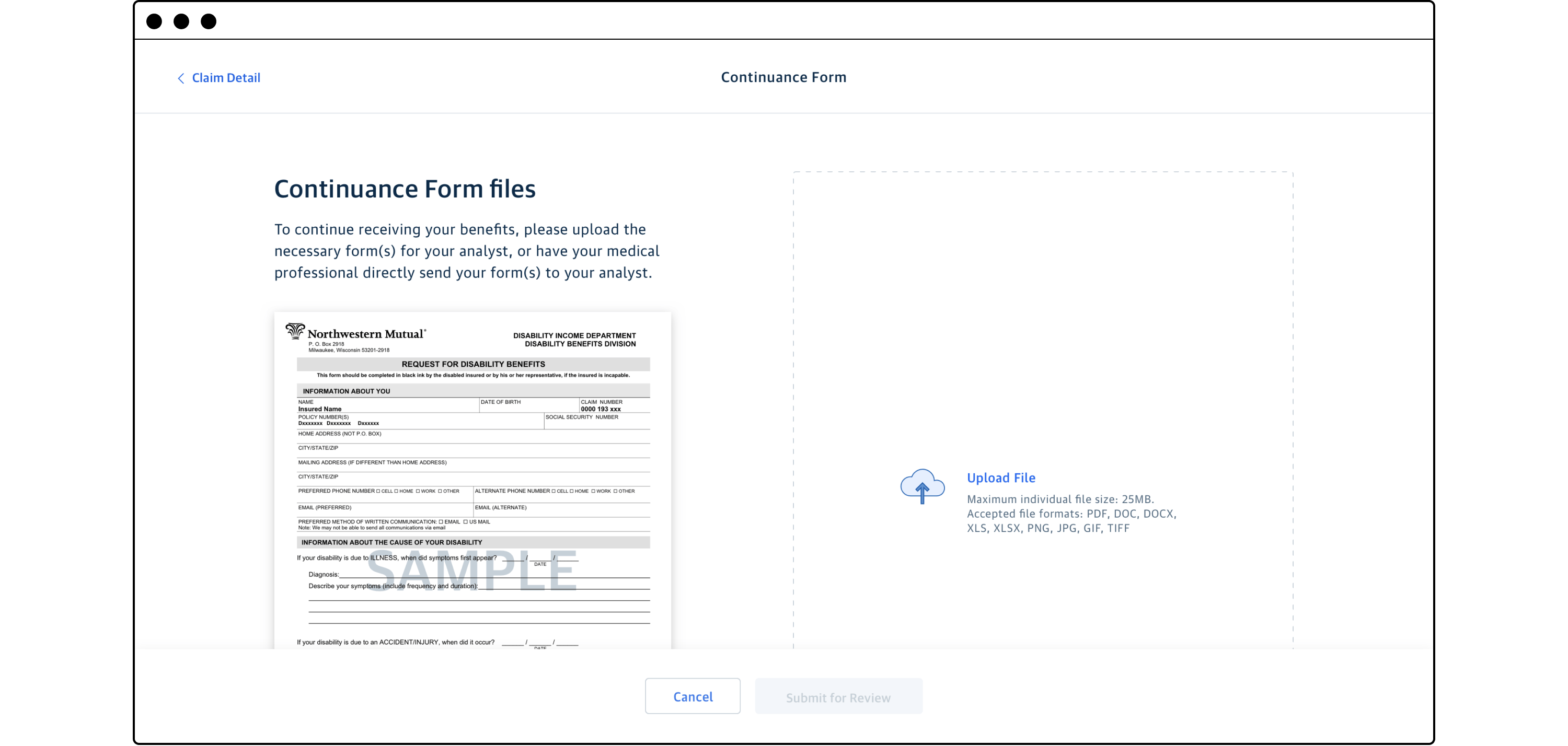
A major pain point for customers is dealing with immense amounts of physical paperwork. This can be especially frustrating during a difficult time like a death or disability claim. We needed to make the process of a disability claim more transparent, quicker, and secure.
The digital claims experience permitted a claims analyst to request relevant documents and enabled the client to easily and securely upload the required information. Beyond the obvious benefits of speed and security, it allowed for both parties to track claim status and provided a defacto checklist of required materials to the customer. While receiving benefits for an approved claim, the client could see which insurance policies were in effect, how much they were being paid, and their history of payments.
Providing a holistic financial picture
In addition to creating a modern digital experience, the overall corporate strategy at NM has been a steady shift from selling a client life insurance to becoming a partner through their life-long financial journey. In anticipation of a fully realized planning-centric experience, we redesigned our investment products experience to begin to incorporate client goals and show their performance through a light planning lens.
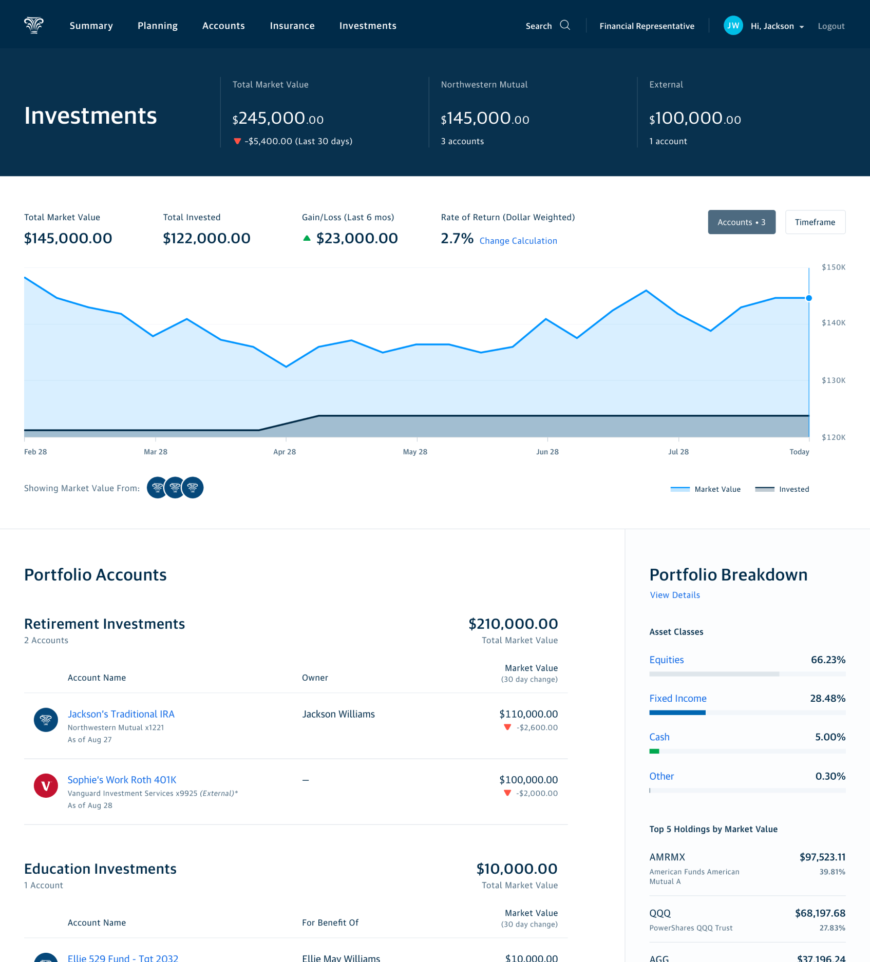
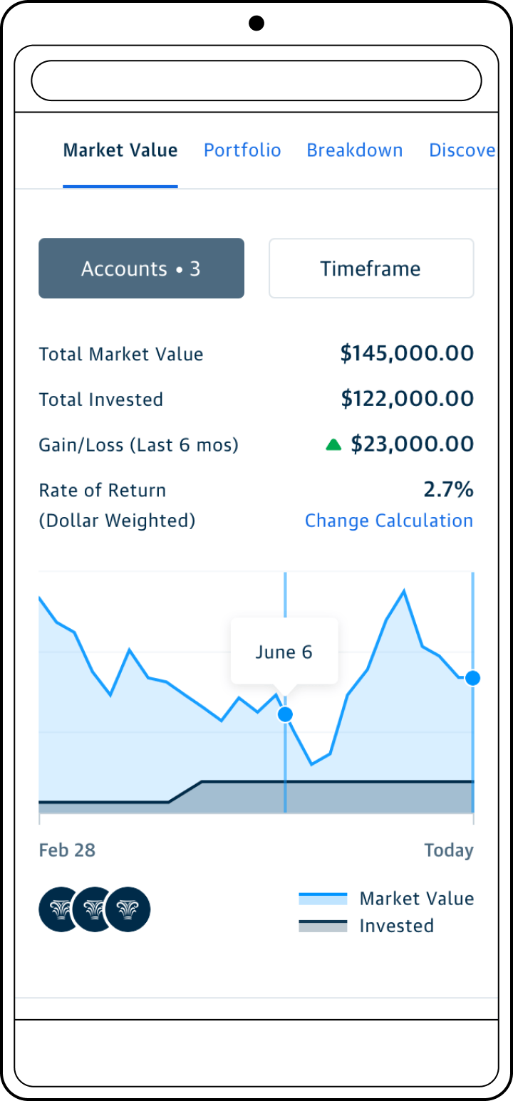
In an effort to both incorporate light planning elements and to facilitate aggregation of external investment accounts we redesigned the investments landing page. We introduced a blended performance visualization, grouped accounts in the customer's portfolio, and aggregated their holdings information.
When my Investments design team had a little bit of idle time while our engineering team tackled tech debt, I challenged them to imagine the future of our Investments experience. We explored how a customer's investment account experience could leverage our financial planning algorithm in helpful and engaging ways. We developed three different approaches to what this account detail page might look like. We evaluated these concepts to gauge our customer's appetite for varying levels of interactivity, direct guidance, and financial detail. I also encouraged the team to not feel constricted and to push the boundaries of our existing design system. In addition to the welcome respite from the usual feature work, our concept evaluation research was referenced in future projects within this work stream.

"Syllabus"
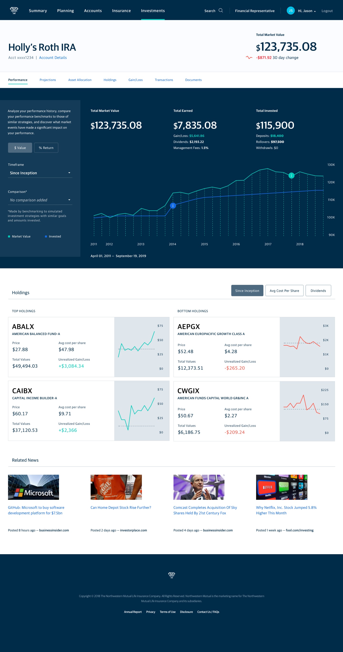
"Deep Dive"
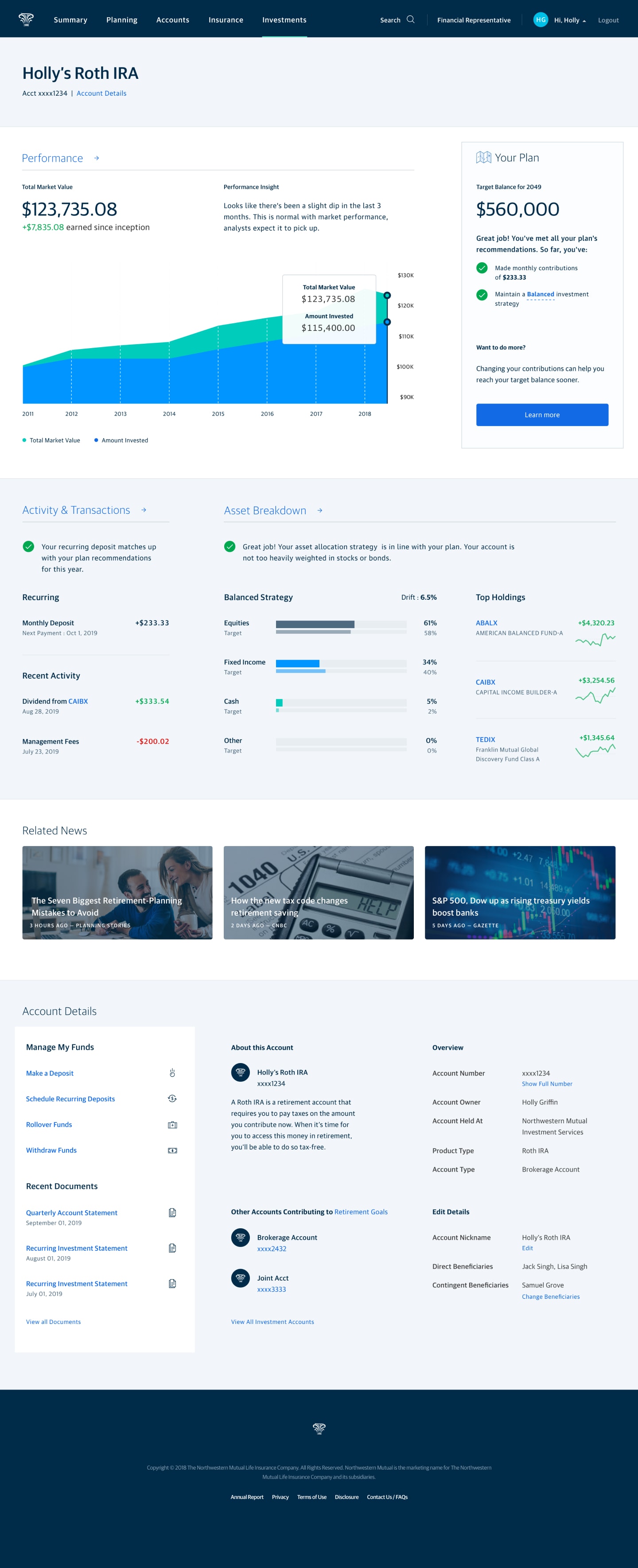
"50/50"
Related Work
Discovery and Prototypes
Transforming the customer experience through exploration and concept evaluation.
Enterprise Experience Design
Supporting end to end product strategy and promoting user understanding.
Design Team Identity
A collection of team identity digital artifacts, collateral, and swag.
© 2024 Will Gabrenya
