As an associate director of product design at Northwestern Mutual, I co-led two portfolios of work within the digital customer experience. These portfolios encompassed dashboards and tools for investment and insurance products, and money movement capabilities (bill-pay, contributions, withdrawals, etc).
This two-part case study describes related “transform” and “perform” initiatives aimed at integrating our in-development financial planning algorithm in order to demonstrate how planning helps customers achieve their financial goals. The “transform” initiative focuses on discovery work intended to build toward the future, while the “perform” initiative satisfied near term customer and business needs.
Organization
Northwestern Mutual Digital Customer Experience
My Role
Design Manager & Individual Contributor
The Design Team
Kathy Liu, Lauryn Paiva, Brian Simon, Billy Snow, Limor Zizbrod
From selling products to developing financial plans
When I arrived at NM, the company was undergoing a strategic shift from selling financial products to becoming a holistic financial planning company. In this new model advisors work with their clients to develop a financial plan. This plan is a living roadmap to help them achieve their goals, such as retirement, starting their own business, or purchasing a home to name a few. The plan suggests appropriate investment and insurance products that would enable our customers to achieve their stated near and long term goals according to their risk appetite, timeline, and a variety of other conditions.
The neglected piece of the portfolio
While whole life insurance products always formed the foundation for these plans, investments are also very important to achieving most customer goals. NM historically favored development and marketing of insurance related experiences as those products generated the most revenue for the company. However, investment products garnered higher commissions for advisors and generally were of greater interest to customers than more passive insurance products.
The lack of development on our investments views, patchwork of antiquated technology and outside vendors, and our sales model of requiring transactions be performed by advisors on a client’s behalf resulted in a large disconnect between our customer’s expectations for our experience versus the reality. This led to frequent uncharitable feedback from our customers:
“Client is wanting to be able to see the performance of multiple investments on any particular day in the same place, rather than having to pull this information up one account at a time.”
“Your presentation of account data is horrible and has been for years… you should take some lessons from your competitors [Fidelity, T Rowe, and Vanguard]…”
“Your financial website is the very worst… For someone who would want to track their investments regularly I would never suggest switching to Northwestern…”
The new direction
The shift in company strategy focused on delivering modern experiences that embrace our new direction as a technology driven financial planning company while continuing to rely on the personal touch provided by our advisors. Generally this guided our approach to product development in order to pursue the following goals:
Ensure all customers have a financial plan.
Address customer needs for modern functionality without undercutting advisors’ input.
Provide self-service for menial tasks so advisors can focus on higher value activities.
Transform: Investment Product Details Discovery
The longstanding assumption by leadership at NM is that customers following a financial plan were more likely to be successful in achieving their goals and typically owned more products from Northwestern Mutual over their lifetime. However, customers didn’t understand why they needed a financial plan when they already owned various financial products from us or other institutions.
For this discovery project, my product manager and I wanted to explore how the investment product experience might prove the value proposition of planning by connecting a customer’s investment back to their financial goals. Since the engineering team for this area of customer portal was engaged in working through tech debt and replatforming tasks, I saw this as an opportune time to allow my investments products design pod to stretch a little beyond feature design.
Ideation and design considerations
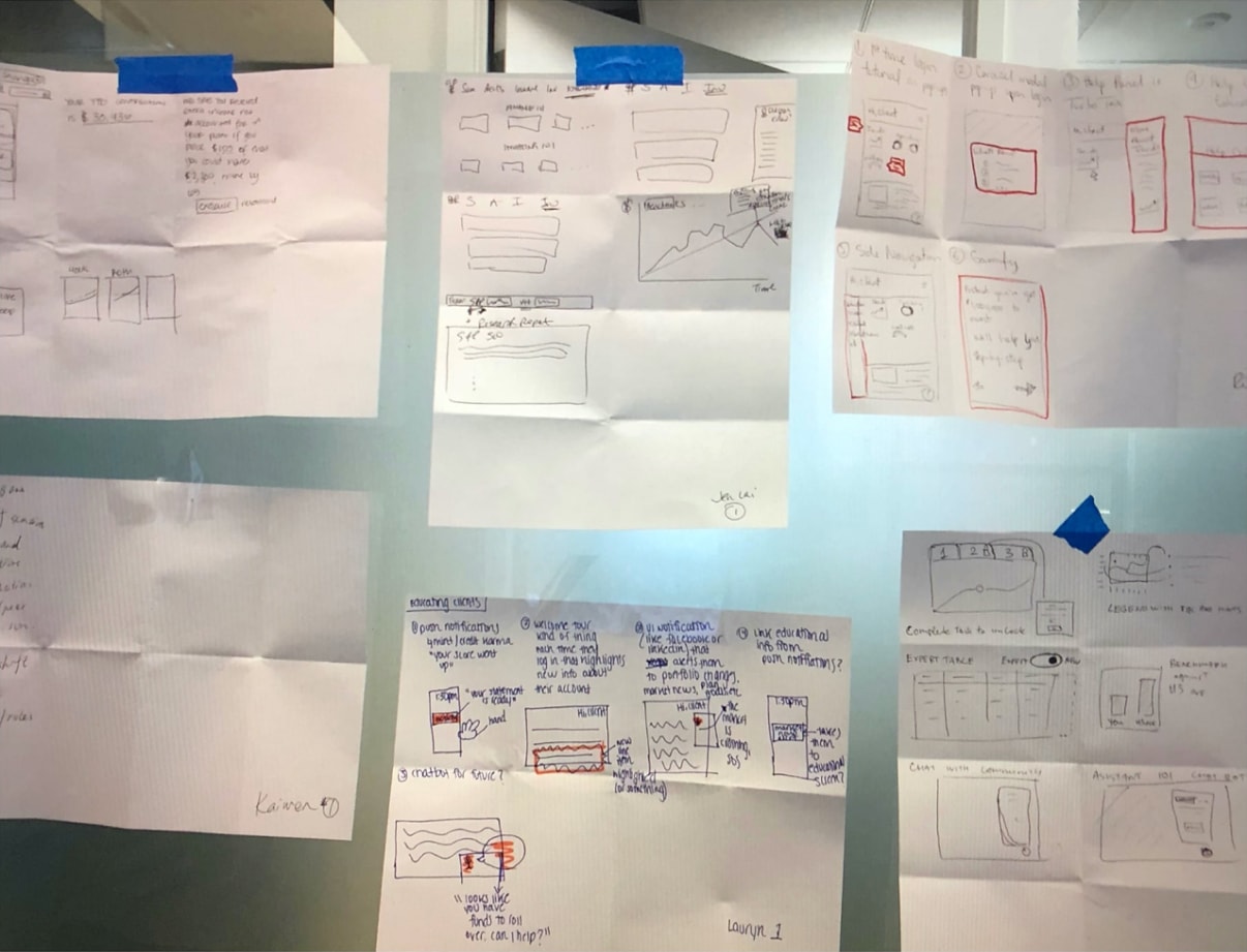
We kicked off this initiative with workshops to align on the problem space, understand our users, and discuss potential applications for our financial planning data in our customer-facing experiences. In addition to the investments design pod, I invited several designers from other tracks of work, our investments product manager, and the engineering team. We followed up with a sketch session which provided ideas for my design pod to develop concepts.
Sketching with our product and engineering friends
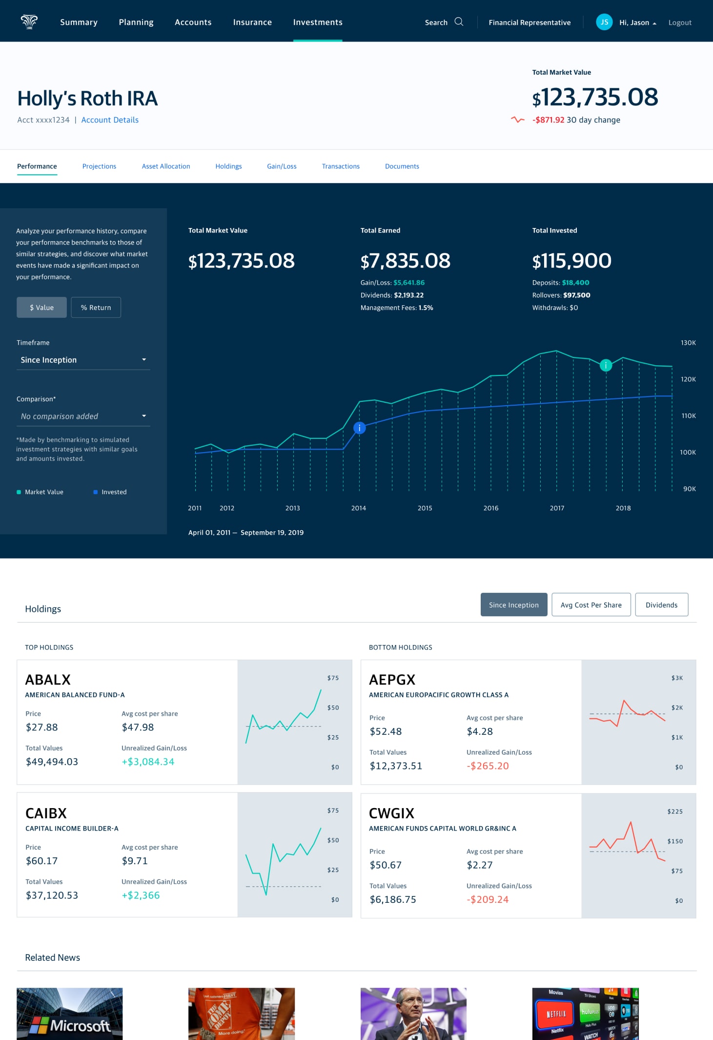
The current investment detail view featured expected elements such as investment performance and portfolio breakdown, but was absent of direction or insights that would suggest the account was in support of a larger holistic financial plan. It lacked the robust investment utility of brokerages like Fidelity or E-Trade that our savvy investors loudly desired. Our advisor-centric sales model required that advisors invested on their clients’ behalf. Thus, we knew we couldn’t take the direct approach of modern brokerages or trading platforms and enable customers full control over their trades.
Working with the product manager, I communicated four design principles I wanted my designers to employ while developing their concepts. I wanted these concepts to address shortcomings in our existing experience, mainly the absence of a connection with the customer’s goals and lack of information required to either understand their investment situation or have a productive conversation with their advisor.
Lead with impact.
Visually demonstrate financial progress a customer has made. If they’re here for only one reason, this is likely it.
Explain plainly.
Avoid jargon. Instead use common language to communicate financial concepts or the customer’s situation.
Suggest the next best action.
Suggest actions for a customer’s benefit that also align to their financial plan. This might a self-service action or require their advisor’s involvement.
Facilitate education and exploration.
Give customers the understanding required to have informed conversations with their advisors and provide savvier investors the detail they desire.
Different approaches to address customer needs
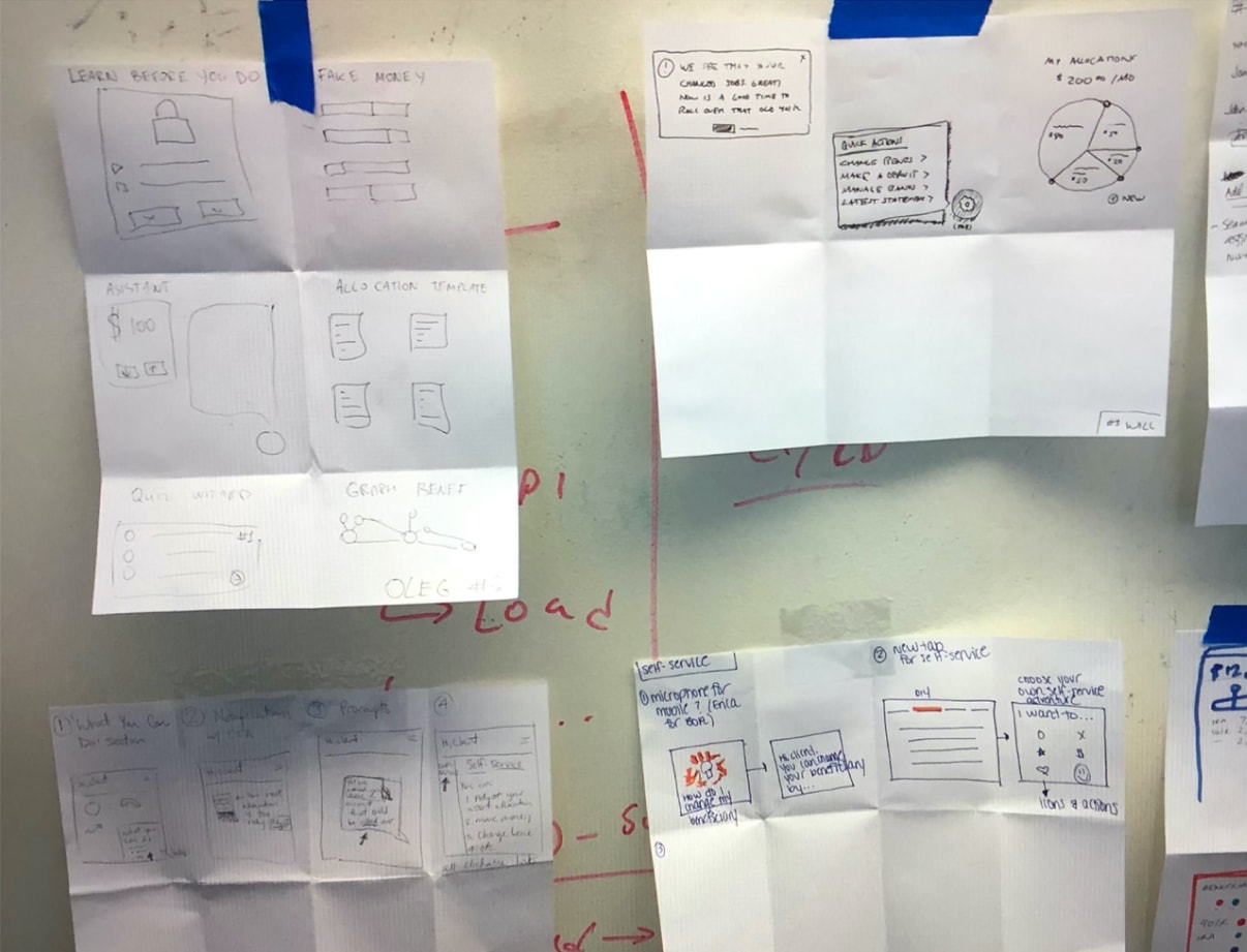
The two designers each designed a concept and I tackled the third. In addition to the four design principles above, I challenged the team to push the visual design a little bit beyond the nascent design system, make the concepts feel more personal to users, and design each direction for a different subset of our core client segments without alienating the others. The concepts differed in form and function depending on the subset of users that each was oriented toward.
“Syllabus” was directed at less experienced or affluent customers and told the story of the user’s money in a long-form editorial style. It intended to demystify investing through ample visuals and an inline glossary. Financial plan data is applied to the pinned goal status to help customers understand immediately how they are progressing toward their goal. A contextual call to action might encourage the user get back on track, over-achieve on their goal, or contact their advisor for assistance. Full disclosure: I contributed this design direction.
The interactive outcome modeling approach of “Deep Dive” appealed to our most savvy investors and their desire for detailed understanding and perceived control over the outcomes of their goals. This concept used financial plan data to allow users to model different scenarios by controlling their timeframe and investment strategy in order to work with their advisor to optimize their portfolio.
The creatively named “50/50” occupied a middle ground between the first two concepts, taking the form of a simple dashboard which allowed for deeper exploration of account details like holdings or performance. This concept employed plan data in a similar way to “Syllabus”, while going a step further and providing confirmation on progress or suggestions throughout the view.
“Syllabus”
“Deep Dive”
“50/50”
Concept evaluation findings
Our dedicated UX researcher helped the team evaluate the three concepts with existing NM customers. While all concepts tested well, “50/50” satisfied the needs of our largest customer segments without indexing too strongly on novices (“Syllabus”) or our savviest investors (“Deep Dive”). A few key research findings that illustrate this:
- Most customers only wanted a snapshot to confirm the overall health of their investment.
- For the few savvy investors, the ability to easily drill into the details was beneficial.
- The notion of integrating goals into the investment view was appreciated despite not all clients having a financial plan.
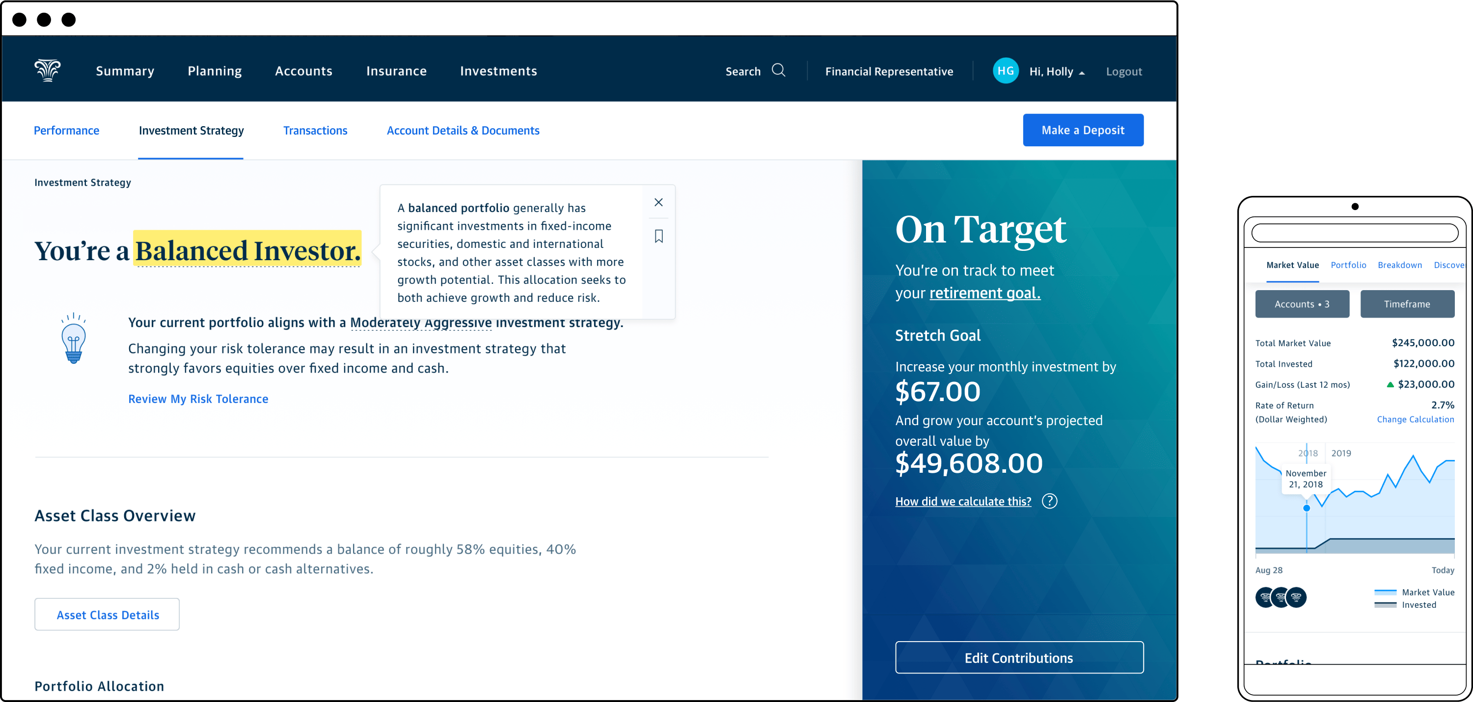
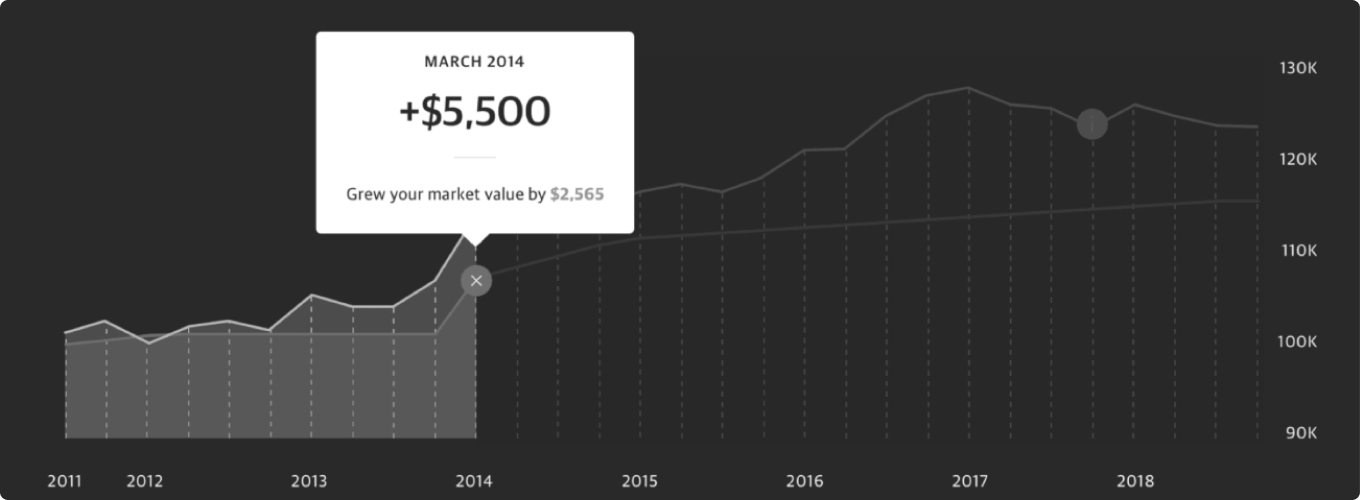
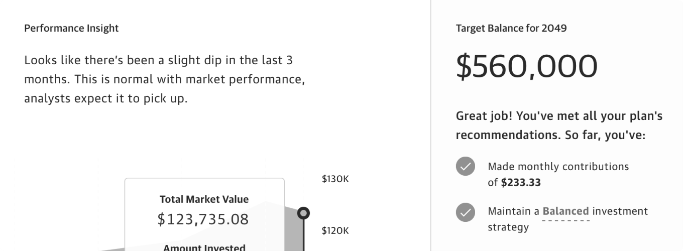
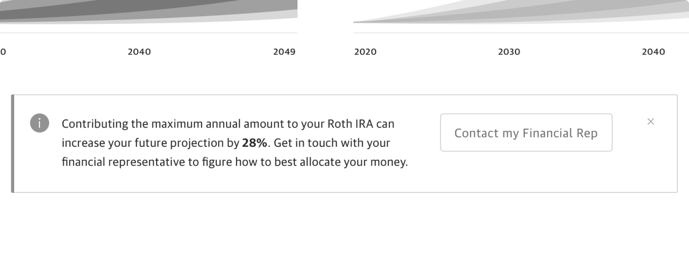
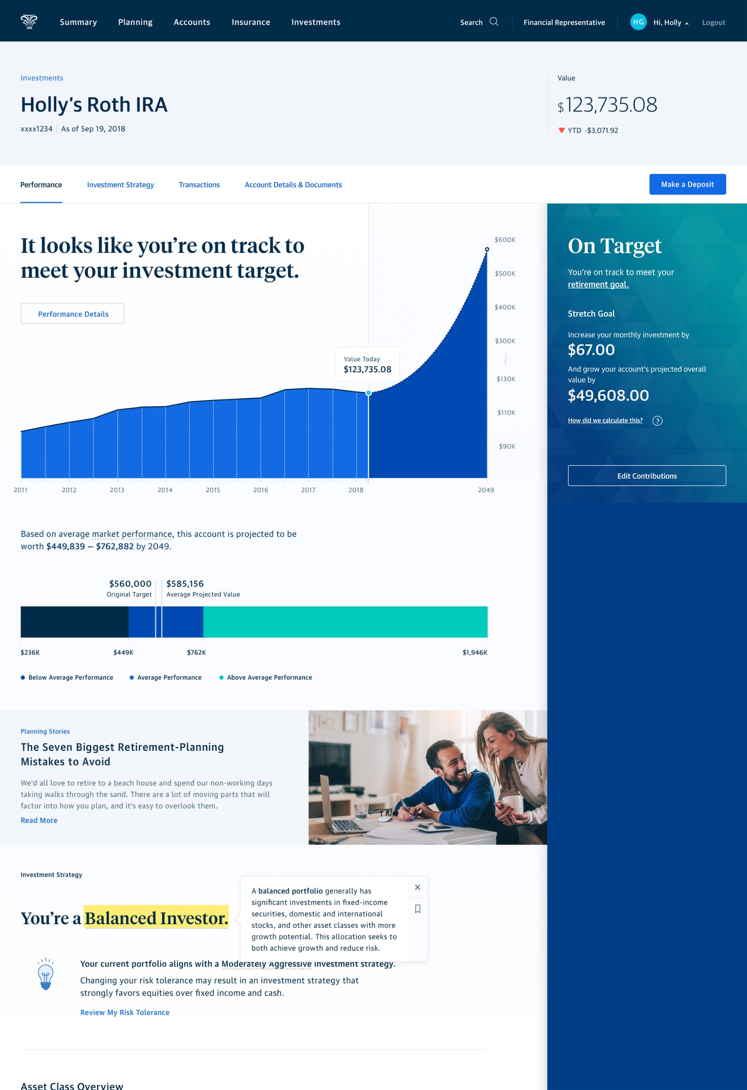
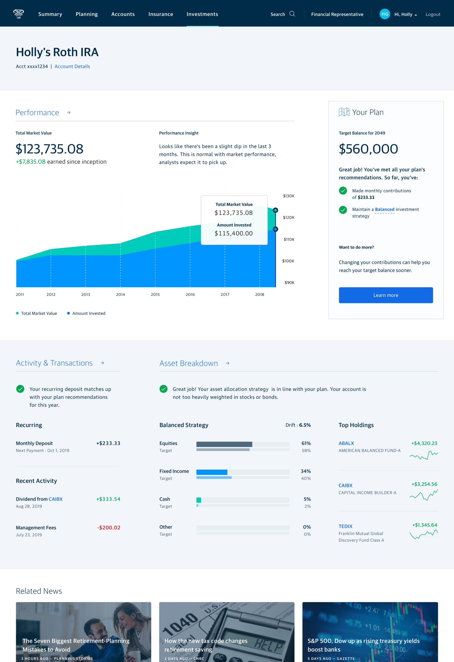
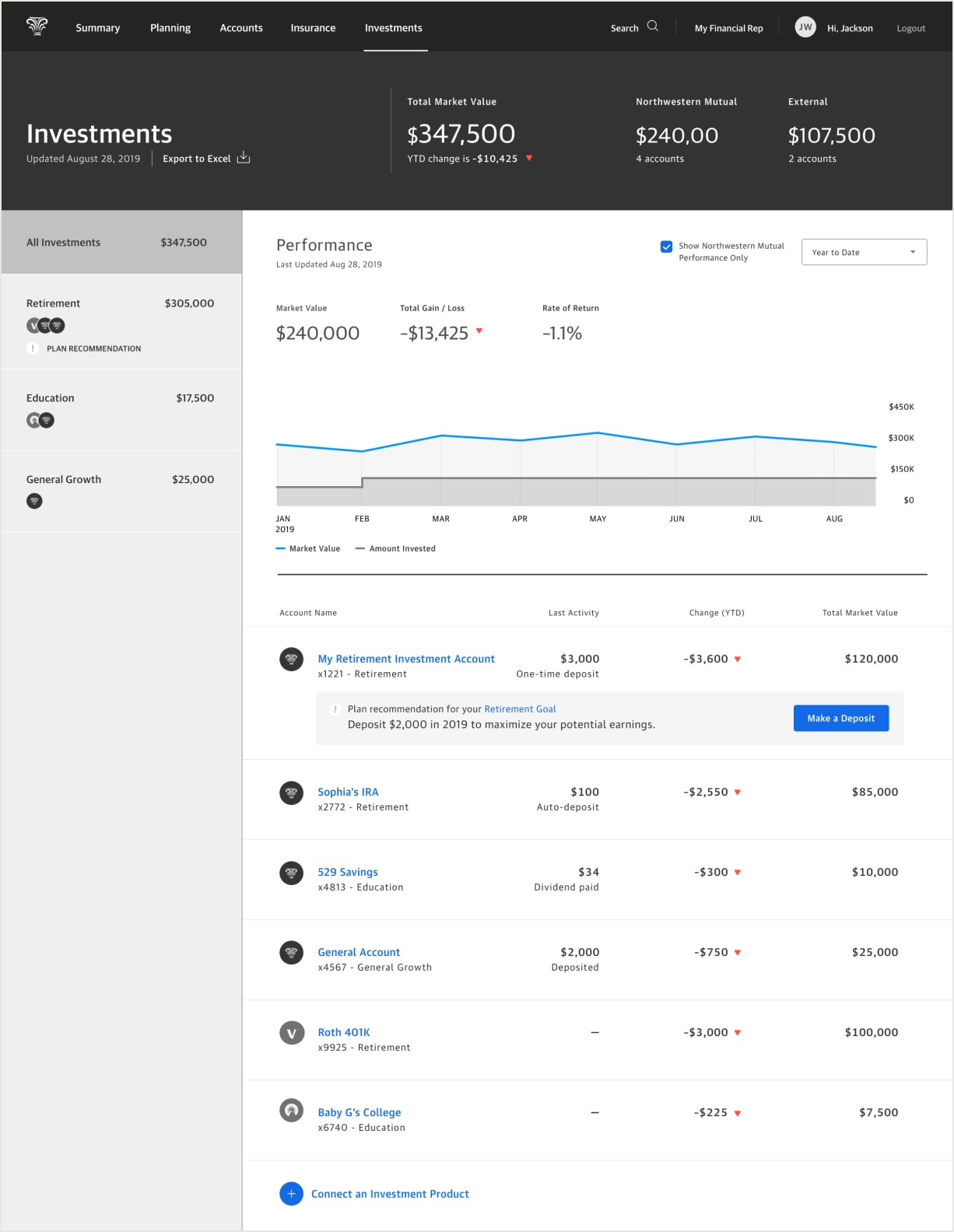
The winning concept was designed for established investors who tend to trust in their advisor’s direction. Even so, it contained ample contextual cues to guide and reassure less knowledgeable customers. It balanced surface simplicity with the ability to drill in deeper for details. Intelligence from the customer’s financial plan manifests across the concept in the form of performance insights, confirmation of whether the customer is on track for their goal, how they might make adjustments to their contributions, and timeline projections for goal outcomes.
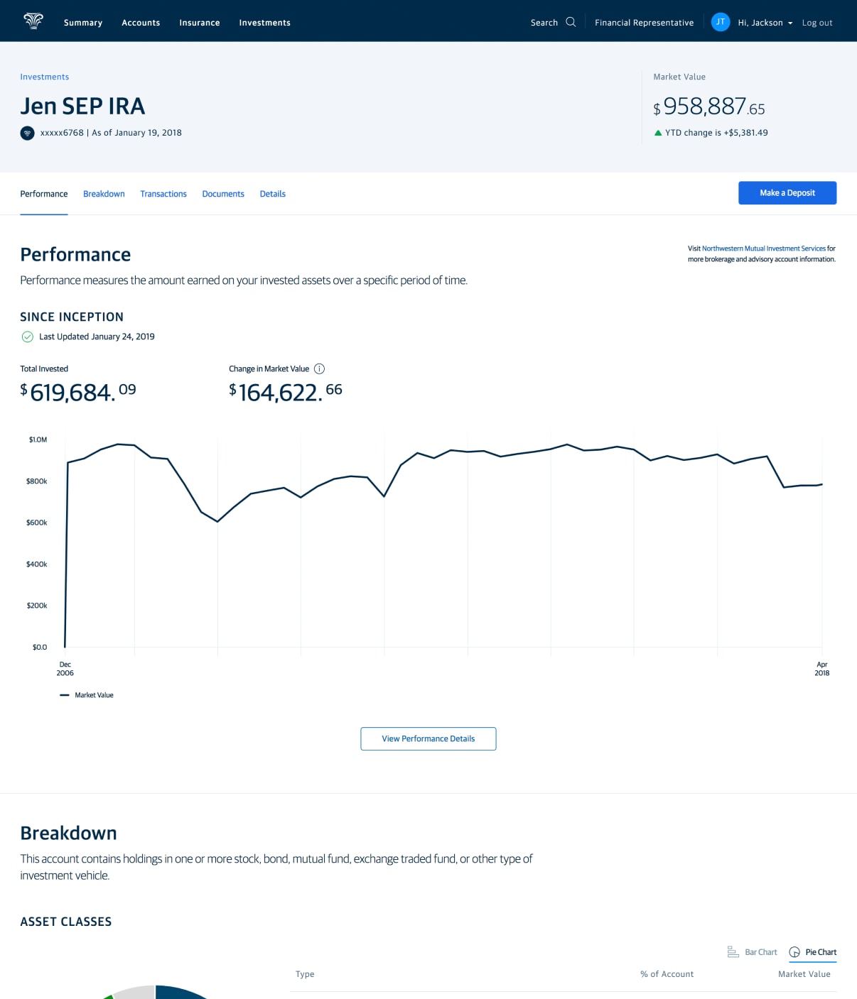
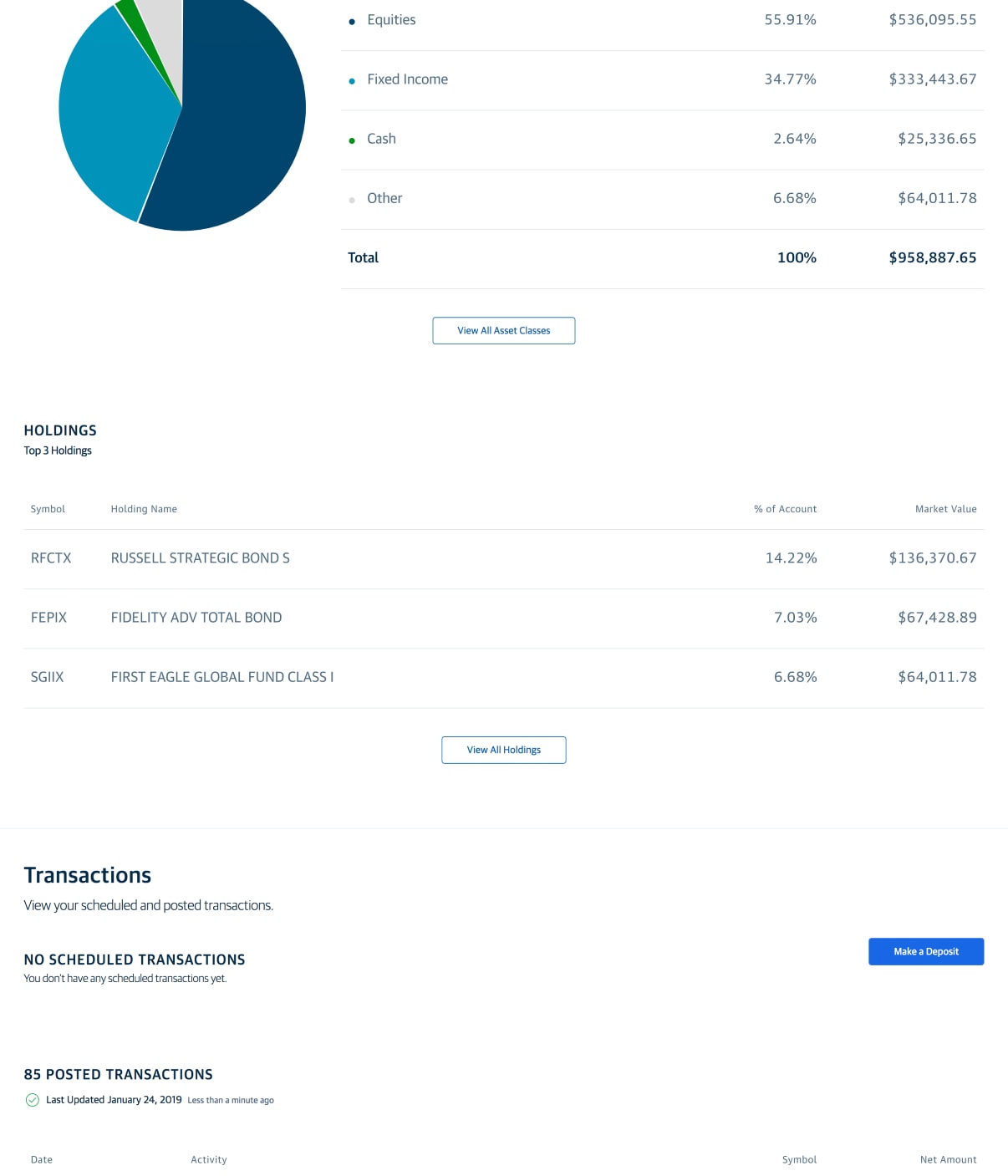
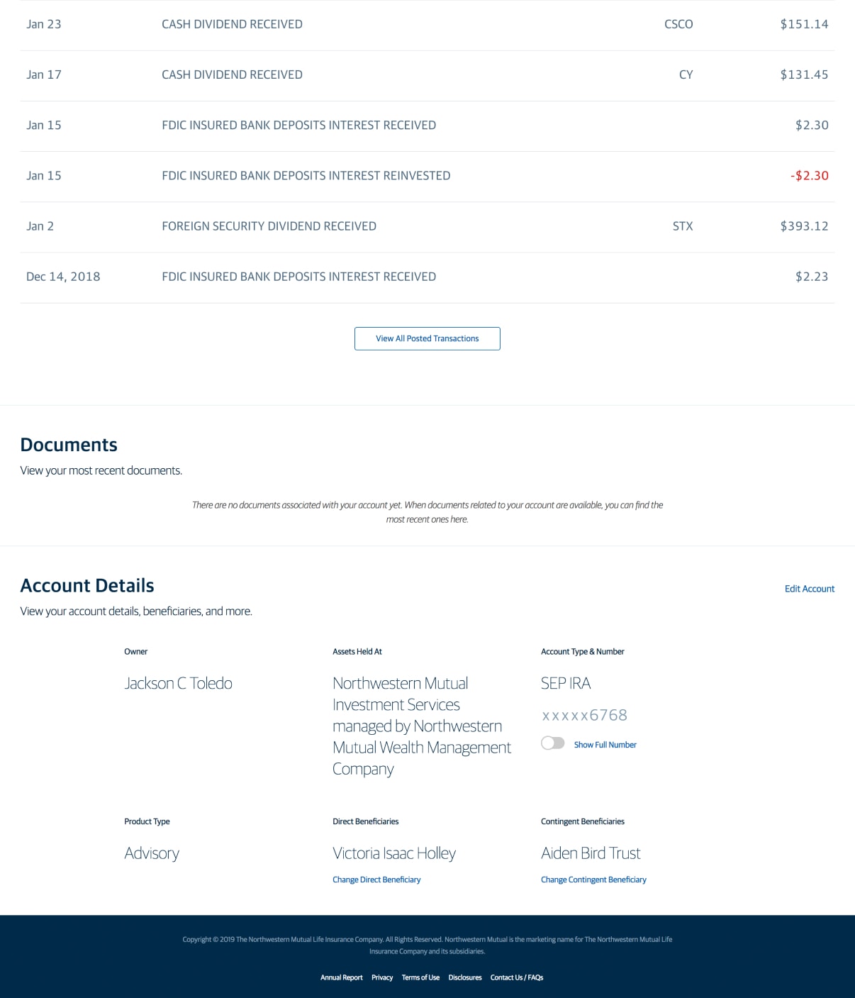
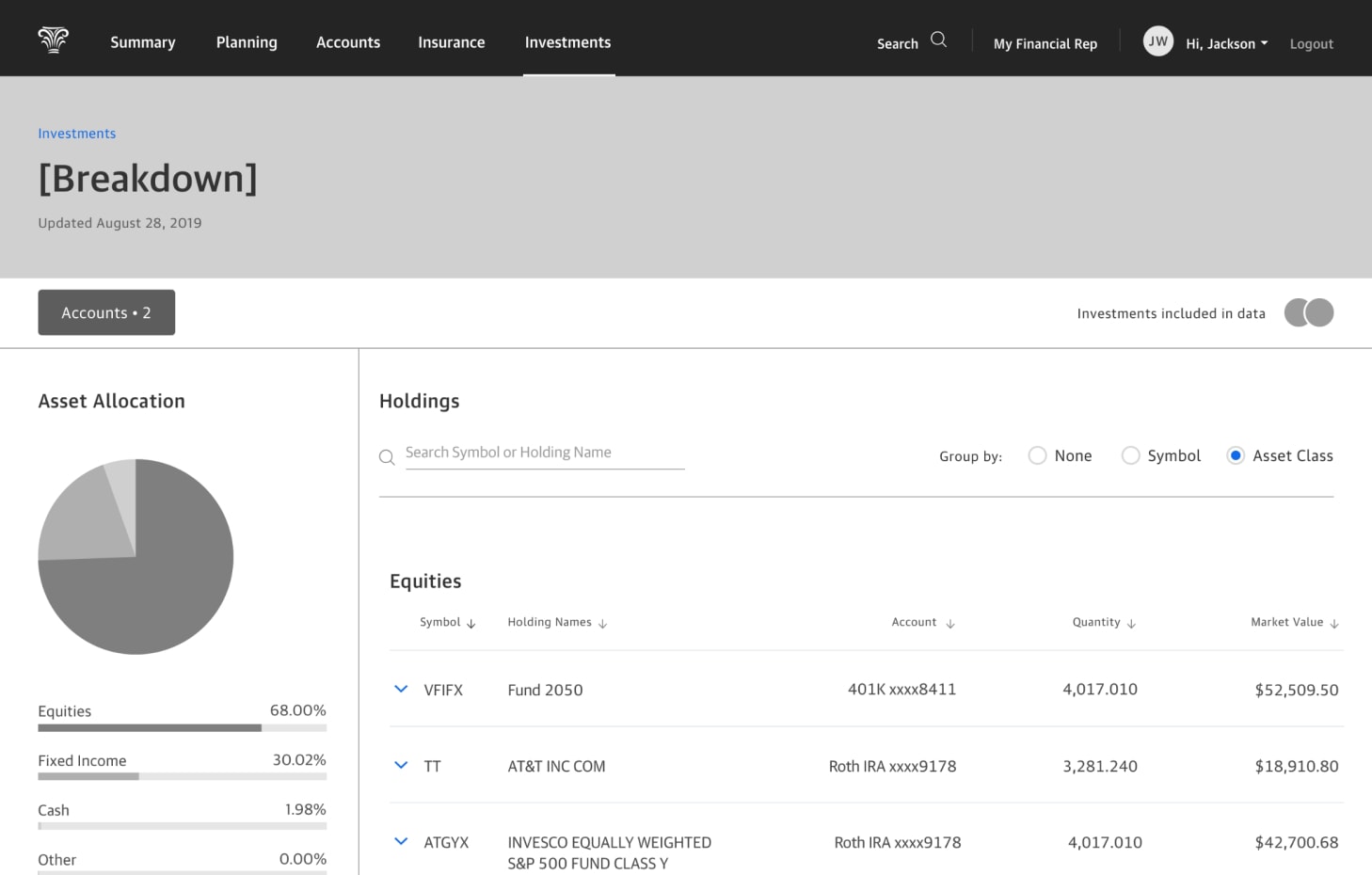
Account main view
Account performance details
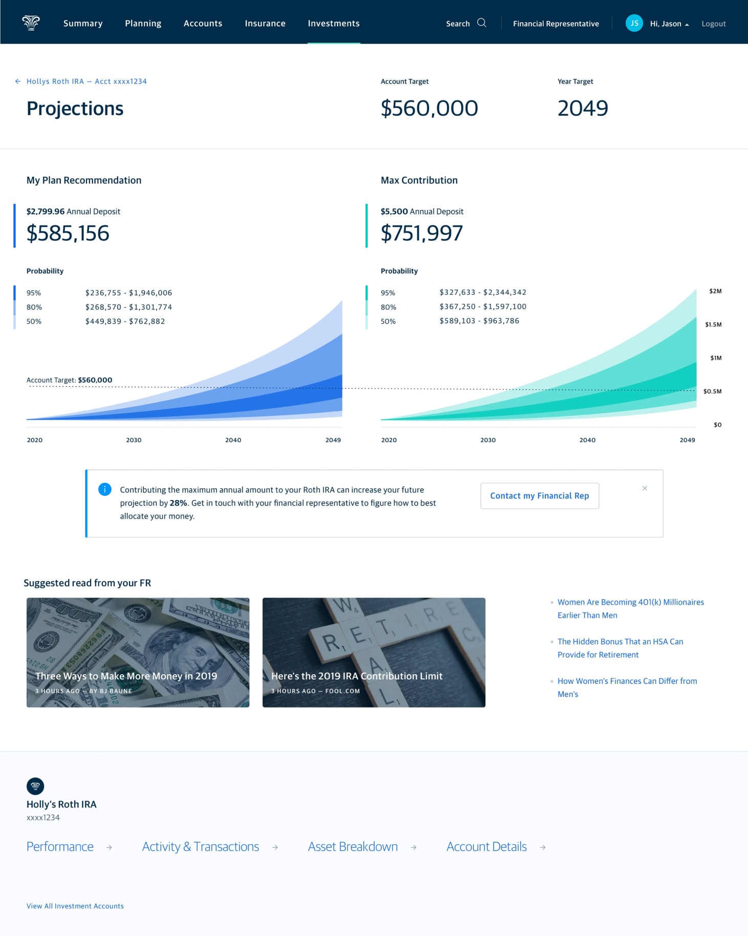
Account projected value
Beyond initial research
Following up on our concept evaluation research, I intended to repeat the exercise with advisors to understand their perspective. To be good partners to our advisors we needed to confirm whether these experiences supported their ability to maintain relationships and have productive conversations with their clients. We wanted to understand what functionality was best provided as self-service features vs actions performed by advisors on their client’s behalf. An example might be allowing a customer to adjust their investment risk tolerance or modify recurring contributions based on intelligent suggestions from the experience—actions that advisors typically handle.
Following advisor evaluation, the product manager and I planned to use those findings to define what an MVP experience might be. However, due to a more pressing need, we shifted our attention toward the “parent” aggregated Investments Landing view.
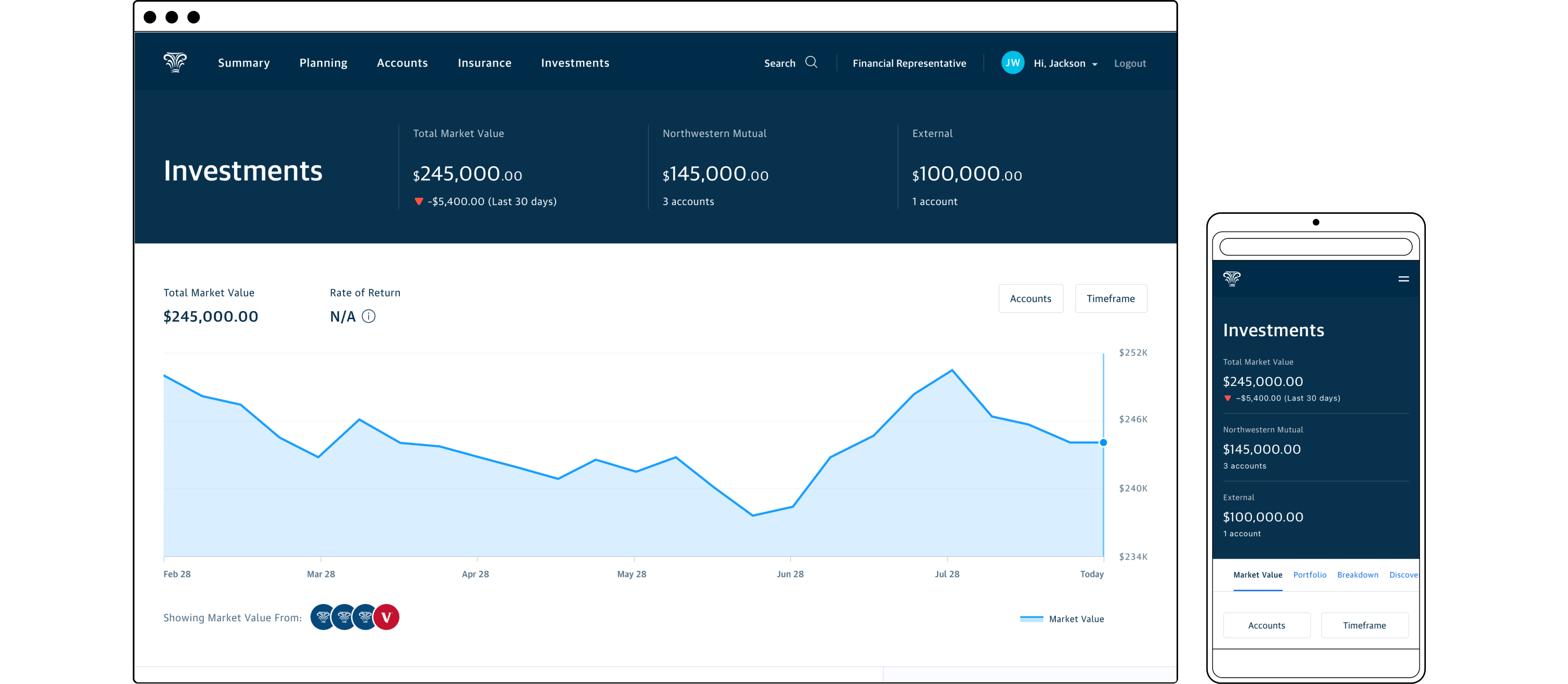
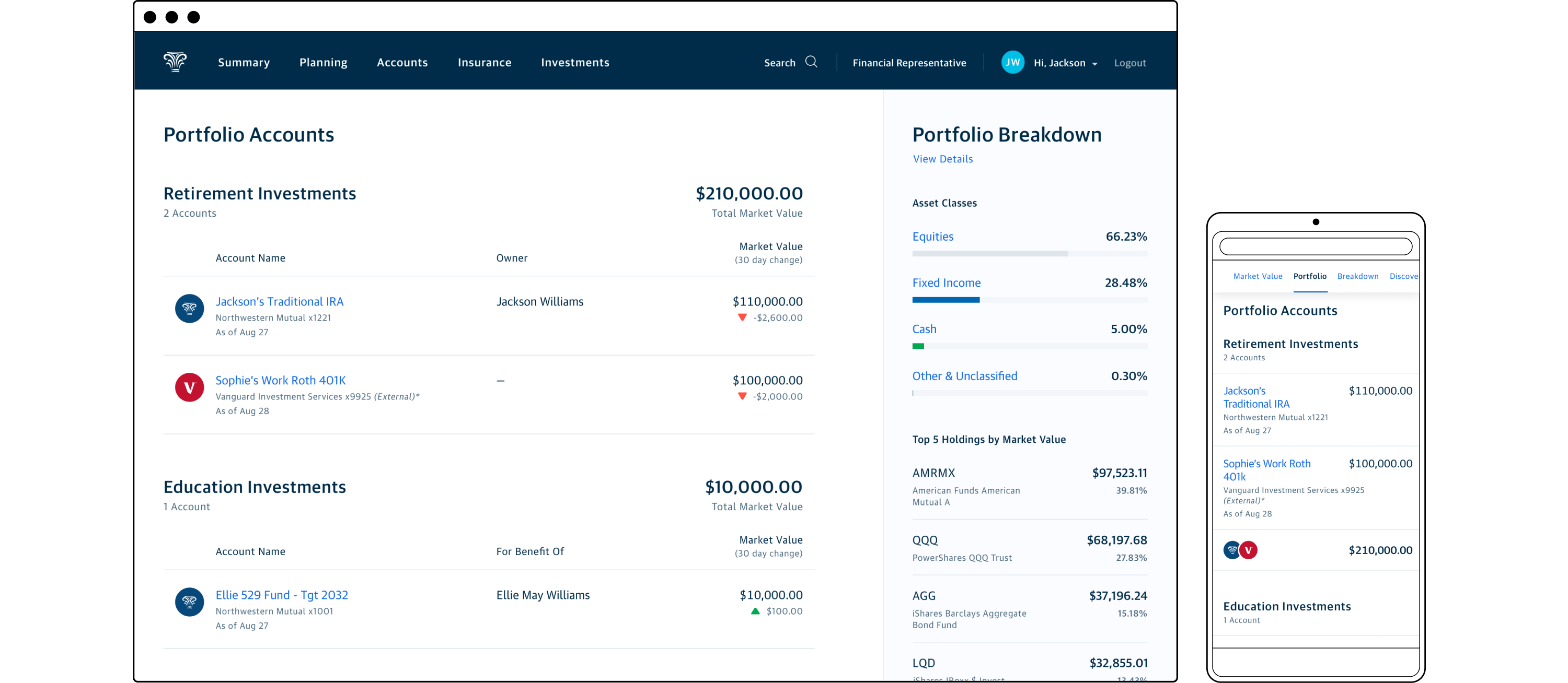
Perform: Aggregated Investments Landing
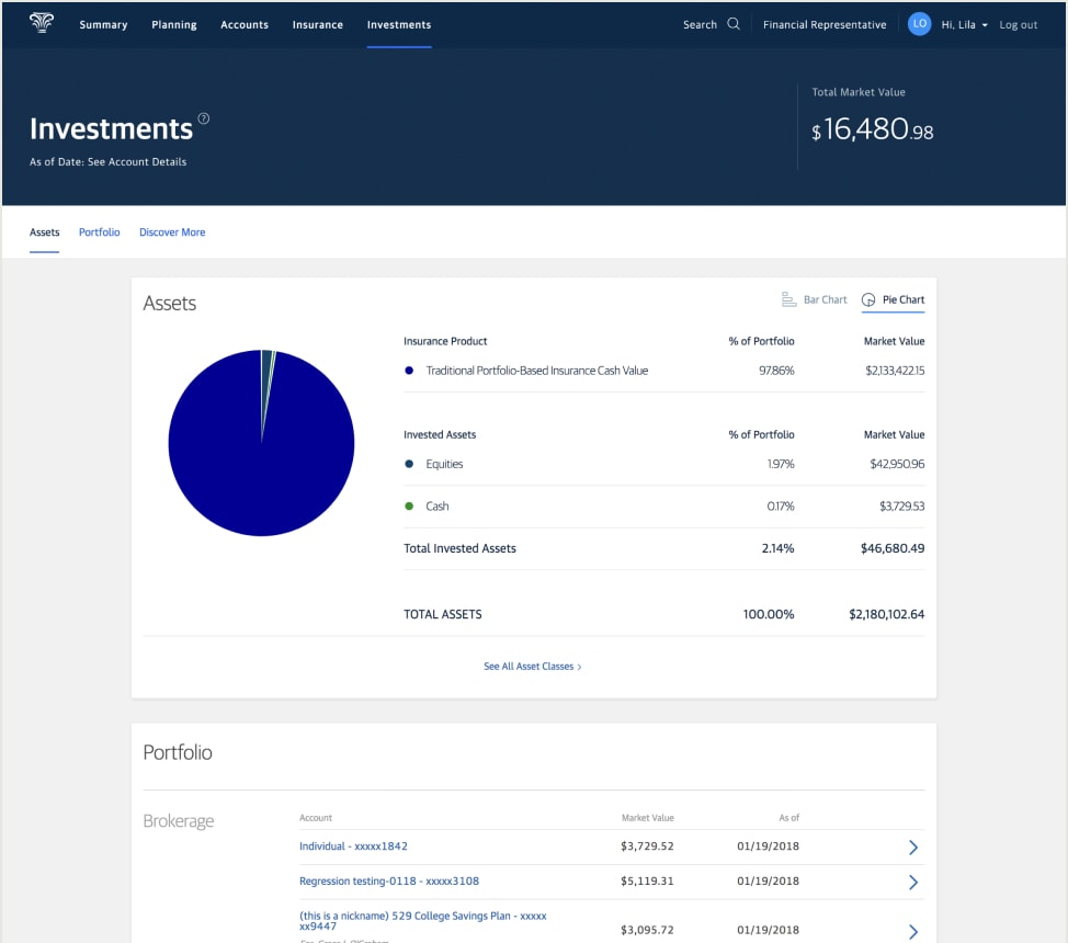
In order to establish NM as the center of customers’ financial lives and drive plan adoption, we need them to view the customer portal as their “financial hub”. The single destination for understanding how they’re progressing toward their financial goals. Part of this effort was being handled by a different team already working on the “upstream” Client Summary page. This high level view intended to show aggregate values for a customer’s investment, banking, and insurance accounts for both NM and outside financial institutions. The Summary view required functionality to connect customers’ outside accounts to calculate overall market value. The financial planning software also needed access to a customer’s complete set of financial data in order to generate a plan.
The Investments area of the customer portal therefore needed to be able to connect external investment accounts to feed data into the planning software and in-progress Summary view, and display holistic investment performance to track progress toward the customer’s financial goals.
Old investments landing view with comically large content carousel
The old investments landing view was source of constant angst for clients and advisors alike. It didn’t provide aggregate performance for NM accounts, forcing users to drill into each individual account to track their account growth. It oddly led with a breakdown of account assets instead of the index of links to the user’s accounts. A questionable choice since the most common action was to directly navigate to an individual account view. Finally the wasteful and enormous content carousel at the bottom garnered very little engagement.
Initial design and evaluation
I briefed the design team on the goals and guardrails for this project. Since it was the same team from the discovery work, the learnings from that project were fresh in our minds. This continuity allowed us to transition to this new work seamlessly, giving us a good chance of launching in sync with the Client Summary view.
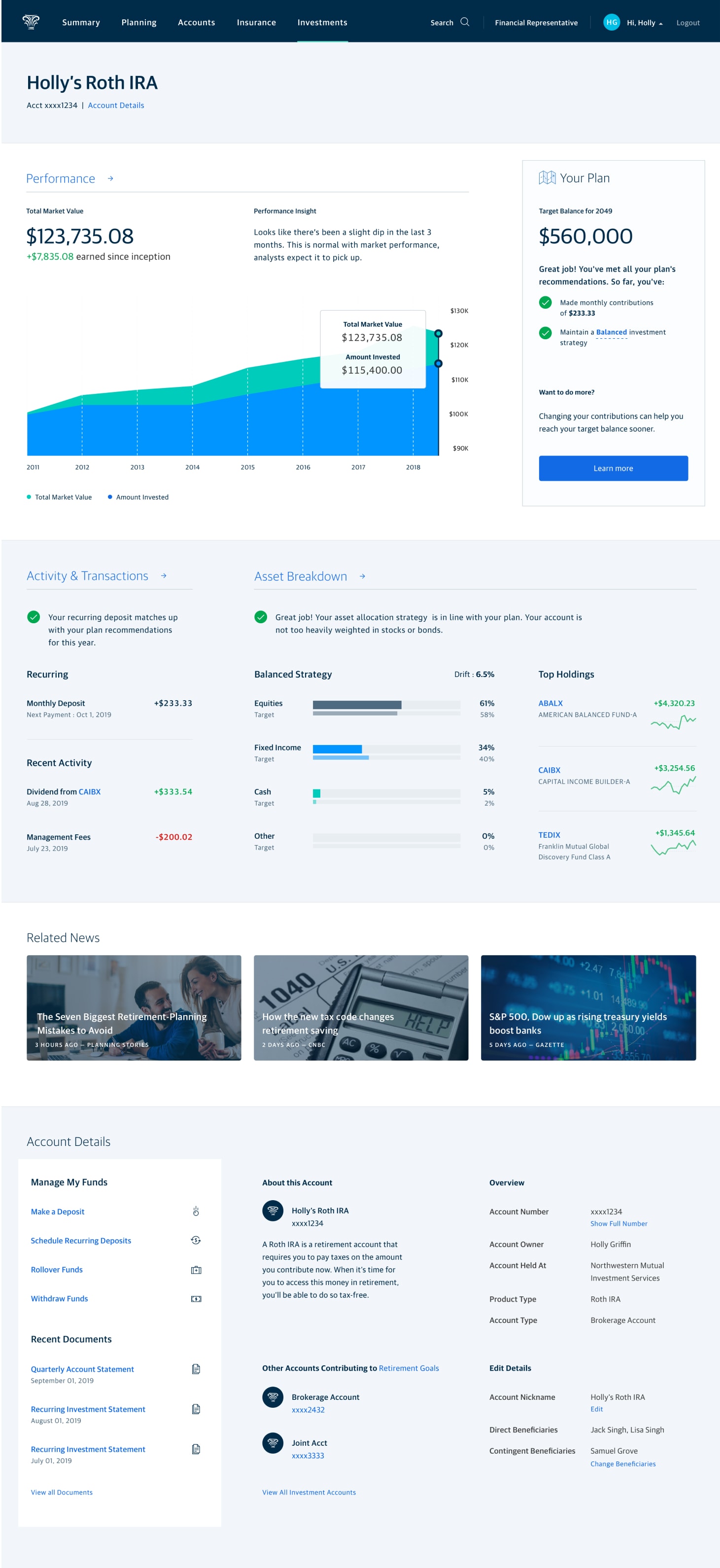
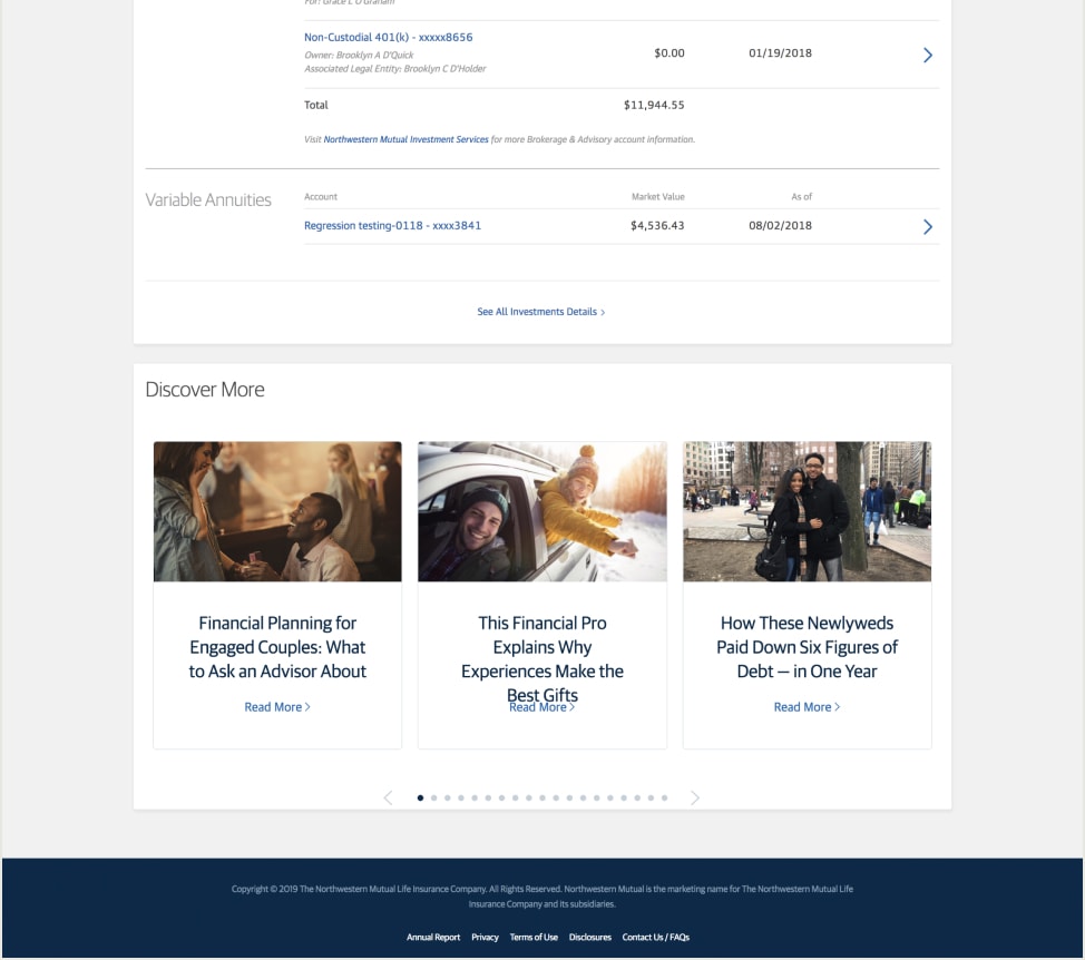
Besides providing utility to connect external accounts, the experience needed to show aggregate account value, performance for NM accounts, and feel goals-driven. Due to technology and time constraints, the MVP wouldn’t have direct hooks into a customer’s plan, so financial goals would need to be represented through investment account types. We knew that IRAs and 401ks could be safely categorized as serving a retirement goal, while a 529 supported an education goal. Any other brokerage accounts would be lumped into a General Growth category. To placate our very vocal (read: angry) savvy investors we needed to provide access to investment holdings details in order for them to “conduct their own research.” While not the primary audience, we anticipated advisors also finding utility in detailed holdings views while discussing investment strategies with their clients.
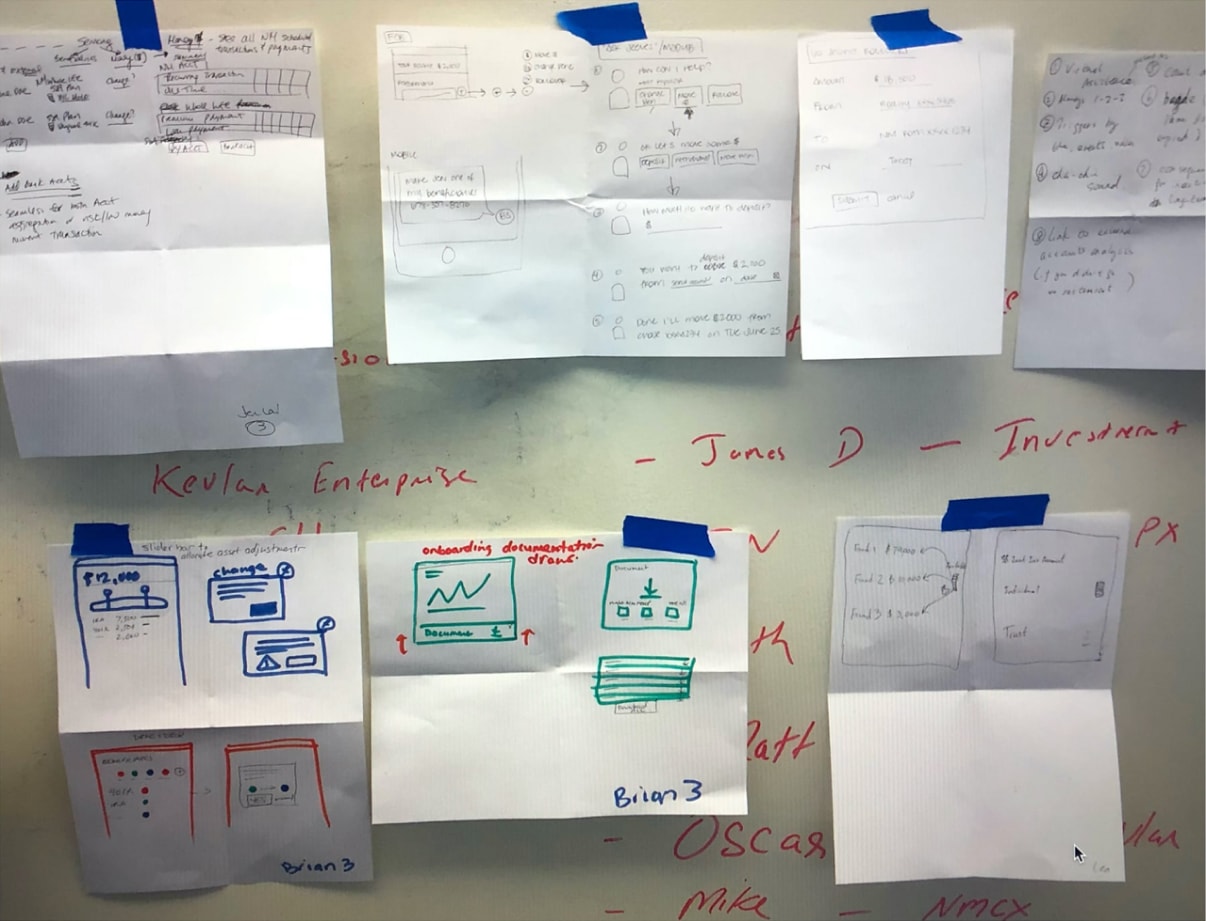
The team quickly set to work, drafting a number of wireframes exploring ways to visualize account value, show activity, and invite users to drill deeper.
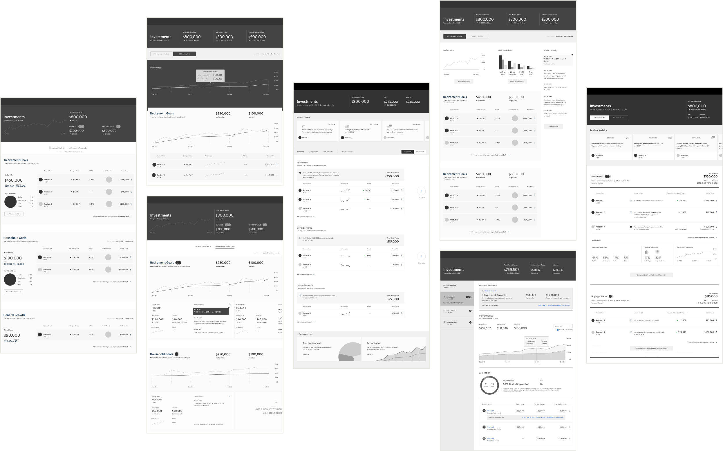
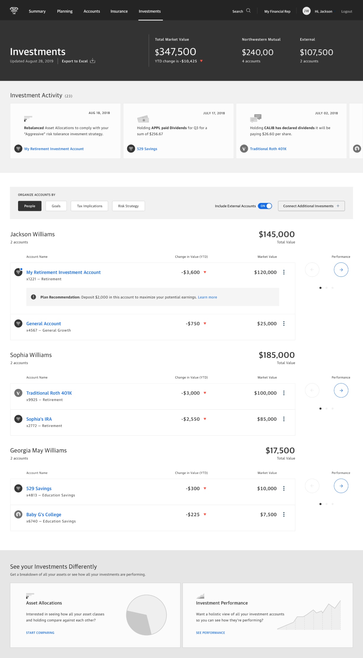
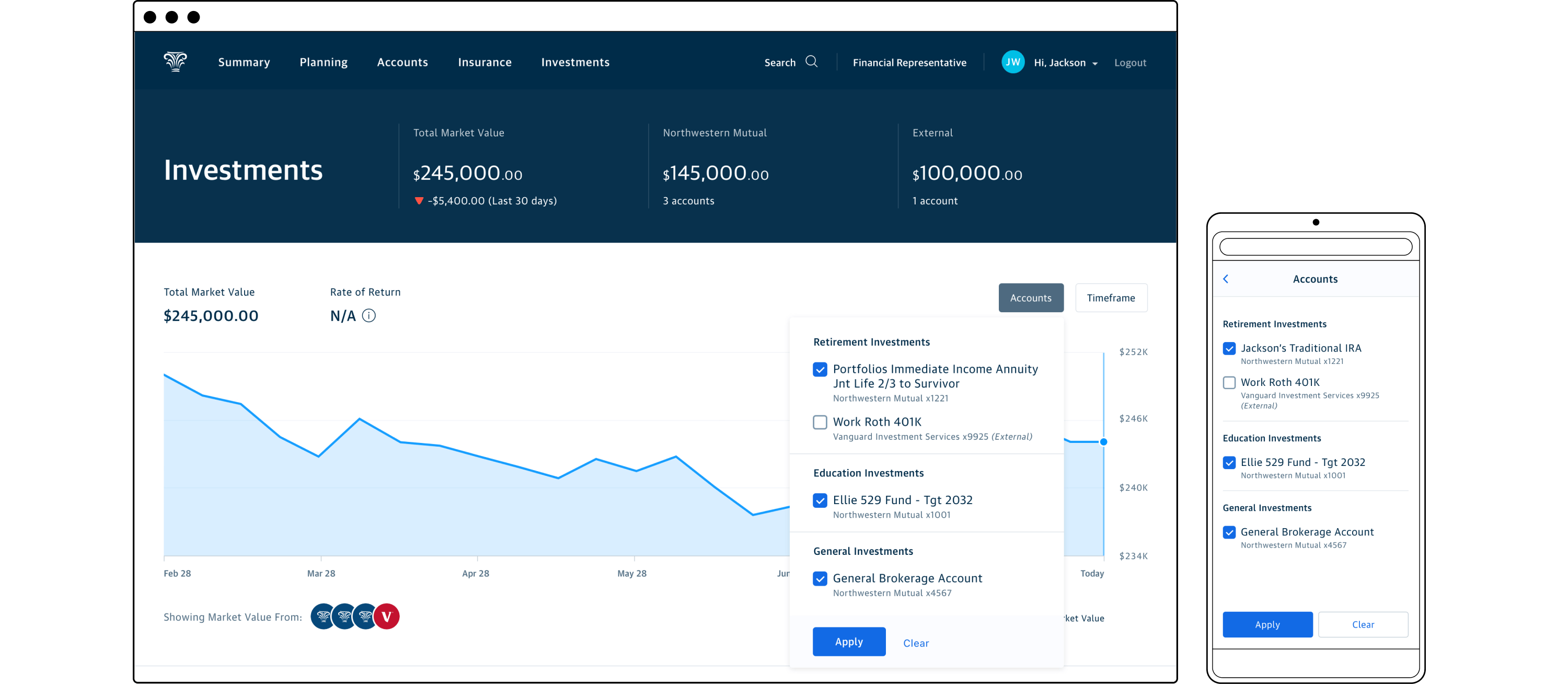
We brought two concepts into our initial evaluation. Our goal was to determine user affinity between an expected readout of performance or market value compared to a more personalized and activity driven approach. Version A employed a more conventional layout leading with overall value and performance before listing the individual accounts. The selection of goal type in the left rail would control the display of data visualization and shown accounts through those goal lenses in the main frame. Version B featured an activity-centric approach highlighting available user actions and account status updates. It also permitted accounts to be organized by household members, goals, tax implications, or risk strategy.
I fully expected Version A to test more favorably due to the prominent visualized display of account performance and intuitive grouping of accounts by goal. Our testing showed that:
- All participants related to groupings of accounts based on 3 goals: retirement, education, and general growth.
- Version A was considered easier to navigate, required less thinking, and was more informative than Version B.
- “You don’t have too many doors to open.” - Participant who preferred Version A.
Version A
Version B
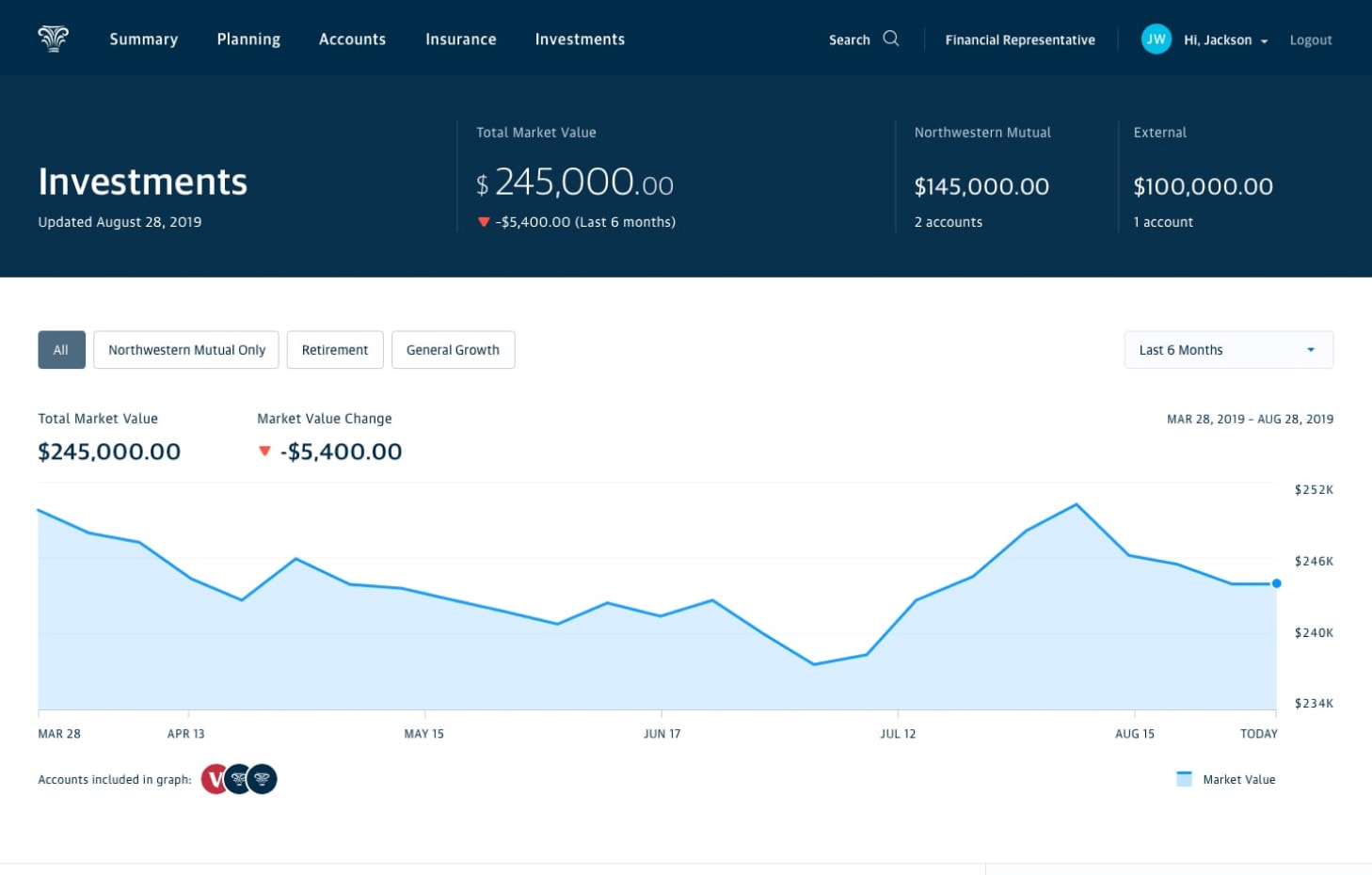
High fidelity design and new constraints
With the learnings from our first round of testing, the product manager and I agreed to move into detailed design based on the more successful direction. However, our engineering lead was concerned about the effort of implementing the left-rail view control, so due to time constraints we simplified to a more static main view. This opened up space to reintroduce aggregate breakdowns of asset classes and holdings across all accounts—something that our savvy investors would deem necessary.
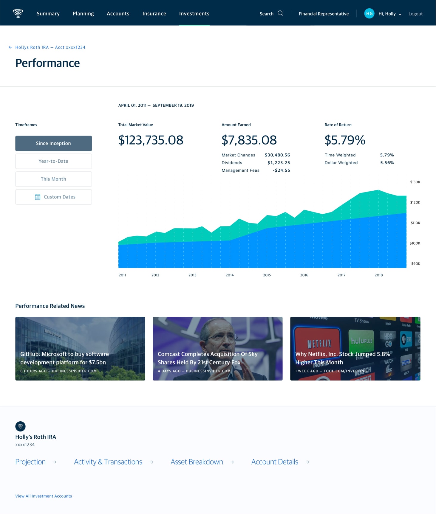
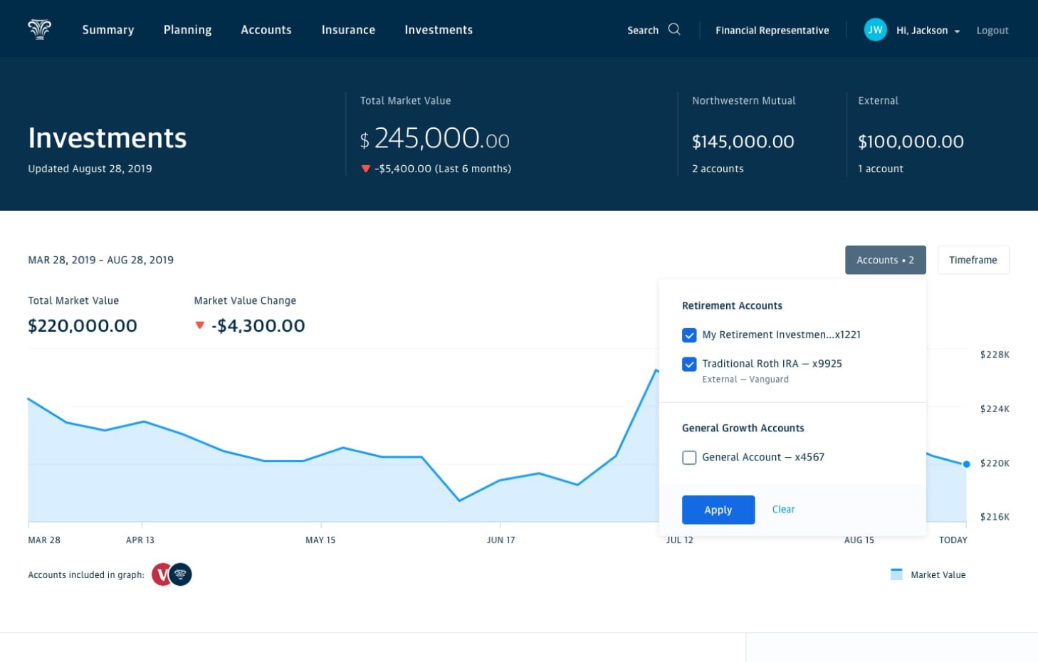
Around this time a new constraint surfaced that required additional design and testing. Due to limitations in the 3rd party aggregation service used to connect outside accounts, we were unable to show performance for those accounts. Essentially we were unable to pull the original purchase price for funds so we couldn’t calculate rate of return. We needed a way to visualize true performance for NM accounts and only market value for external accounts. We tested two approaches for selecting accounts for visualizing performance/value. The first was a blunt solution that used chips to segment between all accounts (default), NM accounts, or accounts associated with a goal. The other featured a fly out menu comprised of individually selectable accounts organized by goal. External accounts would be specifically labeled allowing the user to fine-tune how they wanted to see aggregate value or performance. Our usability testing showed a preference for individually selecting accounts.
Select by account type
Select by account
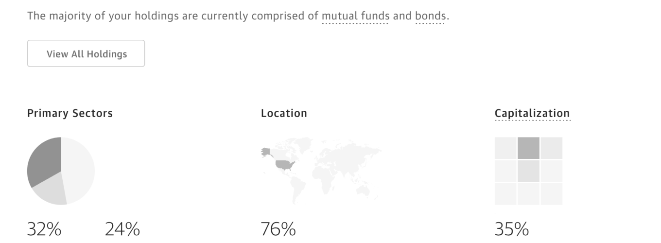
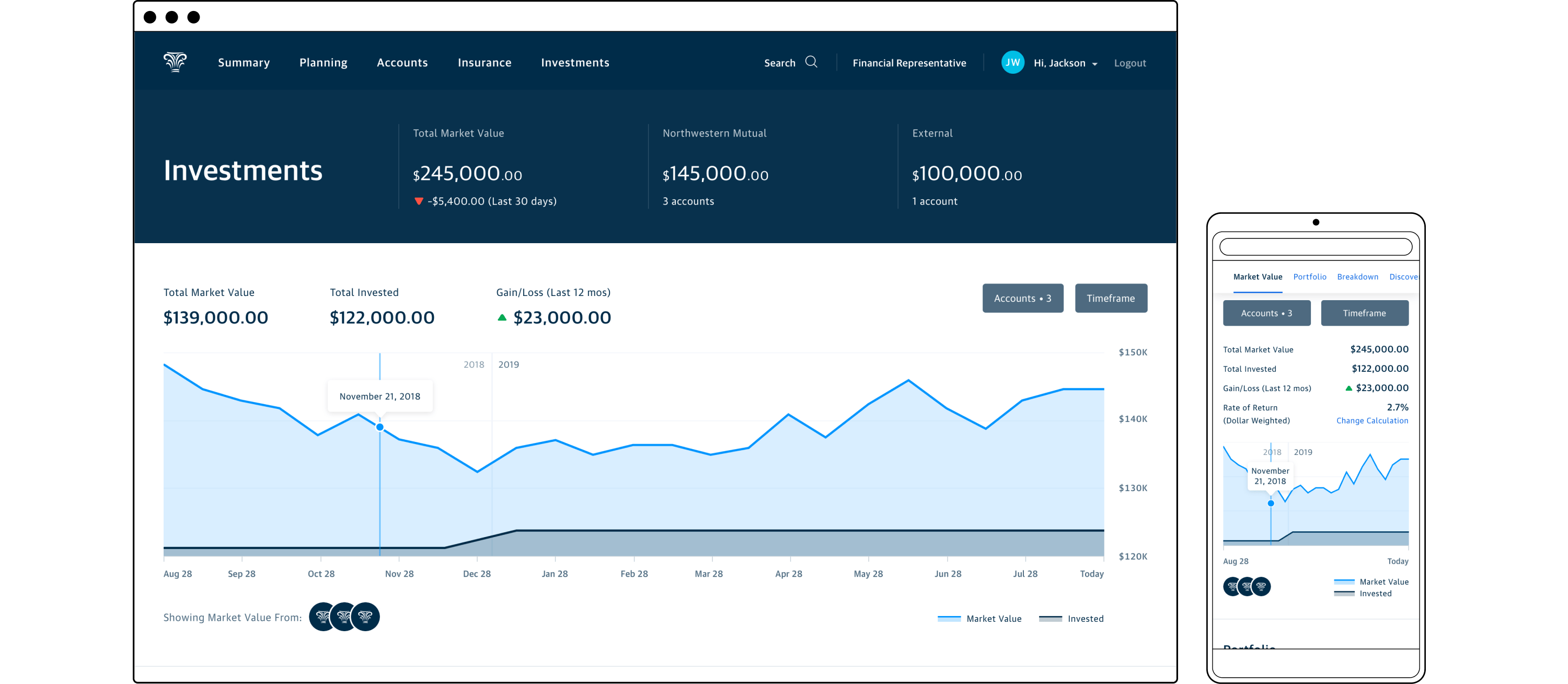
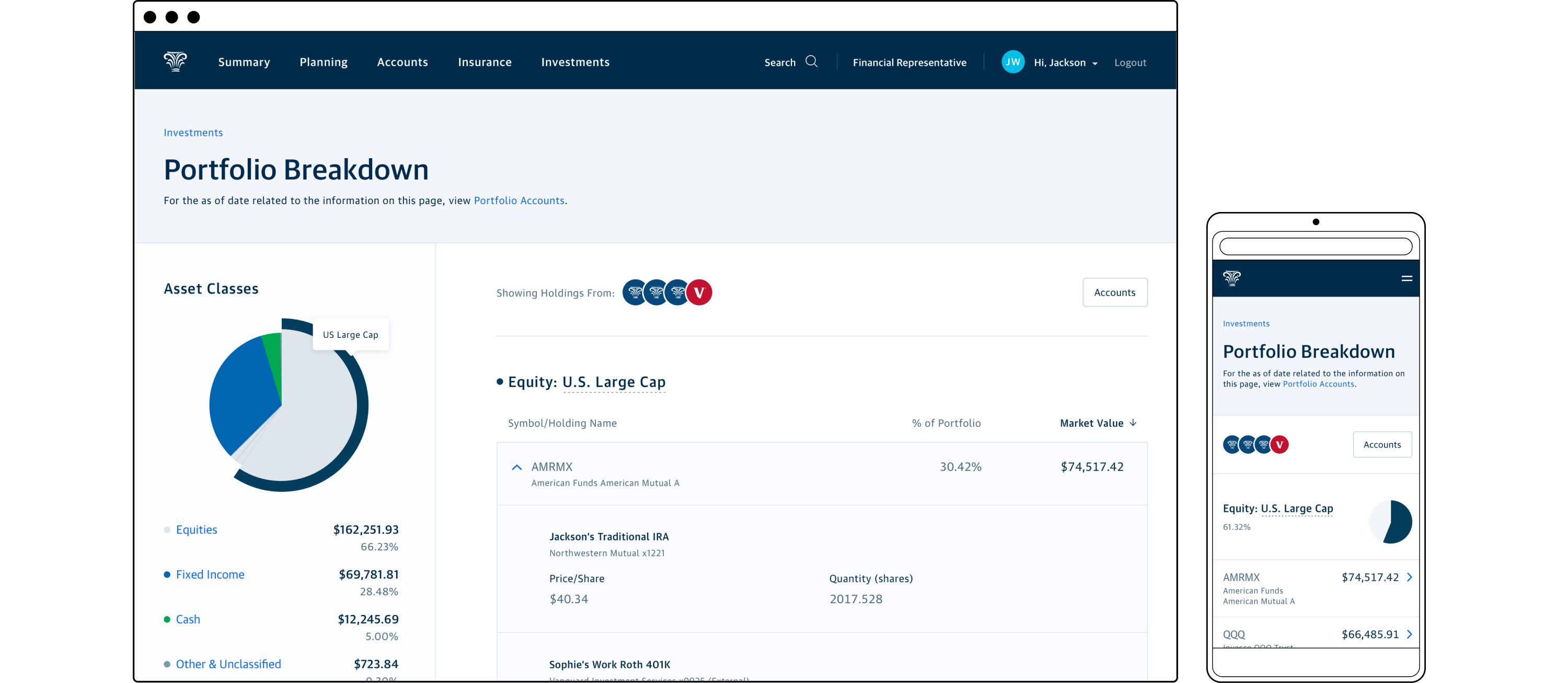
Assets and holdings breakdown
In addition to usability testing, we wanted to gauge user understanding of the drill down state for examining the assets classes and holdings from all of the user’s connected accounts. To continue moving quickly we tested with a wireframe, unconcerned with the accounts filtering mechanism which was being evaluated in the main view. Research respondents understood how to navigate the breakdown view and were generally satisfied with asset organization and layout. We anticipated that the number of users navigating here would be lower than those remaining on the main view or navigating to a specific account, so getting this view perfect for launch wasn’t a necessity.
The home stretch
Around the time of the second round of testing, Product at NM began a large department reorganization with teams and pods refactored and personnel moving on to other tracks of work. This resulted in the designers moving on to other teams, requiring me to take over remaining project tasks as the sole designer. I completed all feature states, worked through the many error states and edge cases related to the performance/market value visualization, ensured the messaging satisfied our compliance team, previewed the experience with influential financial advisors, and assisted the engineering team with QA testing.
After several successful preview meetings with advisors, we felt confident enough to launch the revamped landing page as a pilot for customers of three advisor offices and our home office employees. With no new issues arising during the six week pilot period we followed with the full release for all customers.
Reception, reflection, and what could be
Customer feedback was generally positive, with users appreciative of the presentation of accounts and aggregate performance or market value.
“I like the new segmentation of accounts… but PLEASE add the ability to self select which accounts go into which segments…”
“The investment page is concise and provides a good overview of the value of accounts.”
“Removing the Custom Date Range from the investment returns was a mistake…”
NM rarely defined or tracked success metrics for deployed features, but my expectations were that customers would primarily connect accounts they believed to be obvious matches for our new goal categories, mainly work 401Ks, IRAs, and 529s. Measuring direct impact on the number of financial plans created would be difficult to track initially as our new planning software wasn’t available to most advisors yet.
Before becoming aware of the company re-org, the product manager and I intended to iterate on the base experience, leveraging discovery research, tracked user behaviors, and newly available financial planning data. A few features that we believed would further address user and business needs:
- Robust self-contribution utility for all types of NM investment accounts
- Expanded/customized goals categorization for accounts
- True goal and financial target data integration from a customer’s financial plan
- Helpful contextual market or account insights
My personal reflections on this project are that the cross-functional team delivered a high quality experience despite significant time and technical constraints. Conducting concept evaluation, usability testing, and sharing in-progress work with advisors provided confidence for our efforts and contributed to the smooth rollout of the experience. However, the quick pace of the project might have been mitigated with tighter cross-team roadmap alignment. With more time we might have implemented an experience closer to our ideal designs, allowing us to push our design patterns and take cues from the earlier discovery work.
Related Work

Enterprise Experience Design
Supporting end to end product strategy and promoting user understanding.
Design Team Identity
A collection of team identity digital artifacts, collateral, and swag.
© 2024 Will Gabrenya