I had the exciting opportunity to join the first wave of employees at Critical Mass’ New York office. While originally founded in Calgary, Canada, the NYC office was intended to be a bigger front door for the agency; to bring in new business, and service global and New York City area clients.
Besides notable clients like Citibank, Quinnipiac University, and BMW, I worked on various pitches and some internal agency branding.
Organization
Critical Mass — New York City, NY
My Role
Design Lead / Art Director
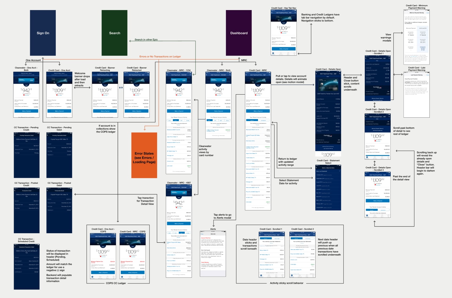
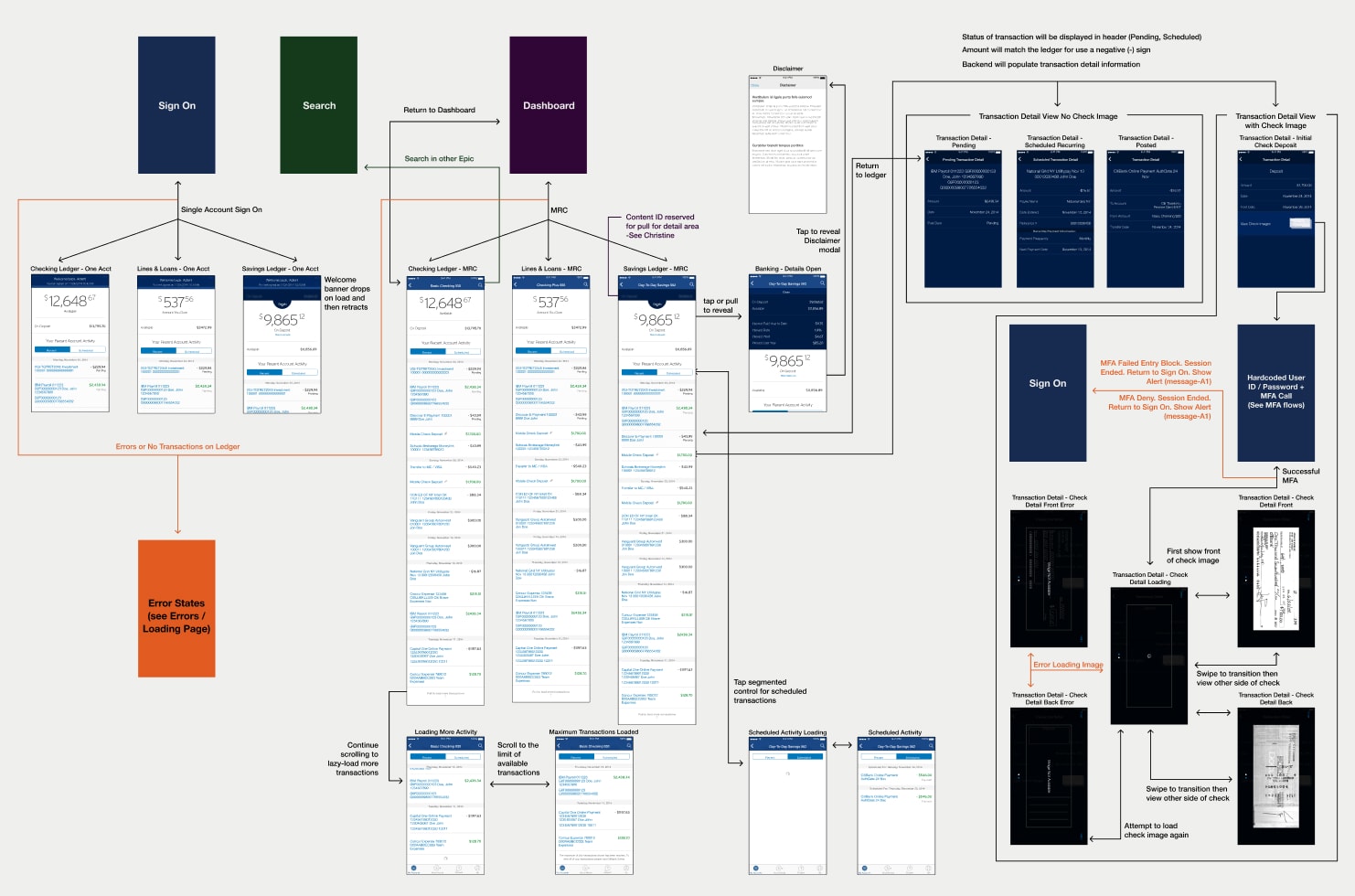
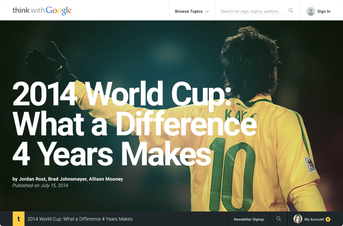
Citibank’s first native iOS app
With the announcement of the forthcoming Apple Watch in the fall 2014, Citi was invited by Apple to become a launch partner for their new hardware. In order to seamlessly sync with the Apple Watch, the old PhoneGap (now known as Apache Cordova) built consumer mobile app had to be retired and replaced with an iOS native app. Critical Mass was brought in as the primary design partner for this effort, with support from an IBM Consulting team who focused on the watch app. We worked with Citibank product managers and engineers, embedding at times at IBM’s Innovation Studio offices in NYC and their Silicon Valley Lab in San Jose.
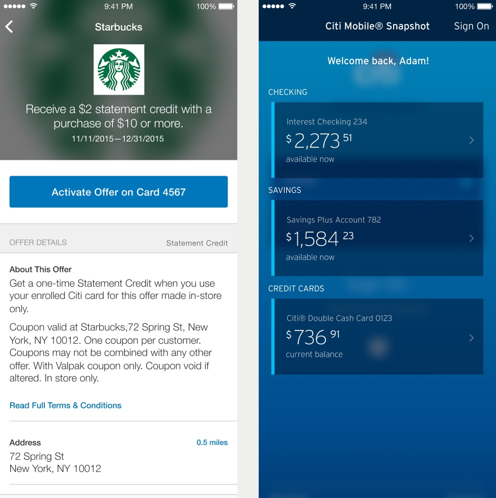
We redesigned the new app from the ground up, with the primary goal of launching with all of the expected banking and credit card account features. From project kickoff to launch, the app was designed, developed, and tested in seven months. As a design lead on this project, I focused primarily on ledger views, the core functionality of the app. I also designed onboarding views to introduce the new app and a local offers feature that didn’t make the initial MVP cut.
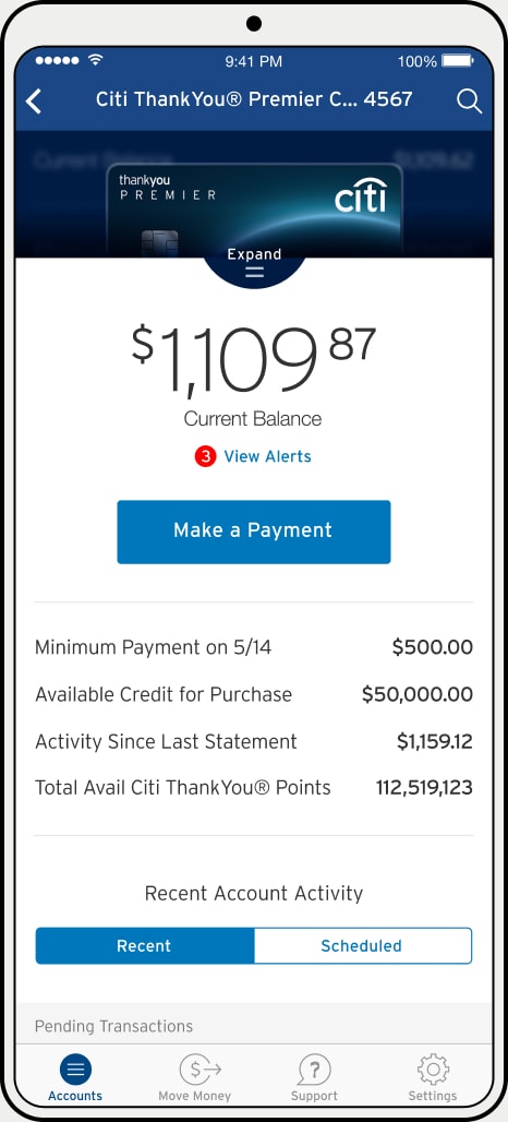
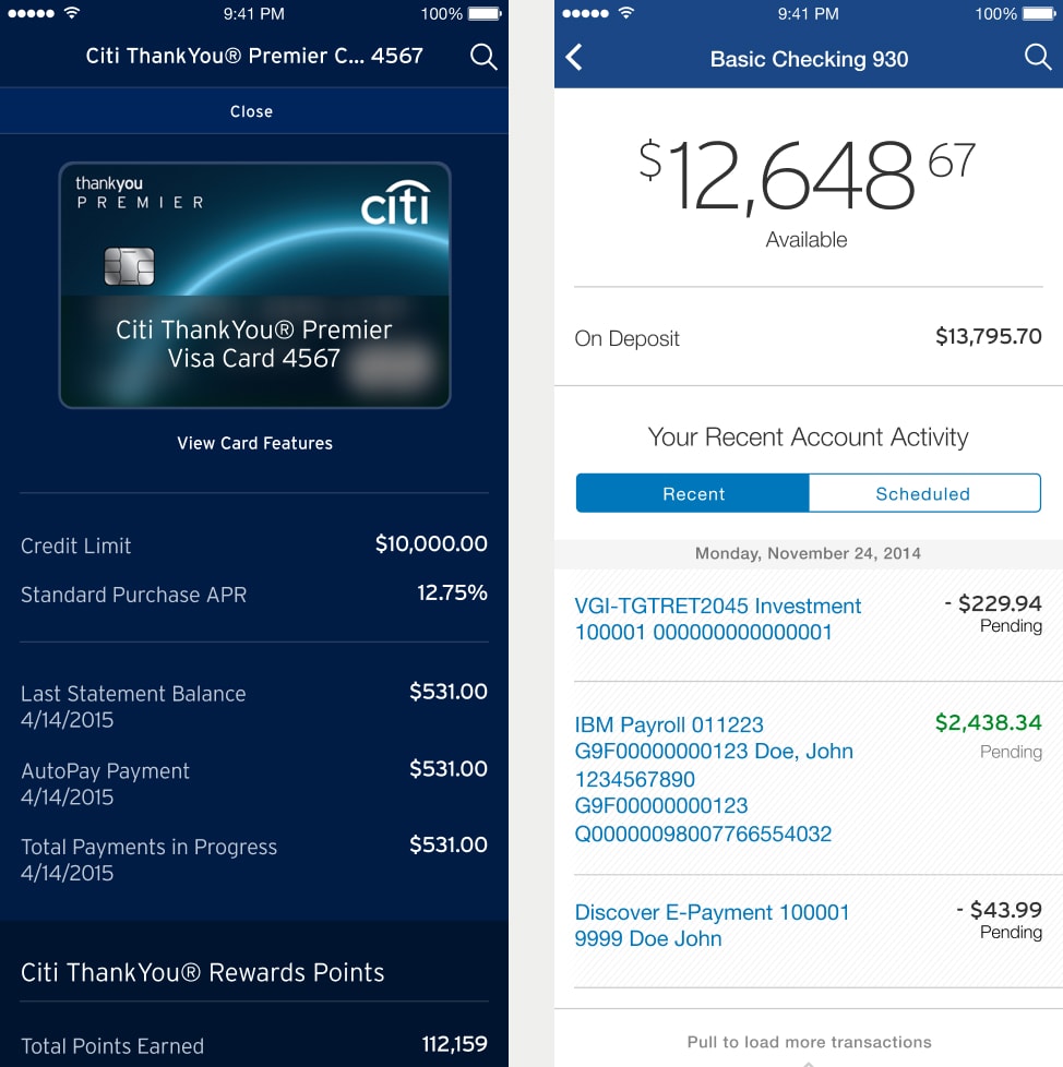
Credit and banking ledger flows
After that grueling seven month grind we launched Citibank’s first native iOS app. We almost couldn’t believe the reception. Despite being the “version 1.0” of the app, we saw an immediate impact to its App Store rating. For context, the old PhoneGap version of the app was rated around 2 stars, and upon launch of the new app the rating soared to 4.5 stars.
The success of the launch allowed for the expansion of the Citibank account for Critical Mass, which saw the NYC office double from around 25 to 50 employees by the end of 2015. By 2017 the Citibank account team in NYC would grow to around 25 employees working on not only the mobile app but sundry other projects for Citibank.
App Store rating from previous app to new native app
2

→
4.5

A digital rebrand and design system for Quinnipiac University
To accompany a complete rebranding of the university spearheaded by Pentagram, Critical Mass was tasked with the digital rebrand and redesign of Quinnipiac University's (QU) website. The client needed a design system that was flexible enough to accommodate a wide variety of content including department pages, course descriptions, social content, and much more while being intuitive enough for their in-house team to manage themselves. The site was built on the Adobe Experience Manager (AEM) platform which was relatively new at the kick off of this project.
A selection of ready to use content components
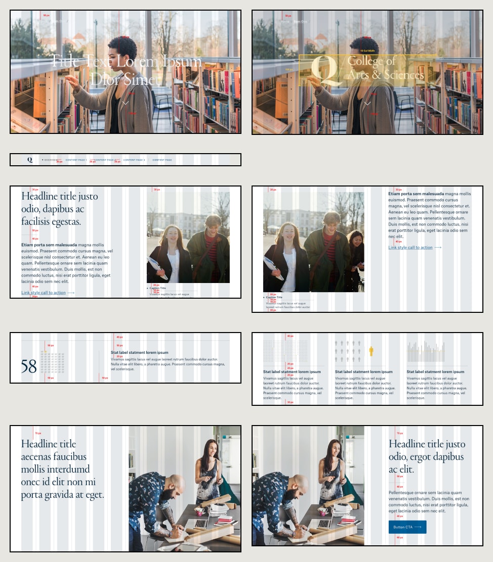
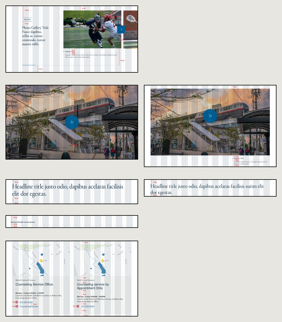
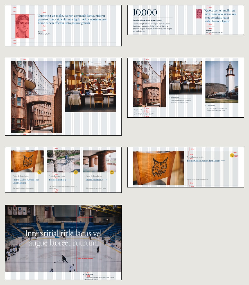
Content page built from standard components
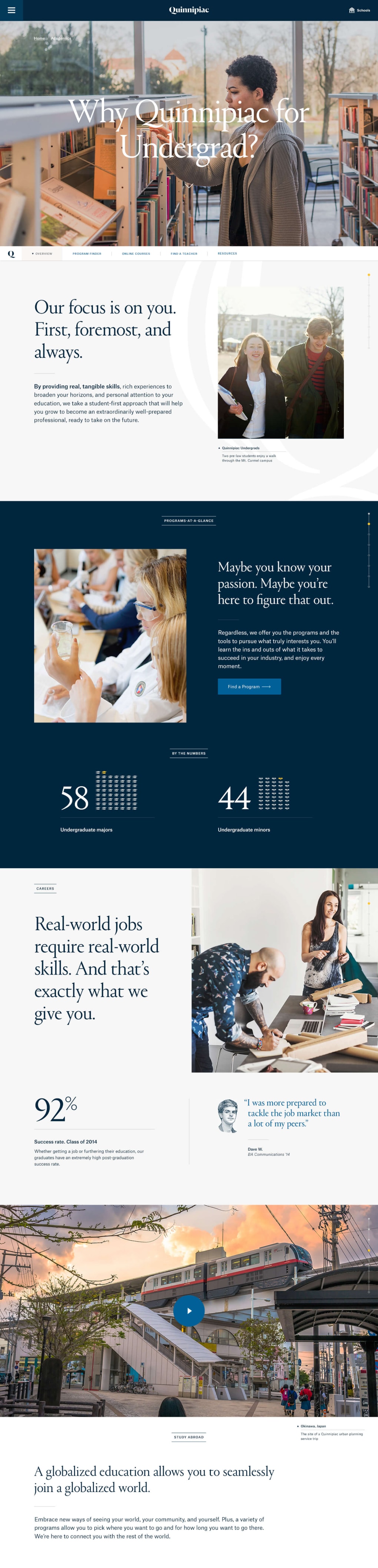
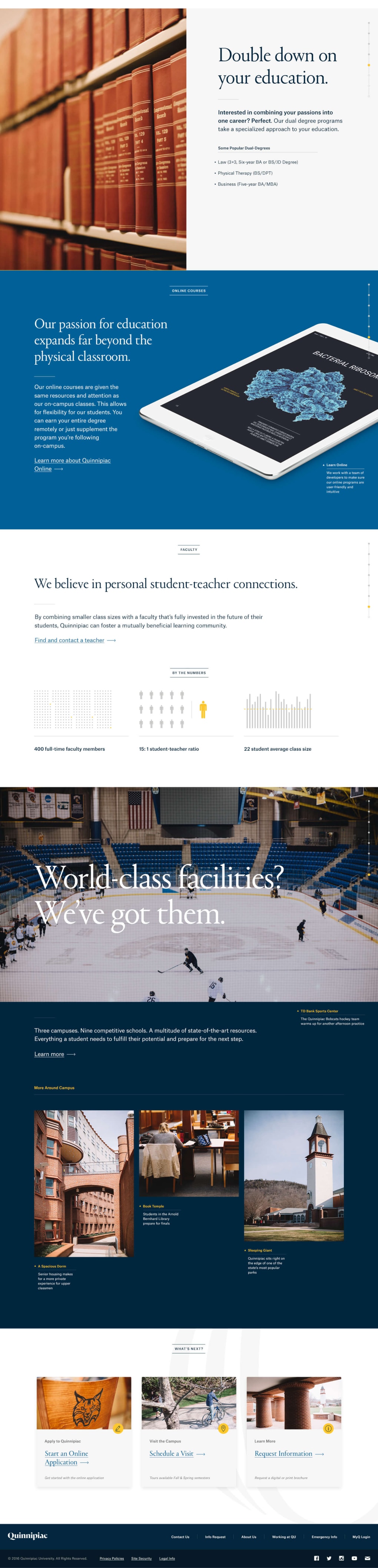
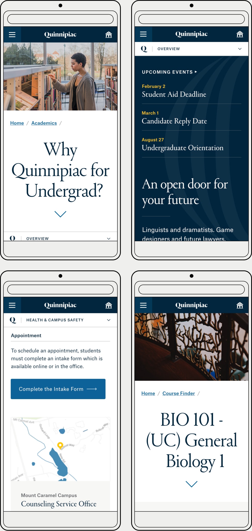
Responsive states
We were pleased to learn that the newly redesigned QU.edu was nominated in the website higher education category and was designated an honoree for best homepage/welcome page. It’s always nice to see recognition for your work after a challenging project wraps.
Websites
Best Home/Welcome Page 2017
Apps, Mobile, and Voice
School/University 2017
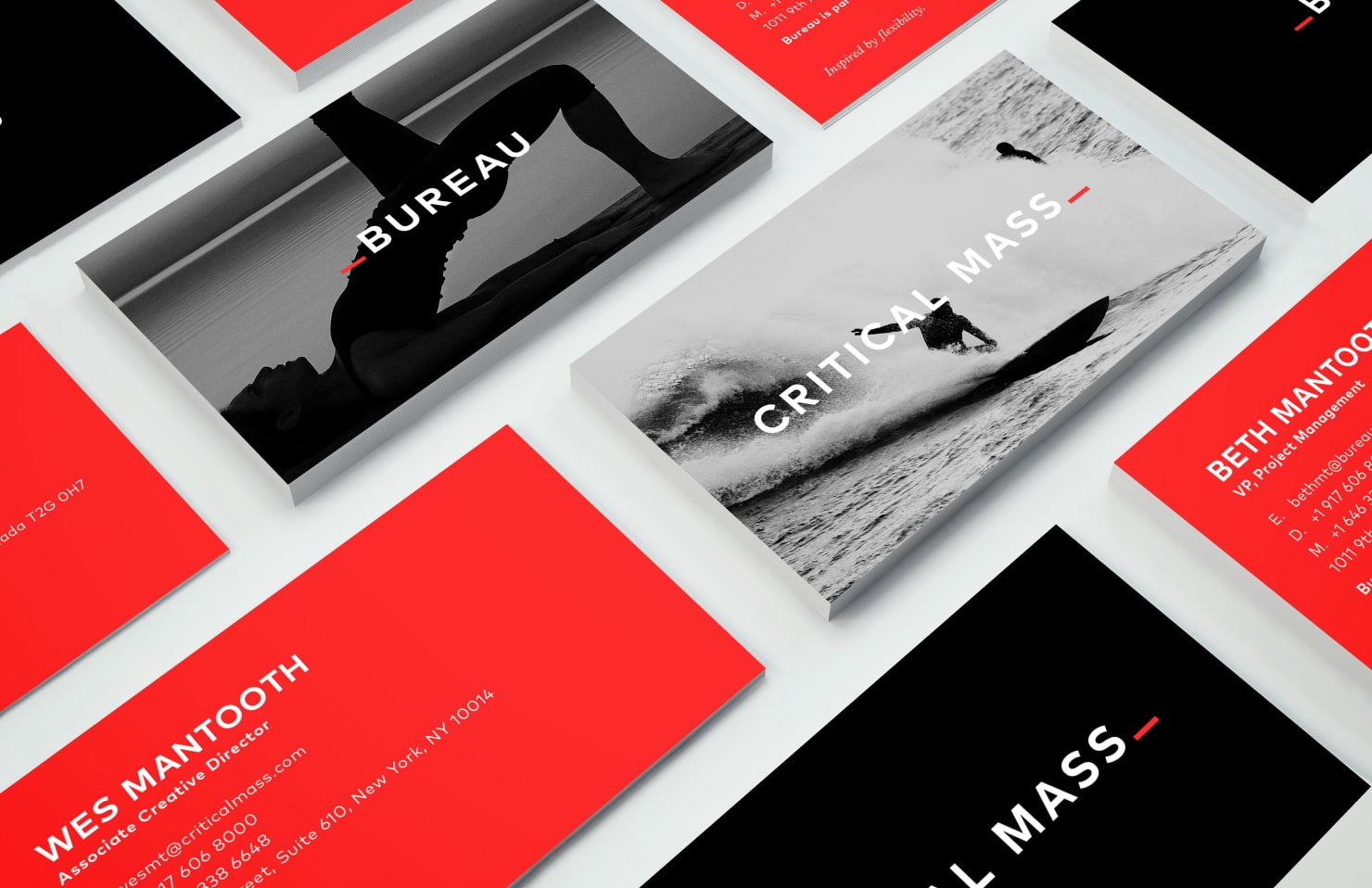
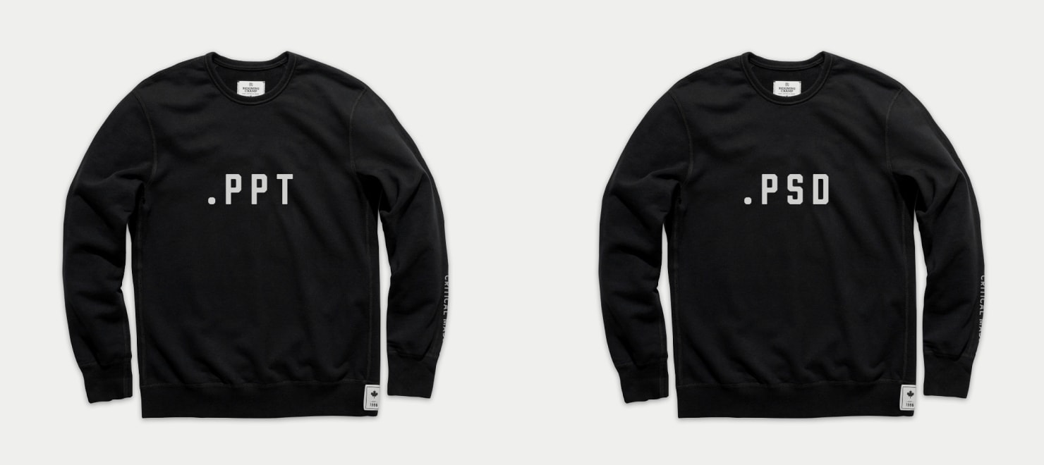
Identity work for Critical Mass and its subsidiaries
In between some of the larger account engagements, I was asked to lead some internal branding initiatives. This included establishing an umbrella brand for companies that we acquired or spun off into our network of agencies. One new acquisition, Zócalo, was required to maintain a unique identity for a period before being more fully absorbed into our network. Finally, when we won all of BMWUSA’s digital work, we believed that we were going to be forced to splinter off a team into a “conflict agency” due to already servicing Nissan/Infiniti out of our Canadian offices.
Original concept for parent and children agency wordmarks

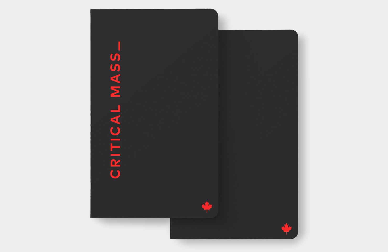
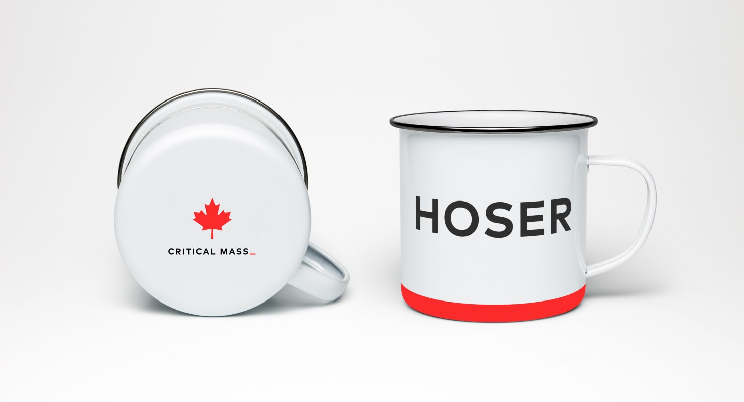
For our new collateral we aimed to project the passion, creativity, and playfulness that were at the heart of our culture, while continuing to nod at our Canadian roots.
Business cards and assorted swag
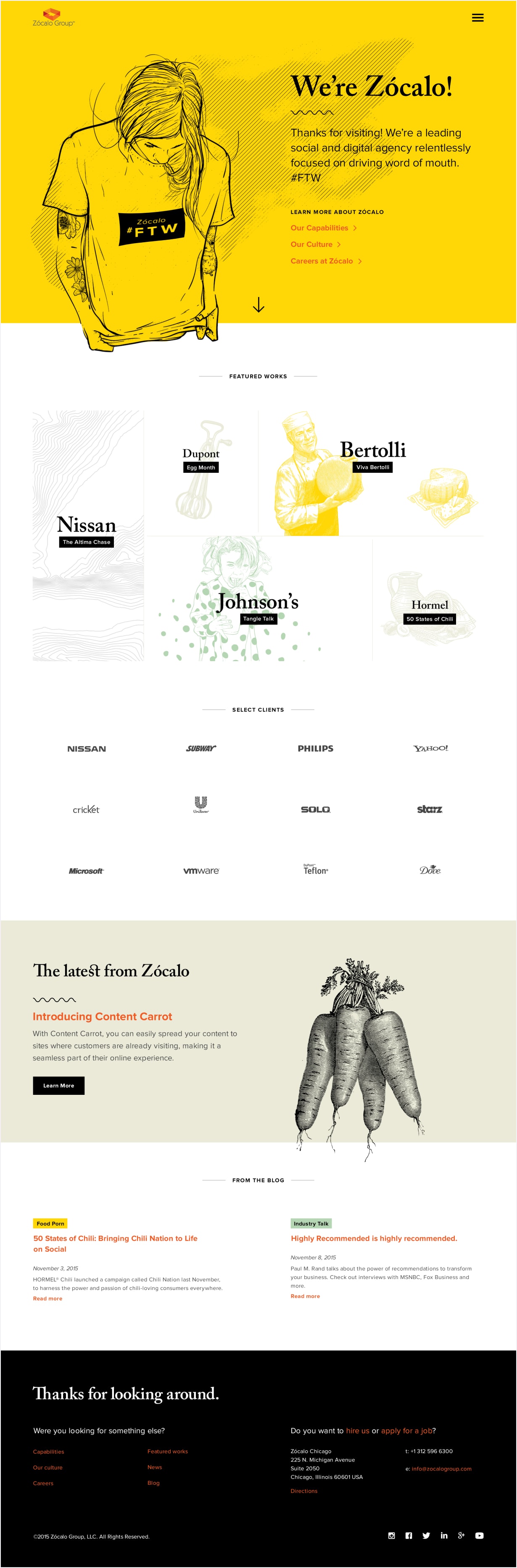
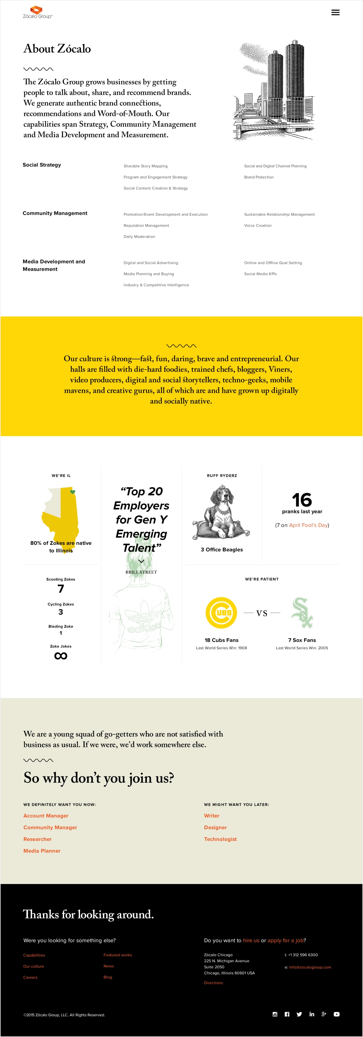
When we were in the process of acquiring Zócalo Group, a word of mouth and social media, the agreement required that they keep their own identity for a period before being fully absorbed into the network. At that point they were in need of a refresh, so I was tasked with helping establish their interim identity. The direction that they preferred showcased their friendly midwestern roots, along with a helping of buzzy quirkiness. The illustrations found in the sample layouts are pulled swipe but suggestive of our intended art direction.
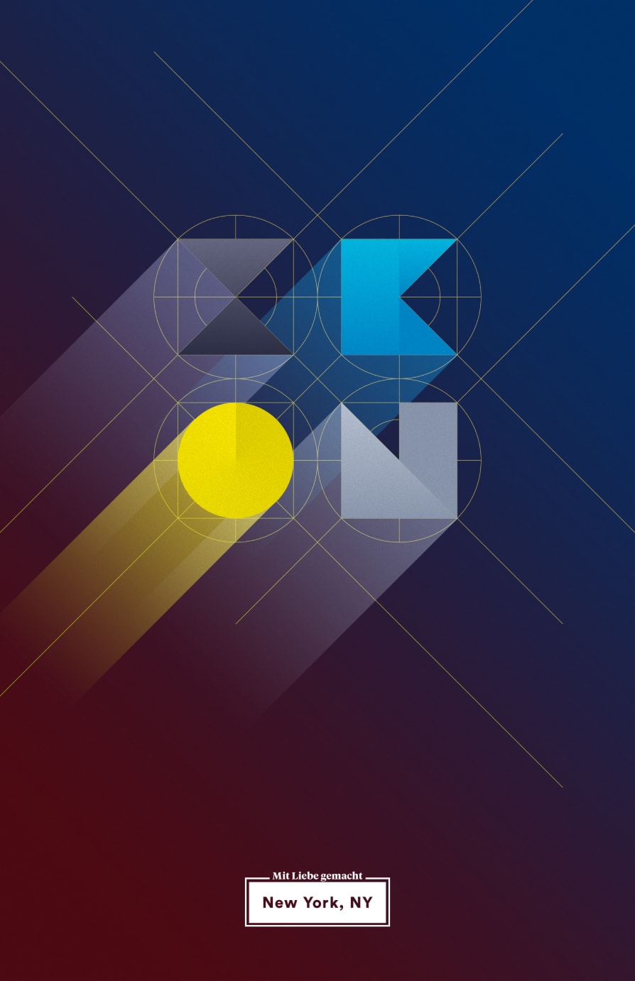
After winning a significant amount of digital BMWUSA work, we were anticipating a requirement from BMW to split off the team that would staff that account due to an existing relationship with Nissan/Infiniti. While the details of the new engagement were being sort out by the respective legal departments, we decided to get a jump on the possibility of this spin-off agency. While much of the logistics were of a practical nature — a separate office space from the main NYC office, we also needed a new name and visual identity. Conor Brady, our Global CCO suggested “Ikon” and I ran with that as I began to experiment with a log and visual treatments. Inspired by BMW’s rondel, I started with a circular grid and built the letterforms from it.
Ultimately, we were never required to split off a child agency, as BMW’s legal team wasn’t worried about our existing business relationship with Nissan/Infiniti. This was a fun exercise, but in the end it was unnecessary.


Other work from the Agency Archive
© 2024 Will Gabrenya