During the later part of my tenure at Northwestern Mutual, I became a founding member of a new team called Enterprise Experience Design (EXD). Our charter was to partner with senior executives to help define and communicate their product vision and to consult with areas of the company who had never worked with Design.
My work on this team included exploratory design for informing multi-year roadmaps, developing a product vision, and promoting user understanding across the company.
Organization
Northwestern Mutual Enterprise Experience Design
My Role
Principal Designer / Dotted Line Design Manager
Navigating towards Northwestern Mutual’s north star
As part of a major digital transformation at NM, internally dubbed “North Star”, significant focus was directed toward the early stages of customer engagement. We referred to this as the Enroll phase. This encompassed the period from a prospective customer deciding to purchase an insurance policy, through underwriting, and into the first 60 days as a paying customer. Our aims were to not only address customer’s technology pain points during this phase, but also friction they felt when interacting with their financial advisor or employees from the home office such as policy underwriters.

High level overview of NM’s “North Star”
Cross-functional workshops
I partnered with Myles Clemones, who had a service design background, to facilitate workshops to help the relevant stakeholders articulate their product strategy and plan for their team’s midterm roadmap. The workshops typically consisted of senior executives in charge of large portions of the customer experience, marketing directors, engineering leads, product managers, and design managers.
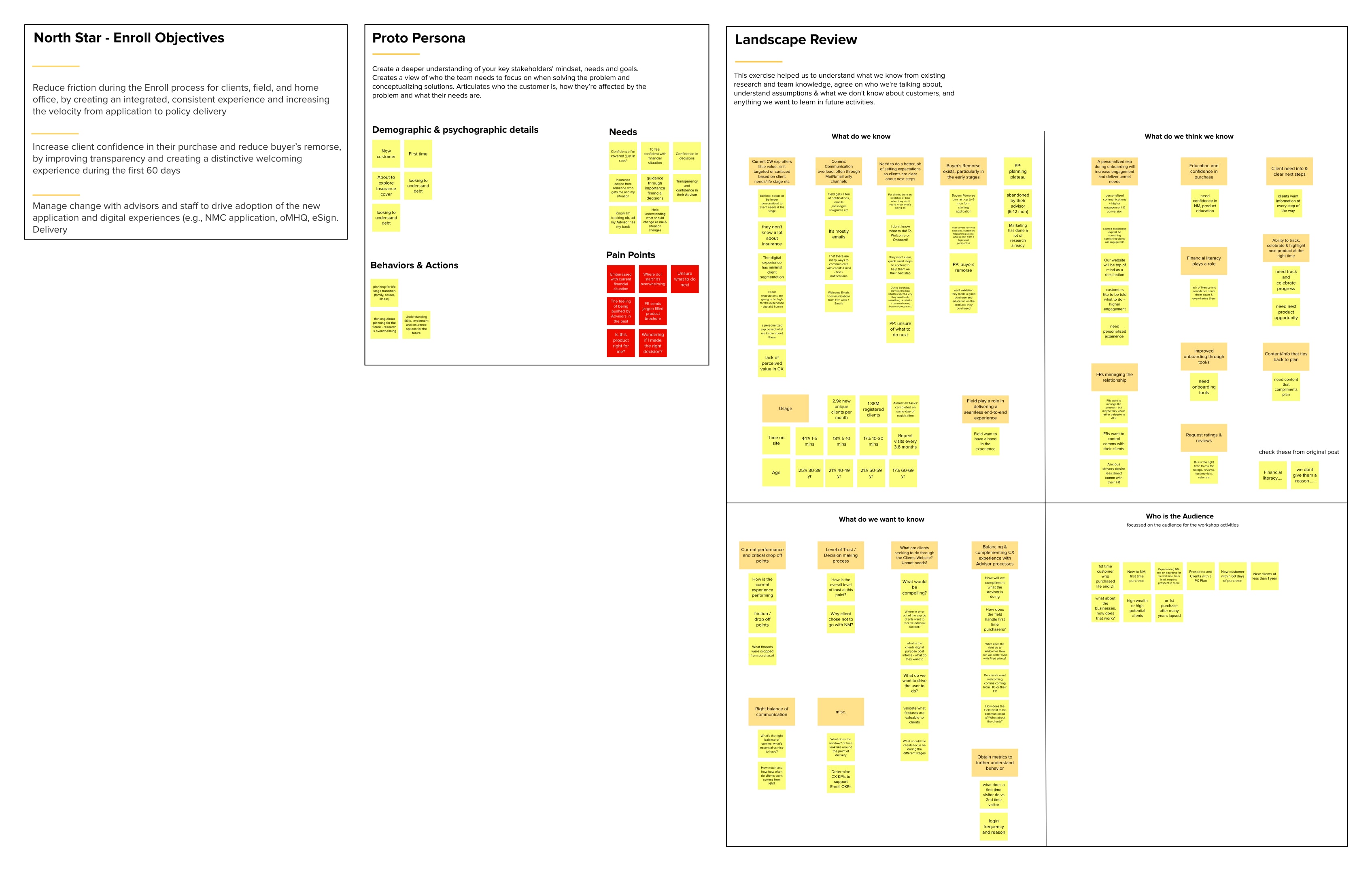
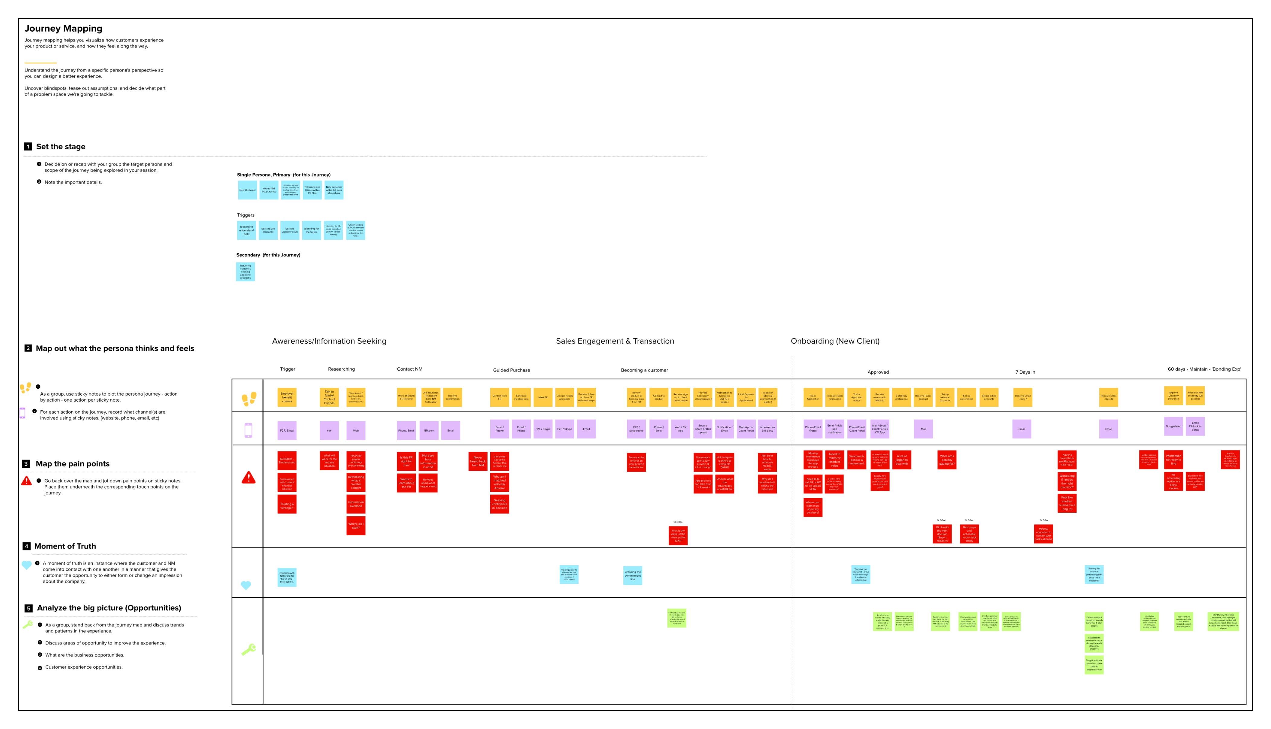
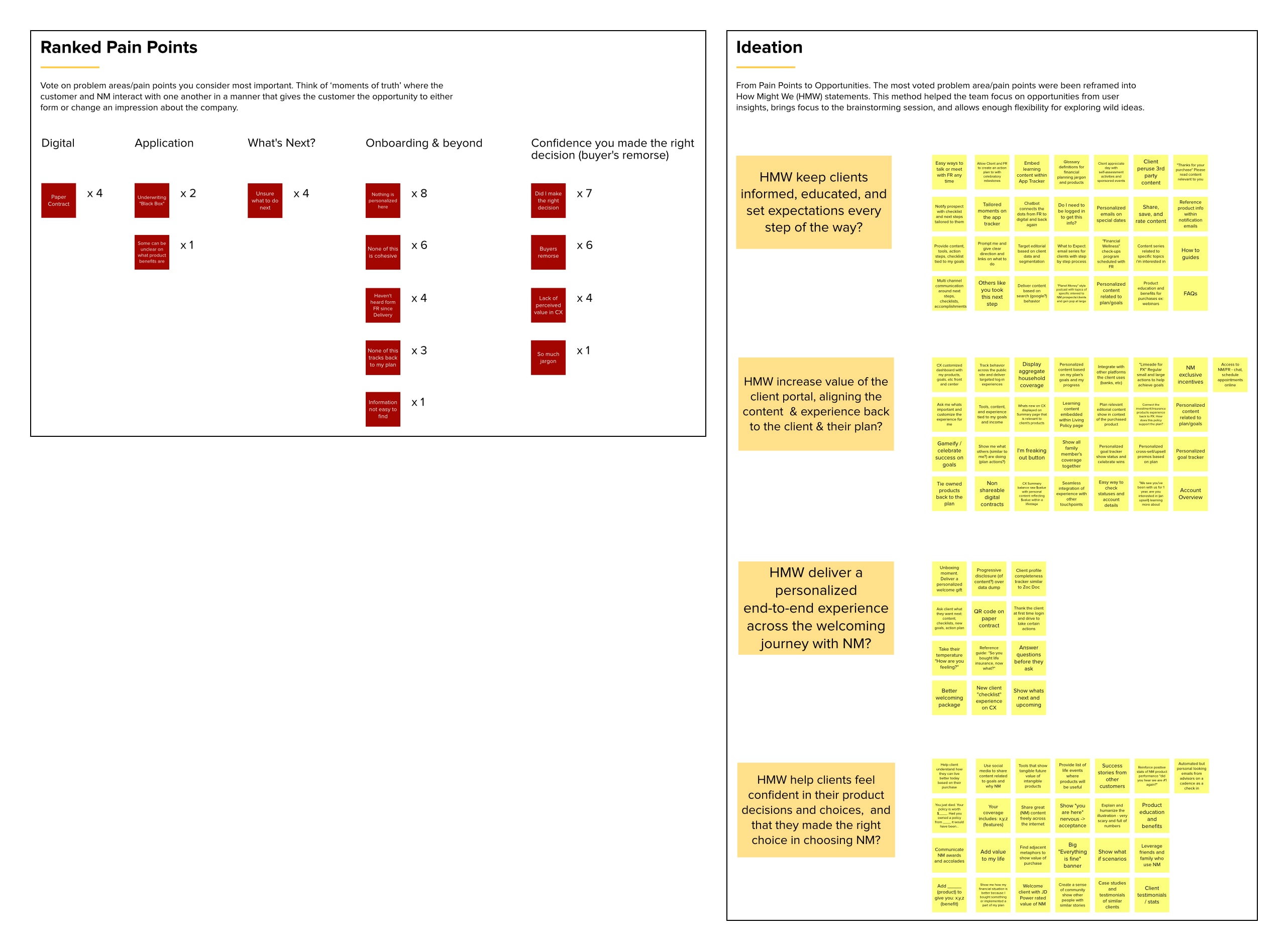
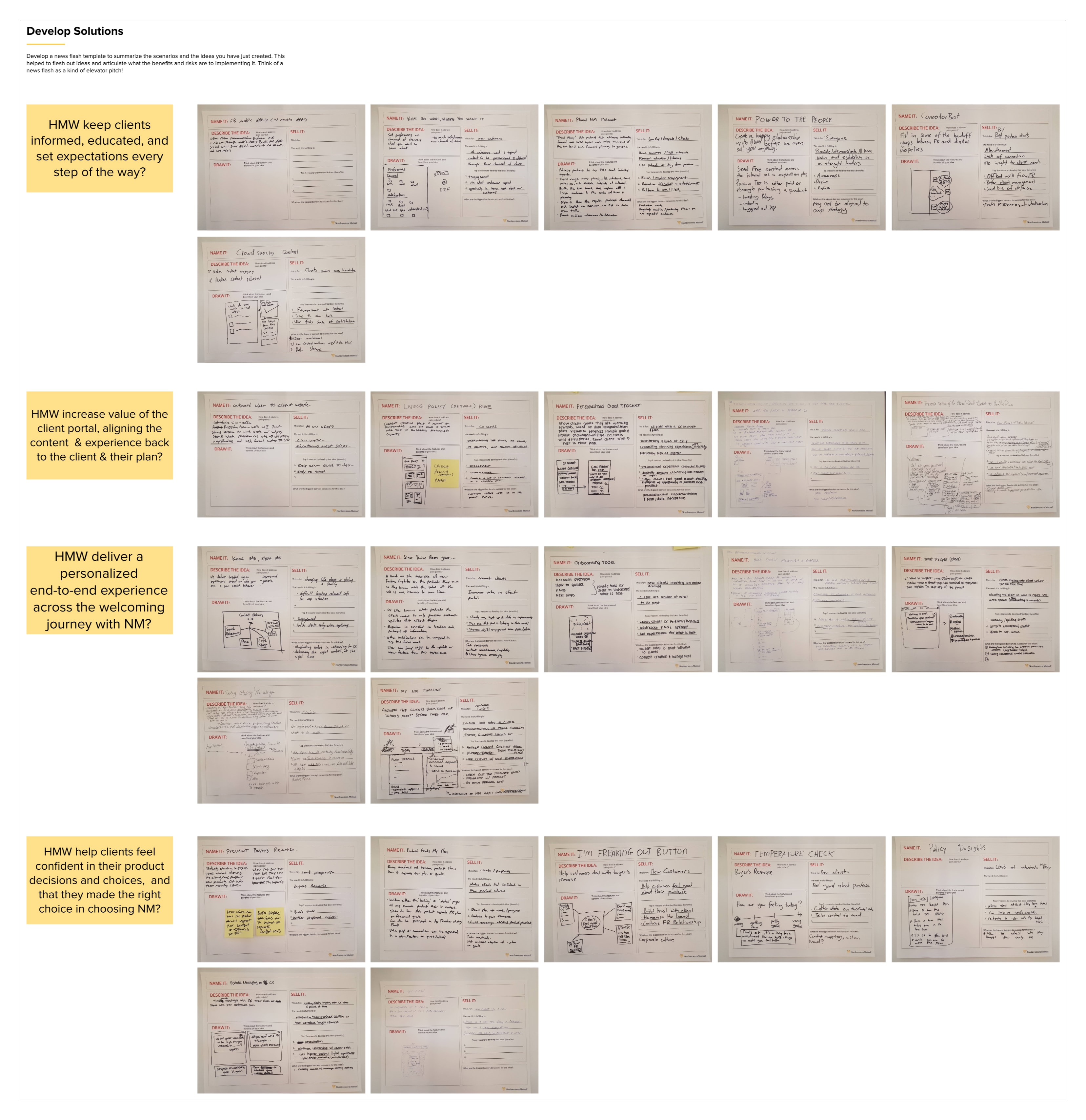
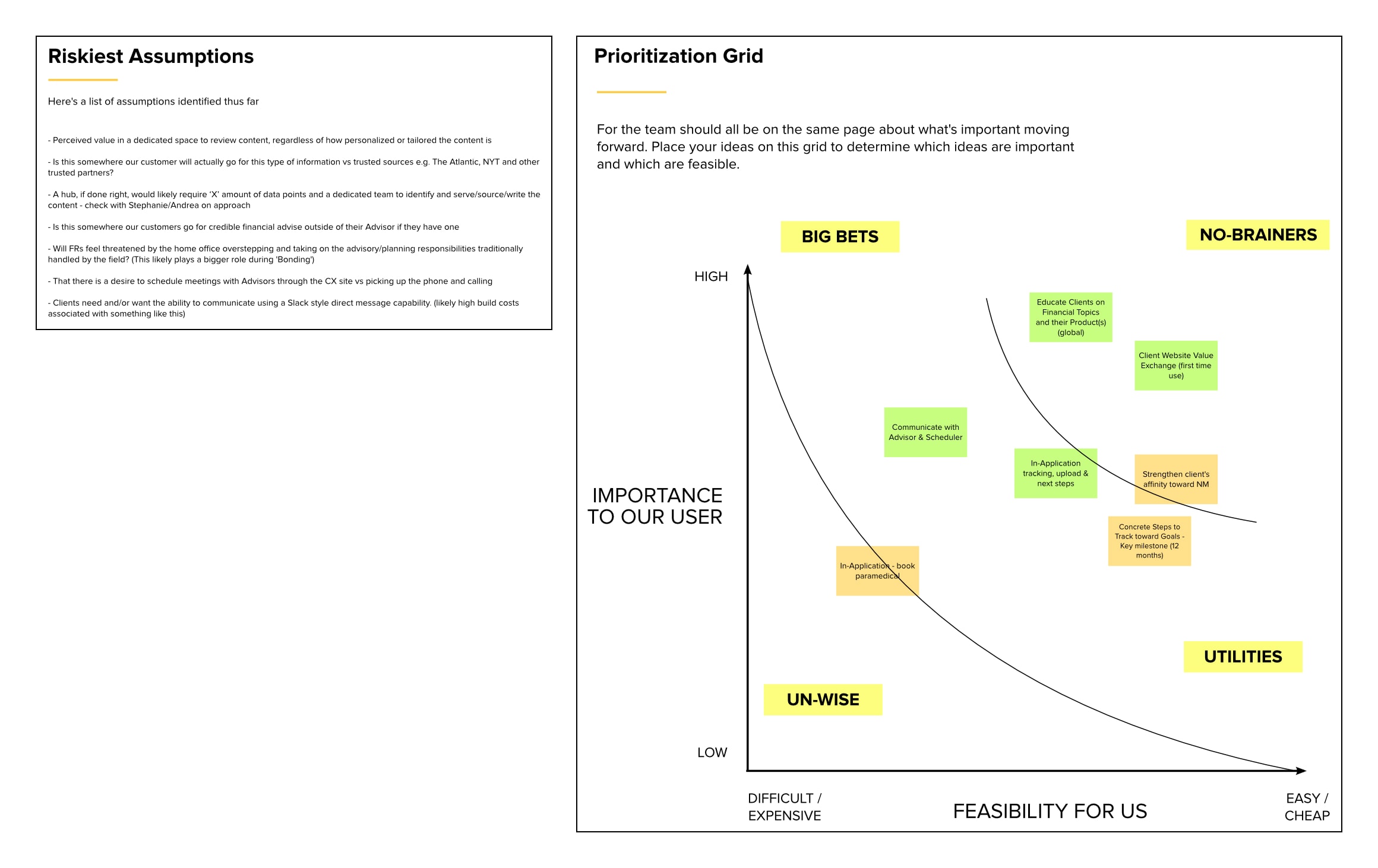
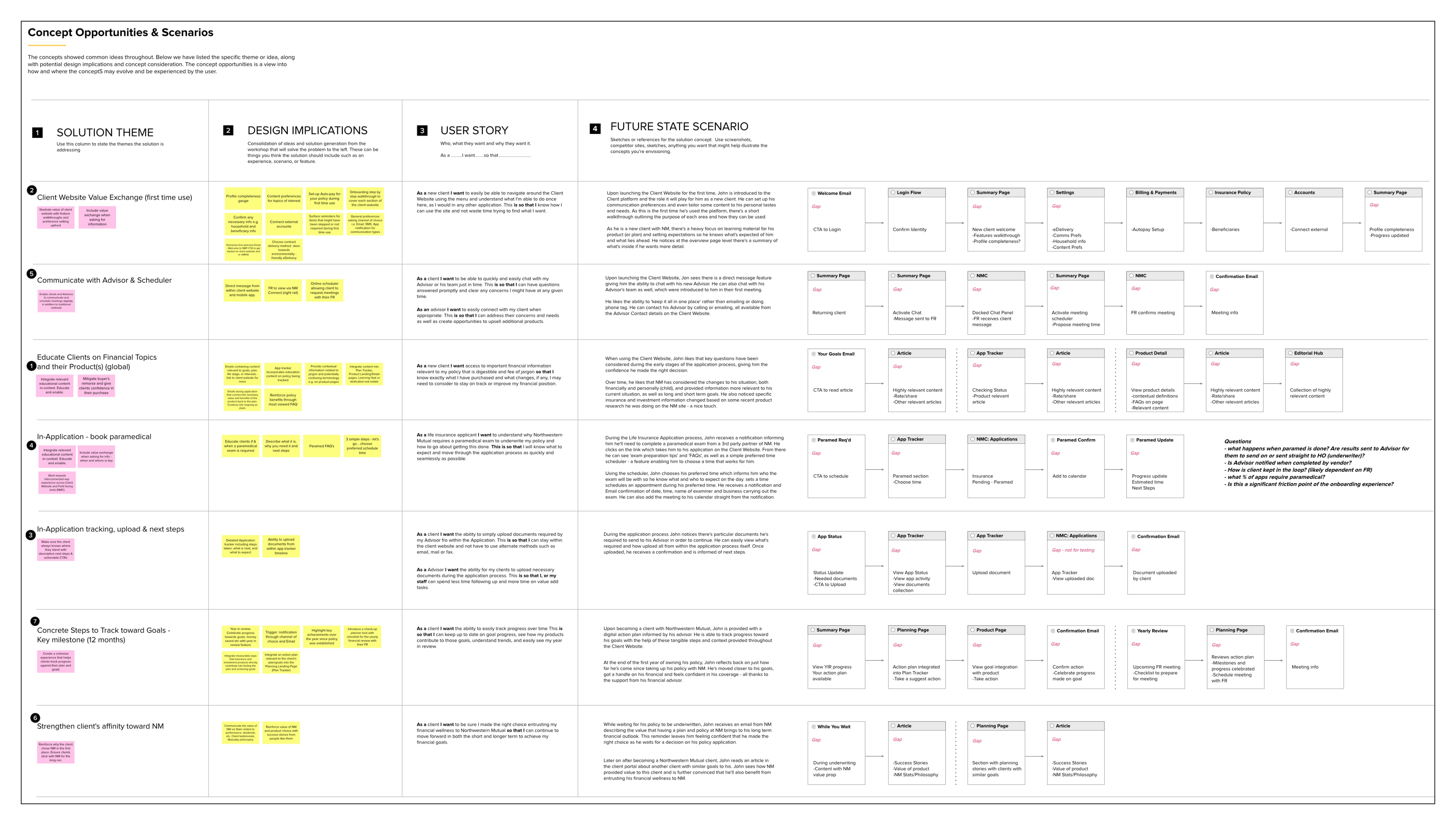
During these cross-functional workshops we framed the problem space by reviewing executive’s business goals, the current experience landscape, and target user characteristics. We collaboratively built a journey map noting the individual actions, channels, pain points, and major sentiment establishing moments. Upon completing and reviewing the journey map, we had the group vote on their top customer pain points. After ranking these pain points we reframed them as “How might we...” prompts and held a rapid ideation session followed by more structured solution sketching. Out of the ideas and sketches a number of solution themes coalesced from which Myles and I built user stories and sketched out future state scenarios. After presenting these scenarios to the stakeholder group, we collectively mapped them to a priority matrix, rating their estimated importance to our customers against the effort to implement them.
Before committing resources to these Enroll phase opportunity areas in a multi-year roadmap, our stakeholders agreed that we should evaluate solution concepts with customers. The stakeholder group voted on their top priorities settling on the three below. I then set about designing concepts addressing these opportunities for our evaluative research.
Modernize the application tracking process for prospective customers.
Orient new customers to NM’s online services.
Foster regular engagement through financial education.
Modernizing application tracking
The application process for a life insurance product could be time-consuming affair for both prospective customers as well as their advisors. While the advisors did their best to communicate and collect the required documentation for the application, unexpected delays and hiccups during the underwriting process could lead to frustration.
Application Tracking: Collecting documents and scheduling a medical exam
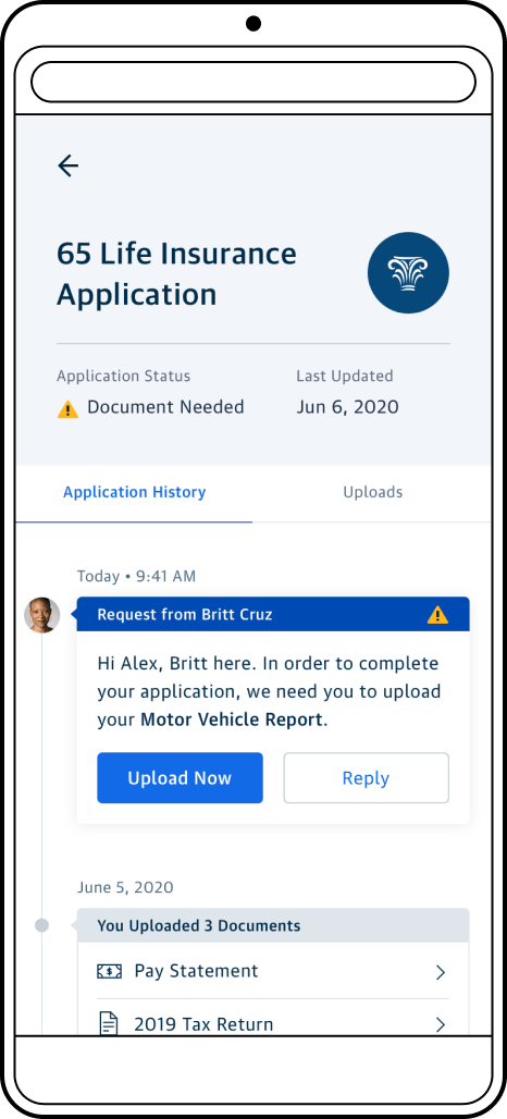
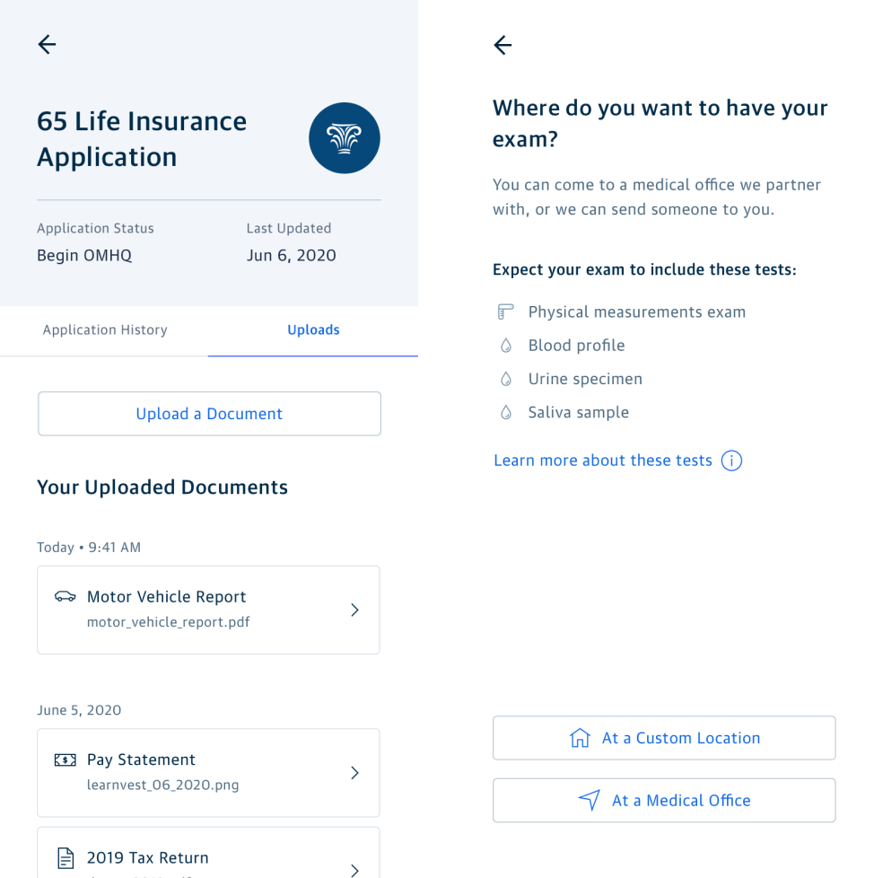
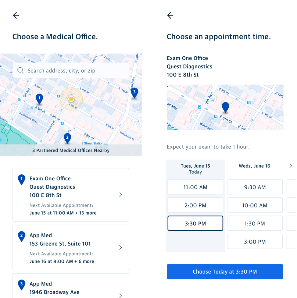
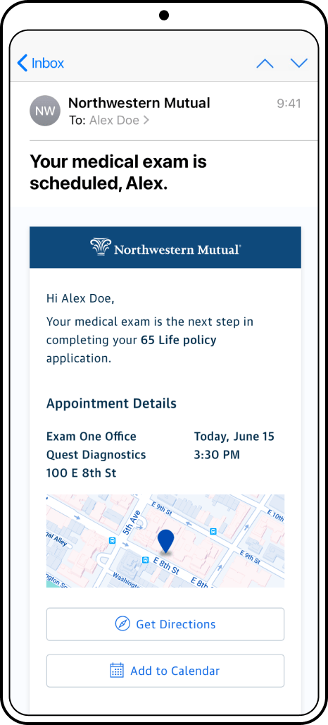
This concept for connecting both the financial advisor and the prospective customer with the home office’s underwriting team via our digital platform was designed to streamline communication, create transparency in the process, and hopefully speed things up all around. The two scenarios I focused on were collecting additional documentation from the prospect and scheduling a medical exam to ascertain health risks. By allowing direct upload for documents, the prospect wouldn’t have to awkwardly deal with scanning and emailing or faxing sensitive documents to their advisor who would in turn just send it along to the home office underwriter. Medical screening could be a sensitive topic that a prospect might not want to discuss with their advisor. Allowing a prospect to schedule directly with an approved lab would provide privacy and also speed up the process by not relying on their advisor to handle those logistics.
Orienting new customers
After delivery of a customer’s insurance policy, we aimed to help them set up their online profile and get familiarized with the digital experience for their owned products. Two concepts were developed to move customers through this critical onboarding period.
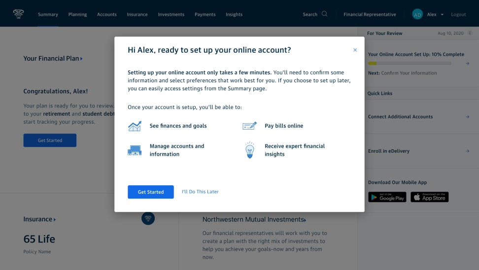
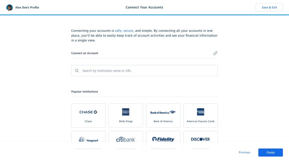
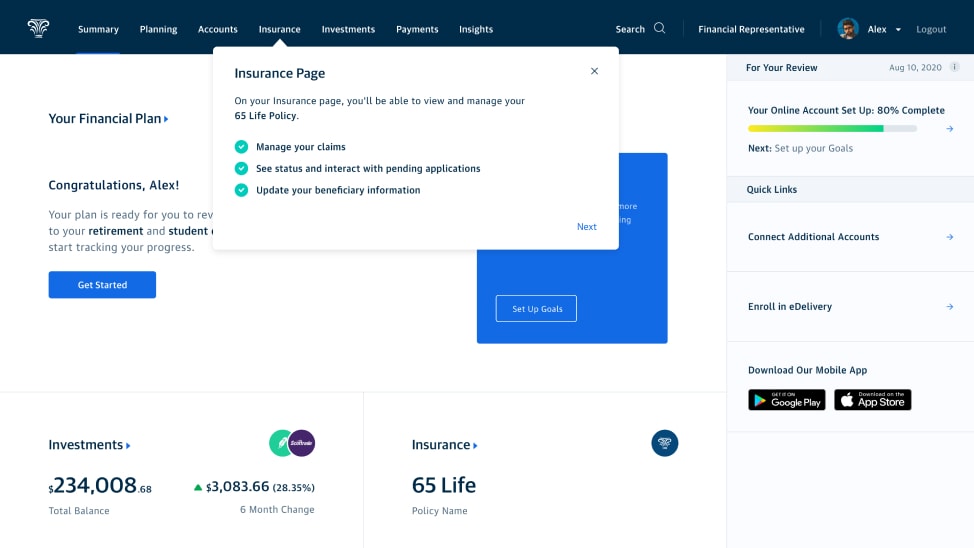
Onboarding: First time login
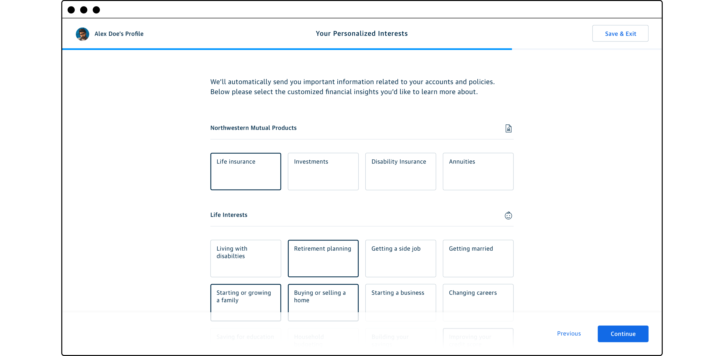
In order to provide the best service via our digital platforms, we wanted to make sure all of the utilitarian account details were complete and correct. This ranged from making sure we had the correct contact information, to connecting outside financial accounts to provide more financial plan context, to identifying financial topics of interest to that customer. A simple wizard walked the customer through these information gathering steps upon their first log in to the customer portal. After finishing their set up, tour tips oriented the new customer to the website ensuring they knew where to find critical account information or self service utilities.
Education and engagement
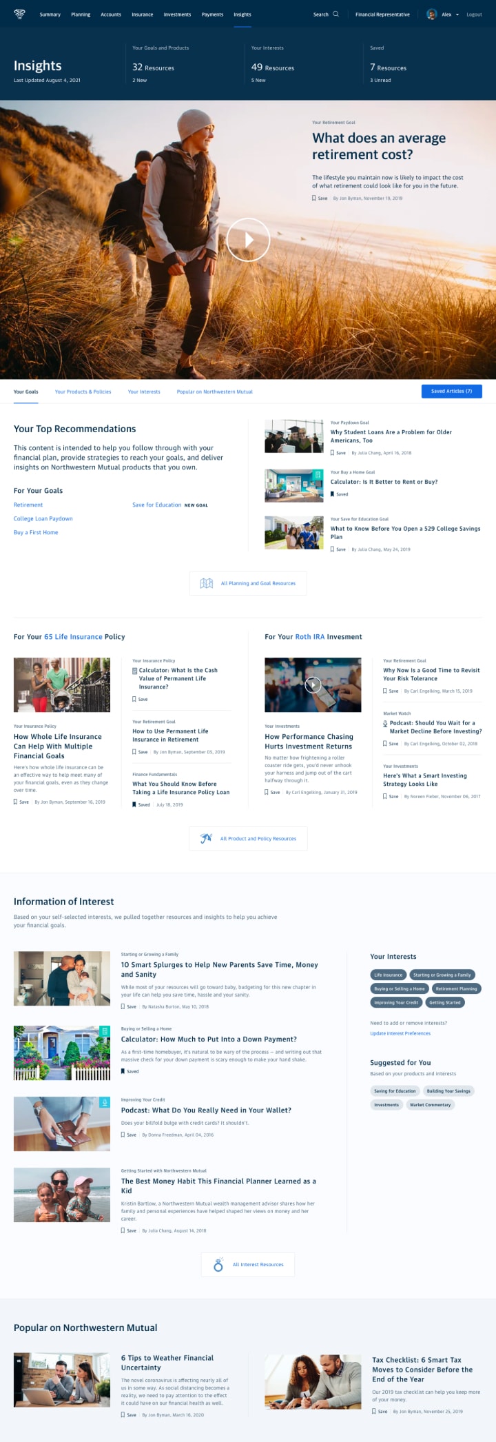
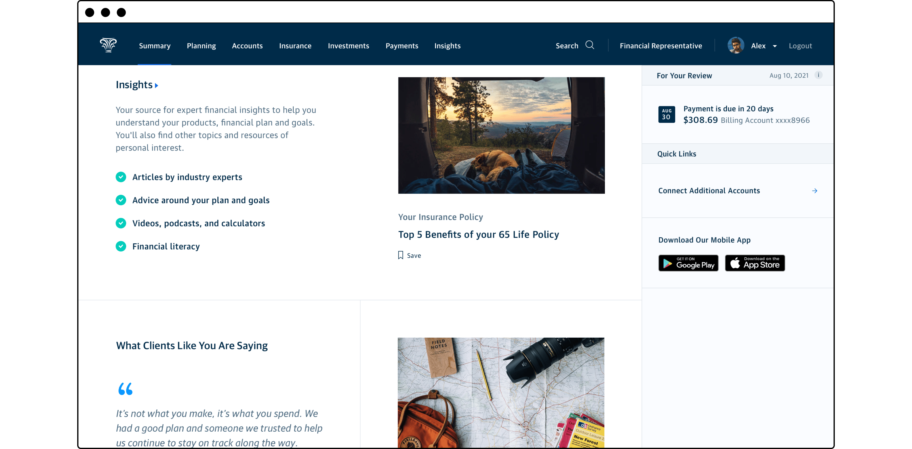
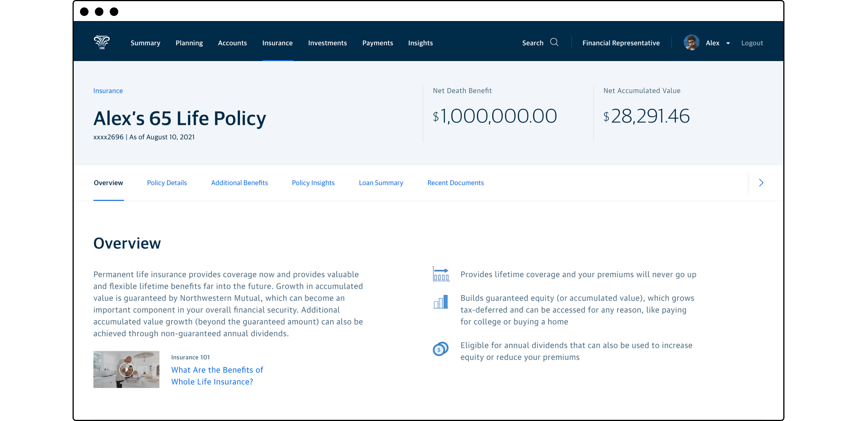
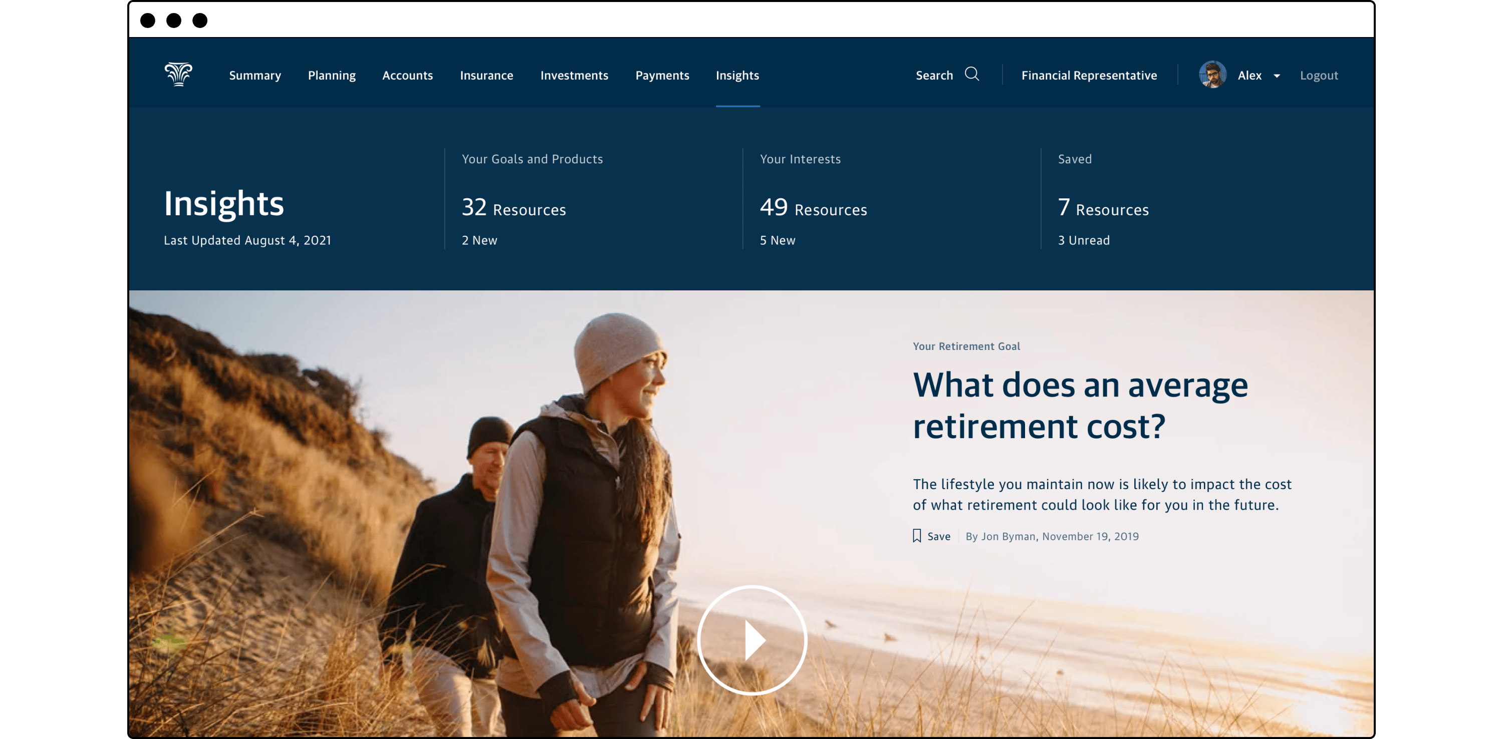
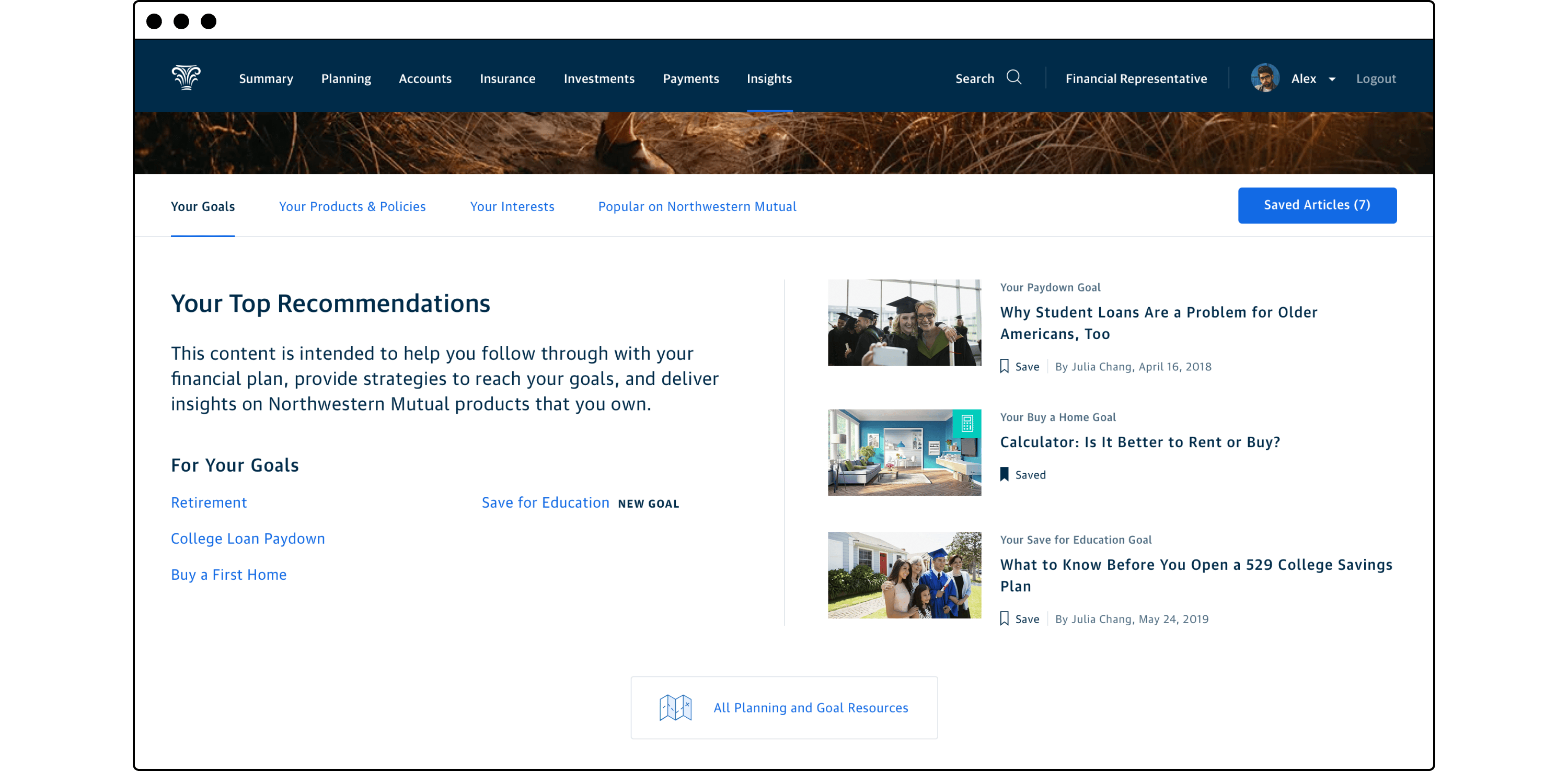
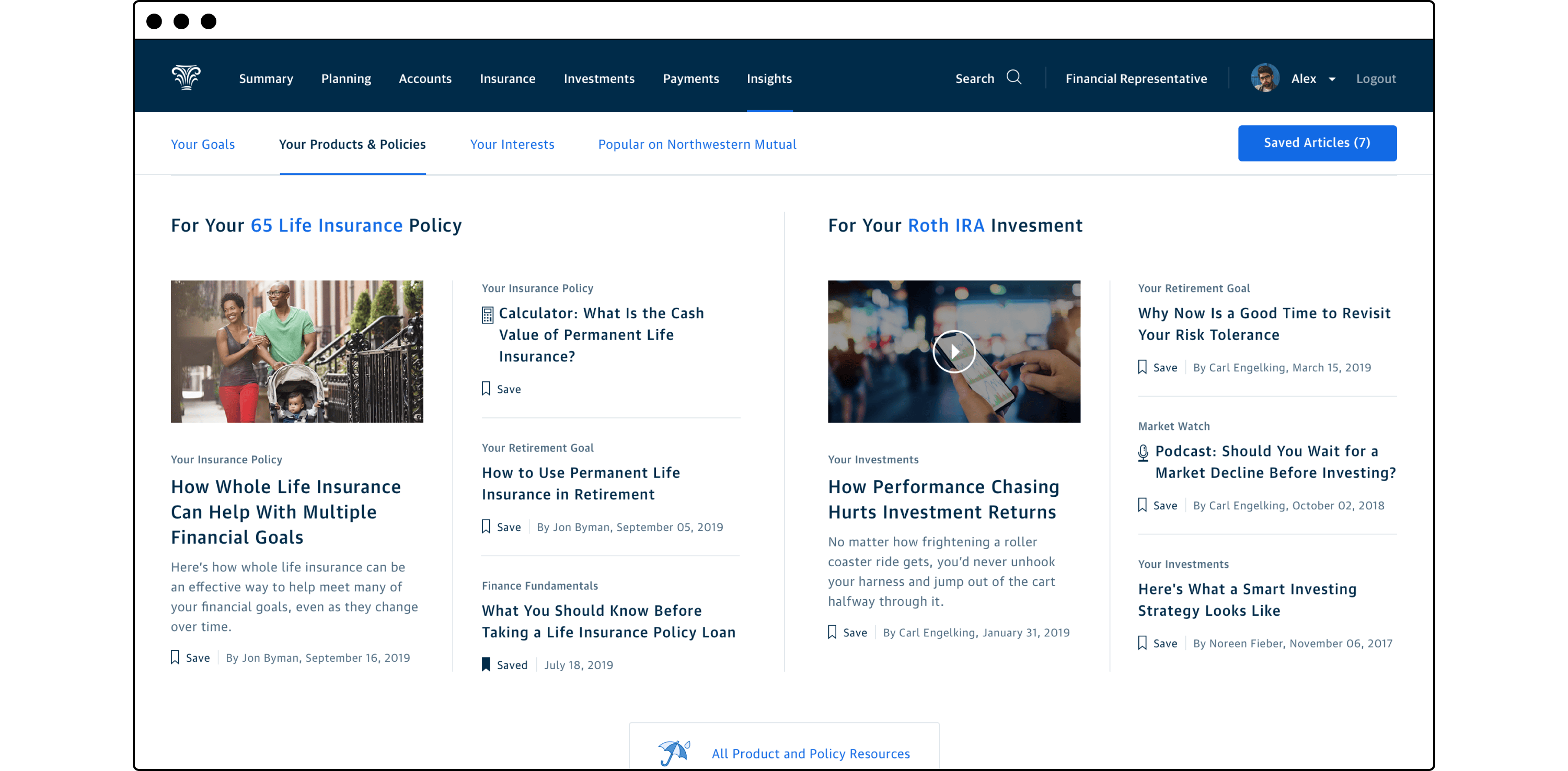
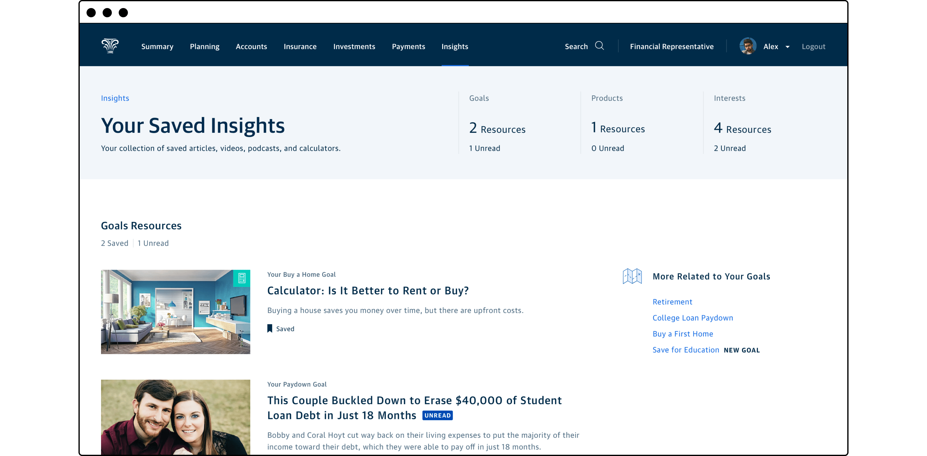
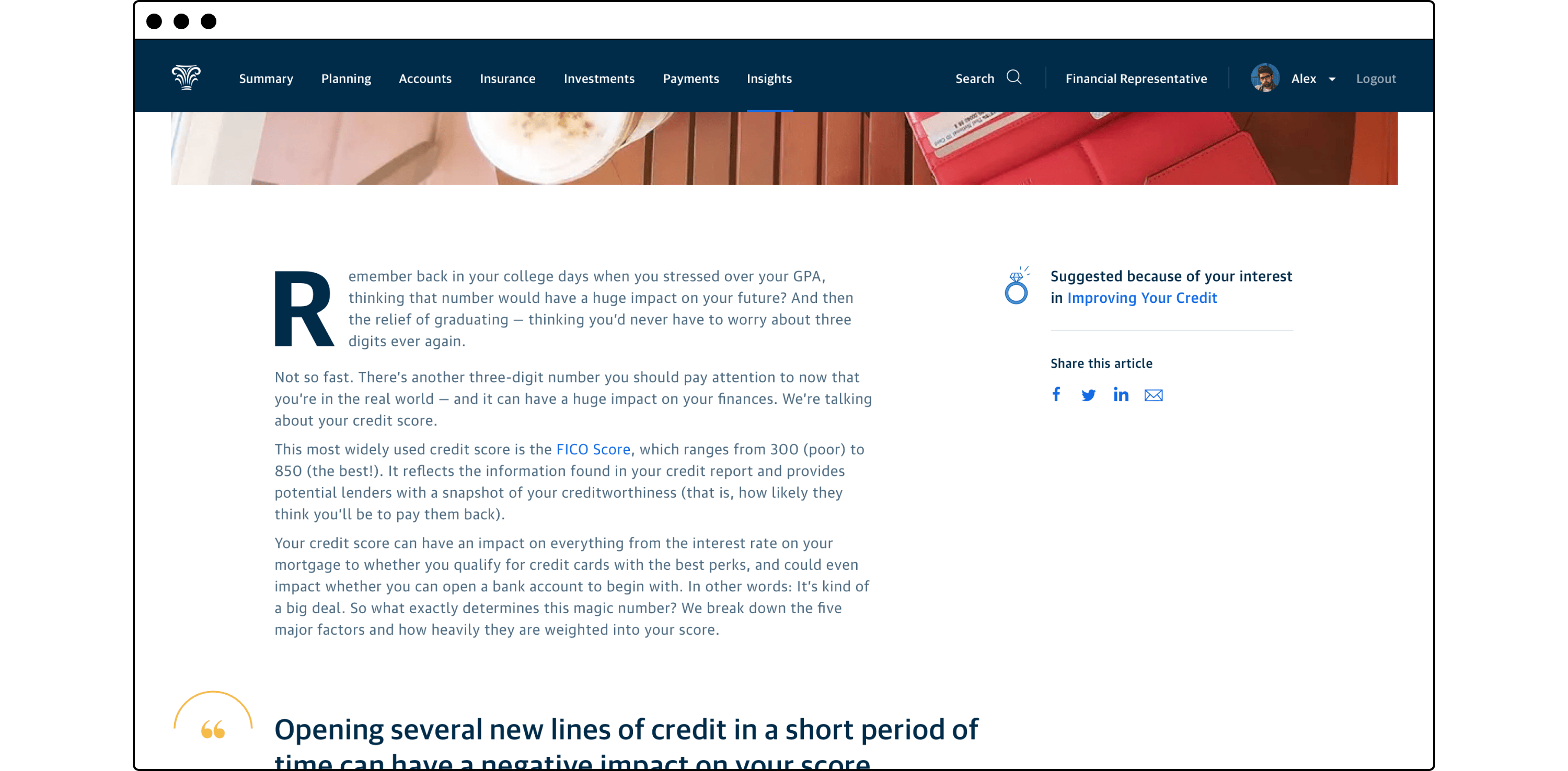
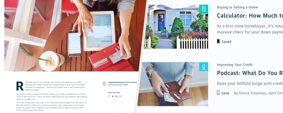
In addition to helping new customers familiarize themselves with the customer portal, we also wanted to ensure they remained engaged with Northwestern Mutual and committed to achieving their financial goals through us. To that end, this concept centered around providing personalized financial education curated by customer owned products, formalized goals, and expressed interests. This content would be housed in a new area of the experience labeled “Insights” and could be accessed via the global navigation or contextually from the customer’s Summary view or from their owned product account views.
Insights Hub
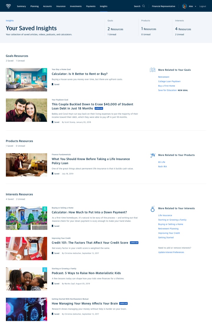
Your Saved Insights

Article Page
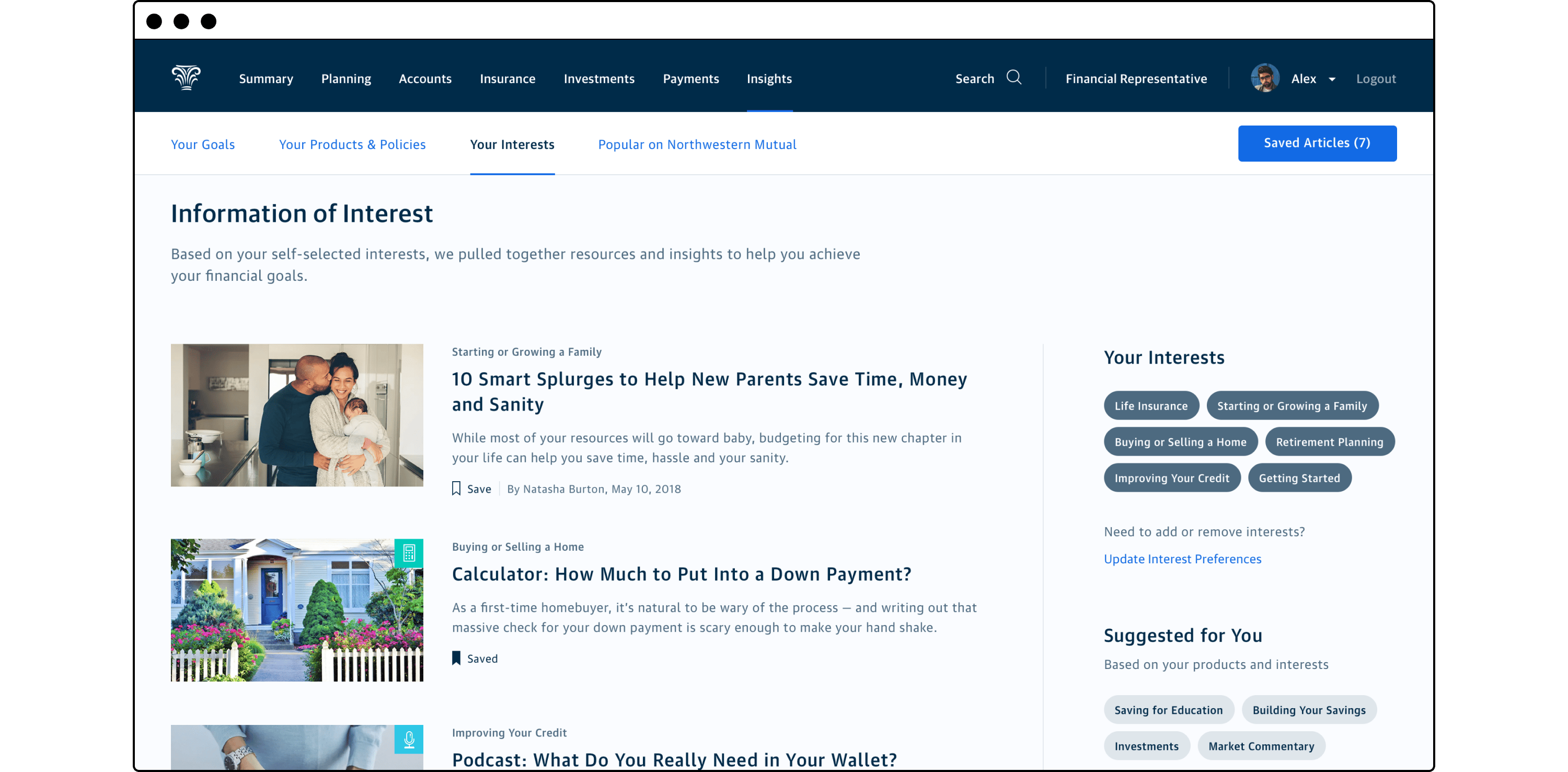
As part of the first time login onboarding flow, the customer is prompted to select financial topics they’re interested in learning more about. These topics could be product oriented such as explainers on annuities, or related to personal goals such as saving for education, starting a business, or growing their family.
The content in the Insights hub was set up in an editorial style prioritizing customer goals first, then content related to owned products, followed by self-elected interests, and finally seasonally popular general interest content at the bottom. The content could manifest as long-form articles, videos, calculators, or even podcasts. As Northwestern Mutual already had a very active content production team writing articles and producing videos for the marketing website, we would already have a comprehensive library available for our customers.
Evaluation and outcomes
The above concepts were evaluated with the assistance of our UX Research team. A takeaway deck for our executive sponsor was co-authored by myself, Myles, and the researcher. We represented the user affinity for each of the concepts and outlined the risks of moving forward with each item. The application tracker concept was well received, while the onboarding concepts received mixed reception from respondents.
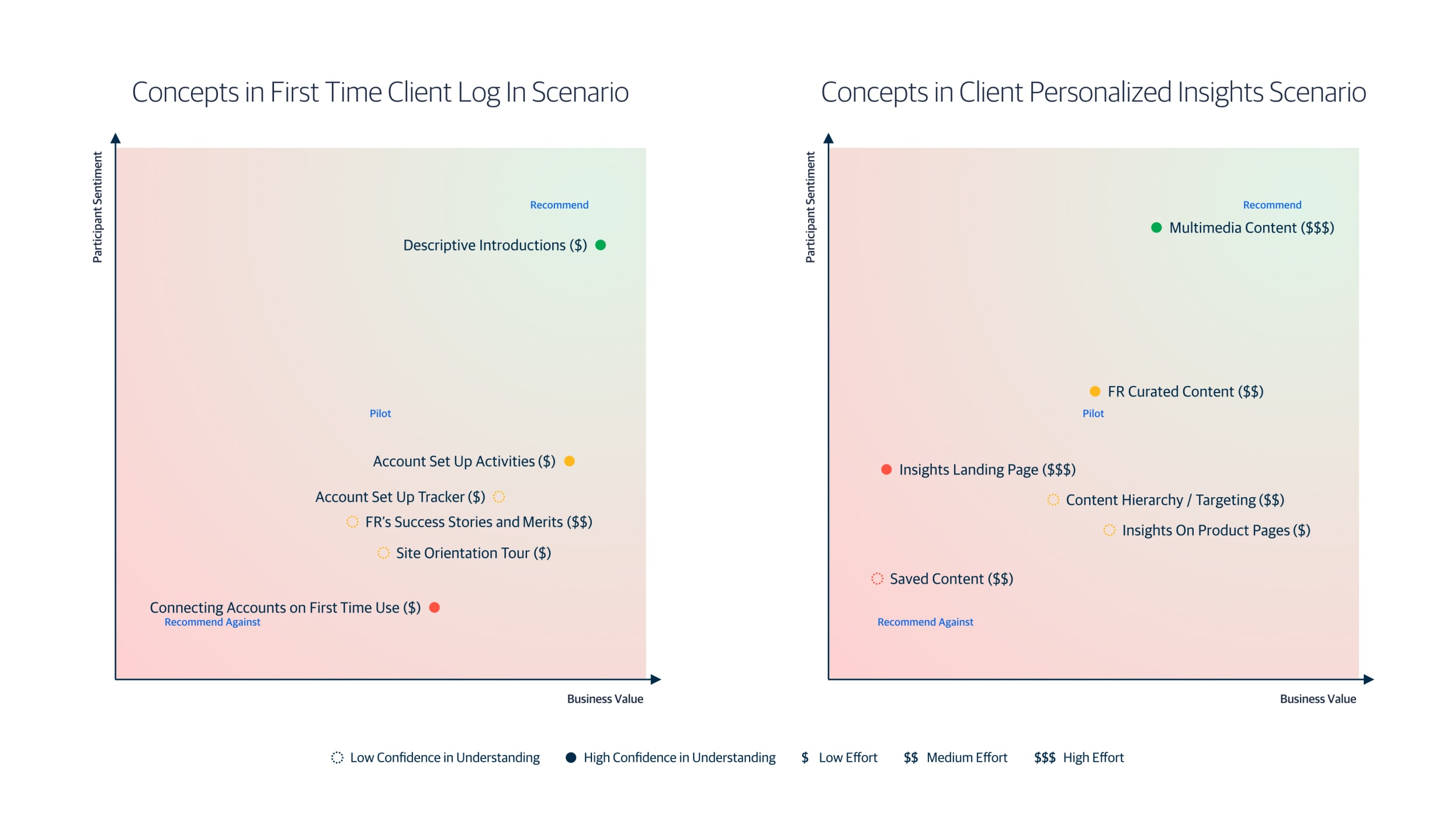
Concepts recommendation matrix slide from evaluation research deck
By the time I moved on from my position at NM, a number of those concepts had found their way into the roadmap or were launched for our customers. In particular, the lower effort onboarding ideas were rapidly developed, mostly based on the designs I provided for the evaluation research. The high effort editorial and content ideas were slated for the roadmap, but due to their long time horizon, I’m unaware of their implementation status.
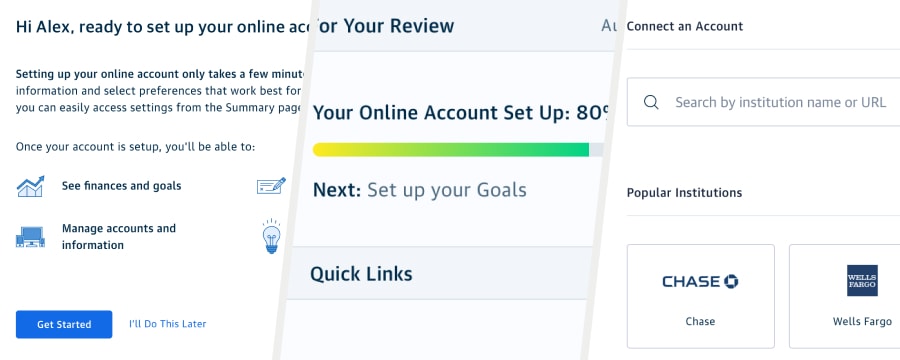
🚀 Launched or piloted features
Descriptive Introductions
Account Set Up Tracker
Account Set Up Activities
Connecting Accounts on First Time Use
🗺️ Future roadmap features
FR Curated Content
Multimedia Content
A design driven digital ecosystem vision
Early into his tenure, the new head of design at NM tasked EXD to help craft a vision for an interconnected digital ecosystem that would finally bring all facets of the organization into the 21st century. This vision would be design driven but developed in partnership with executive stakeholders representing the customer experience, the field (our advisors), enterprise data, and technical architecture. This vision was to be a vehicle for Design at NM to stake their claim as serious business partners and increase our influence throughout the organization.
I again partnered with Myles to lead this effort. We engaged all of the senior design directors, working to understand their own design portfolio objectives, experience pain points, and how they were working toward the company-wide “North Star” digital transformation initiative. By workshopping with this group, we had a good approximation of the current landscape and potential future direction for every business vertical or organization in the company directly supporting our core growth drivers.
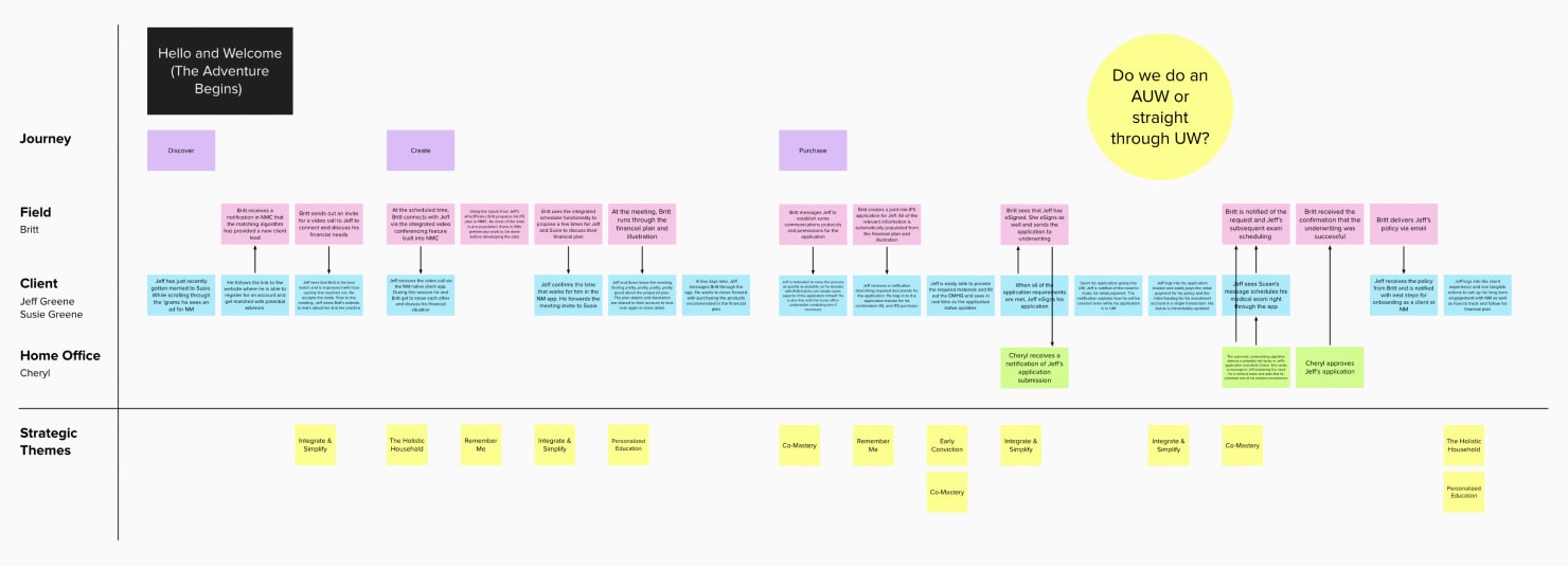
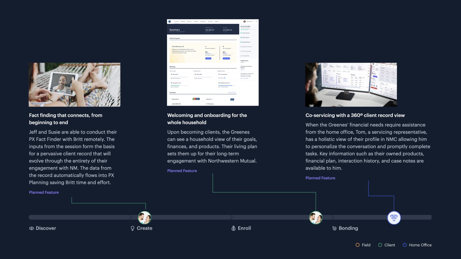
Scenario with user actions mapped to high level journey and strategic themes
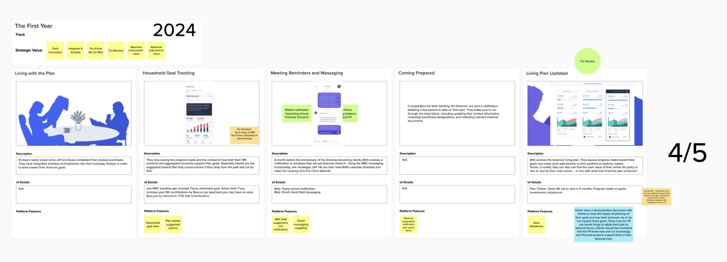
More detailed storyboarding for the vision deck including gestural experience UI
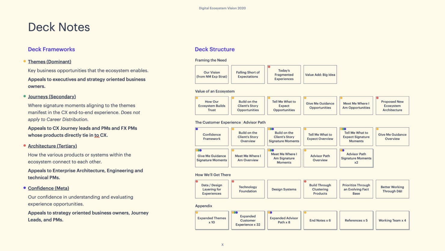
I developed key scenarios that interwove the needs of our customers, advisors, and home office employees through the lens of our established “North Star” experience journeys. These scenarios described how a future digital ecosystem could address their needs and also benefit our business. I managed designers from across our experience portfolios to assist with asset creation to portray concepts from our vision scenarios. As we fleshed out our case for the vision, we worked with Liz DeLuca, a UX researcher on our team to organize elements into various frameworks appealing to different stakeholder groups. This meant that depending on who the head of design was presenting to, he could tailor the story to be directly relevant to their role in the organization.
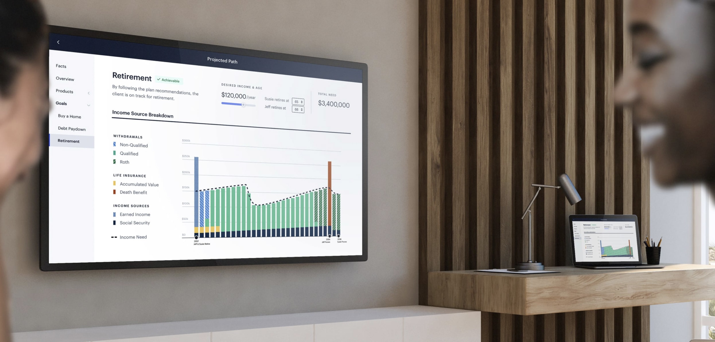
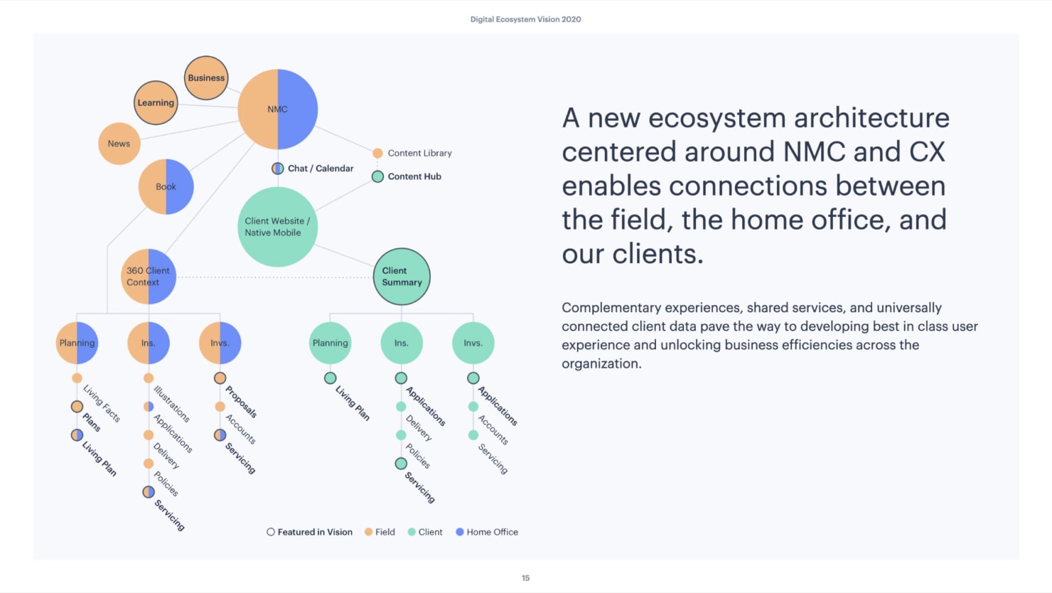
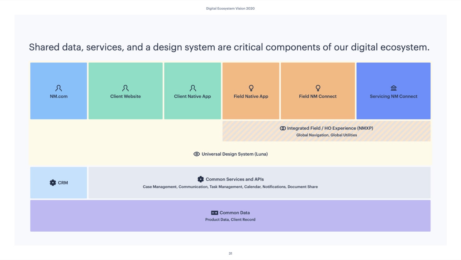
The final output artifact was a slide deck which described the underlying business need, the value of a comprehensive digital ecosystem, how it might manifest in the customer experience, and how we’ll build toward it. The digital ecosystem vision was a significant undertaking, with the intent of being presented to the CEO and board. Unfortunately, those sorts of meetings are difficult to arrange, so I’m unsure if the concepts within were ever seen at the highest levels of the company.
Developing a shared understanding of our users
During my time on the EXD team, I spent a lot of time working on broad end to end experience strategy initiatives where the artifacts were mainly oriented toward storytelling and alignment generation. I also had the opportunity to lead the development of an enterprise personas tool for our design and product teams. With a team of nearly 80 designers, writers, and researchers supporting a broad array of products and tools for our customers, advisors, and home office employees, it was important to provide a foundational set of personas to support their work. I partnered with the head of UX Research as well as members of myriad research and user insights teams to develop a set of customer and advisor personas. My small working team included a visual designer and content strategist as well.
Leveraging existing marketing segmentation data and ongoing survey and polling data provided from groups outside of design, we synthesized that information into key demographic and physiographic characteristics for each persona. For customer personas we provided both direct and derived insights through the lens of their financial goals, their affinity for our product offerings, and how to influence their decision making process and purchasing outlook. Building our advisor personas was more difficult due to the many specializations they fall into based on their clientele, expertise, and philosophy on financial planning. Ultimately we were able to build a common advisor persona framework centered on their attitudes toward different products, needs in terms of digital tools, and how to help them succeed in their own practice (advisors are independent entities from our home office).
These enterprise personas manifested as both a pdf packet (the favored distribution channel for many home office employees) and an internal reference site for those who prefer viewing in a browser or on the go, and want the most up to date versions of the personas.
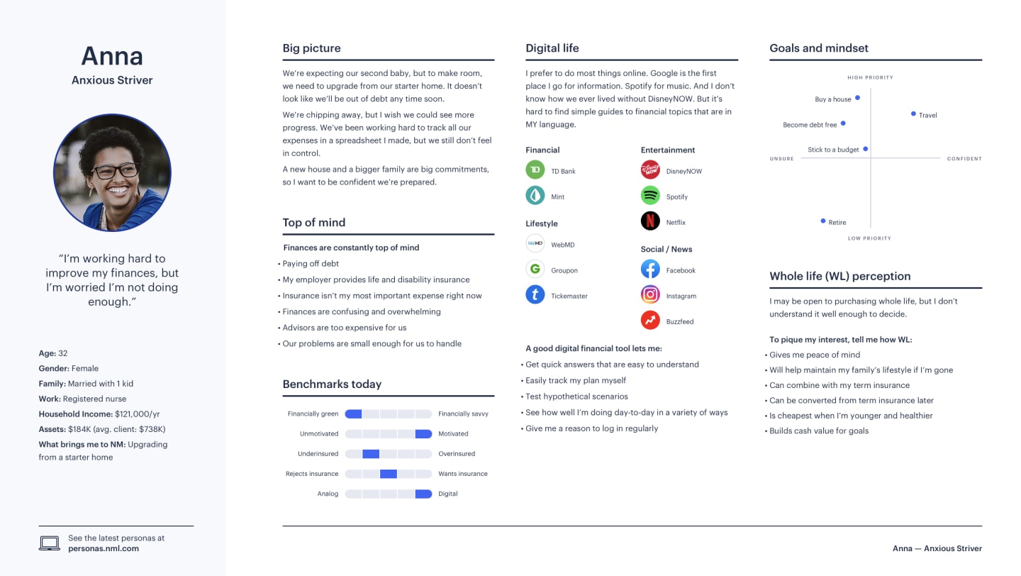
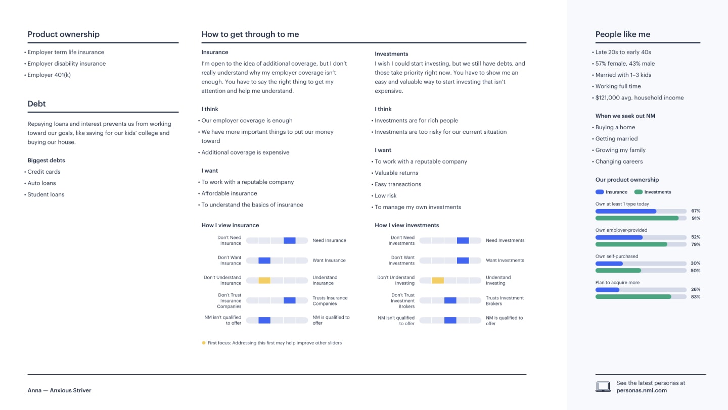
“Anxious Striver” customer persona
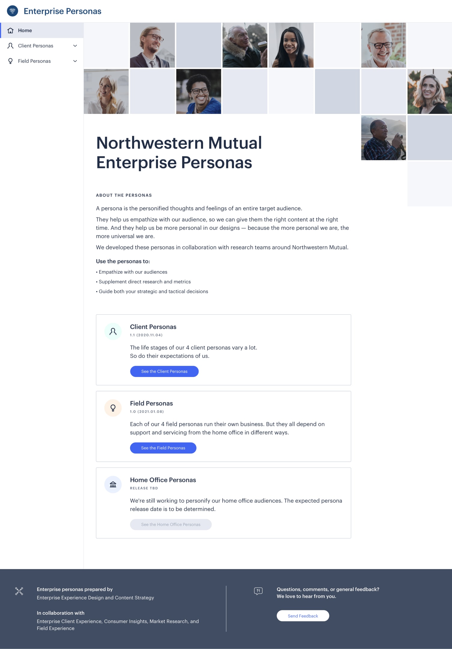
Enterprise persona landing page

“Integrated Planner” advisor persona
Related Work
Investments Account Experience
Encouraging financial planning with our investments experience.
Design Team Identity
A collection of team identity digital artifacts, collateral, and swag.
© 2024 Will Gabrenya
