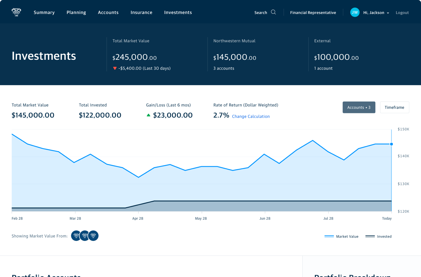
While at Northwestern Mutual, I occupied two roles during my tenure there. Initially, I operated as a design manager with occasional hands-on work. Later on, I became a founding member of a new team called Enterprise Experience Design. Our charter was to partner with senior executives to help define and communicate their product vision and to consult with areas of the company who had never worked with Design.
The samples below represent exploratory work intended to guide future work by other design teams at NM.
Organization
Northwestern Mutual Digital Customer Experience / Enterprise Experience Design
My Role
Design Manager / Principal Designer
Bringing intelligence to our investment product views
As a design manager in the larger CX organization, I had the opportunity to spin up a discovery project with our Investments Products product manager. The team had some downtime for this work stream while the engineering was heavily engaged in completing other work and addressing tech debt.
The goal of this project was to leverage the intelligence of our financial planning algorithm in order to reinforce the benefits of planning. Secondarily it was aimed at creating more direct customer engagement with us (the home office) such as encouraging greater usage of our self-service utilities or consuming homegrown financial planning content.
Between myself and the two dedicated designers in investments design pod, three directions were designed, each oriented toward at a slightly different set of customer personas. These concepts were evaluated with real customers and the findings were referenced for future investment track work. Examples of the two other directions along with other artifacts from the teams I managed at NM can be found at the bottom of this page.
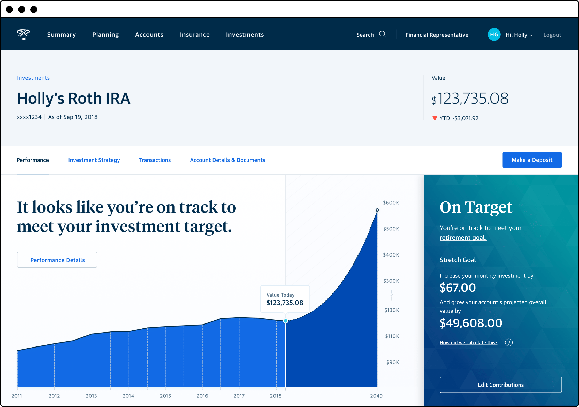
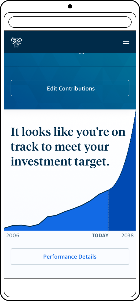
In order to provide more differentiation between the design concepts, I decided to orient my direction toward less savvy investors. I wanted to break down financial concepts and tell the story of their investment in an editorial way, providing opportunities for educating the customer throughout. That manifested foremost in bold direct statements about the status of their investment account.
Customers typically log in to check on the performance of their accounts occasionally or perform a transaction. In order to accommodate those common needs, I placed their performance data, projections, and most common actions at the top of the page. In the shown example, this customer is on track to meet their retirement goal via their IRA account. They have easy access to make a single contribution or fast track their original retirement goal by increasing their recurring contributions.
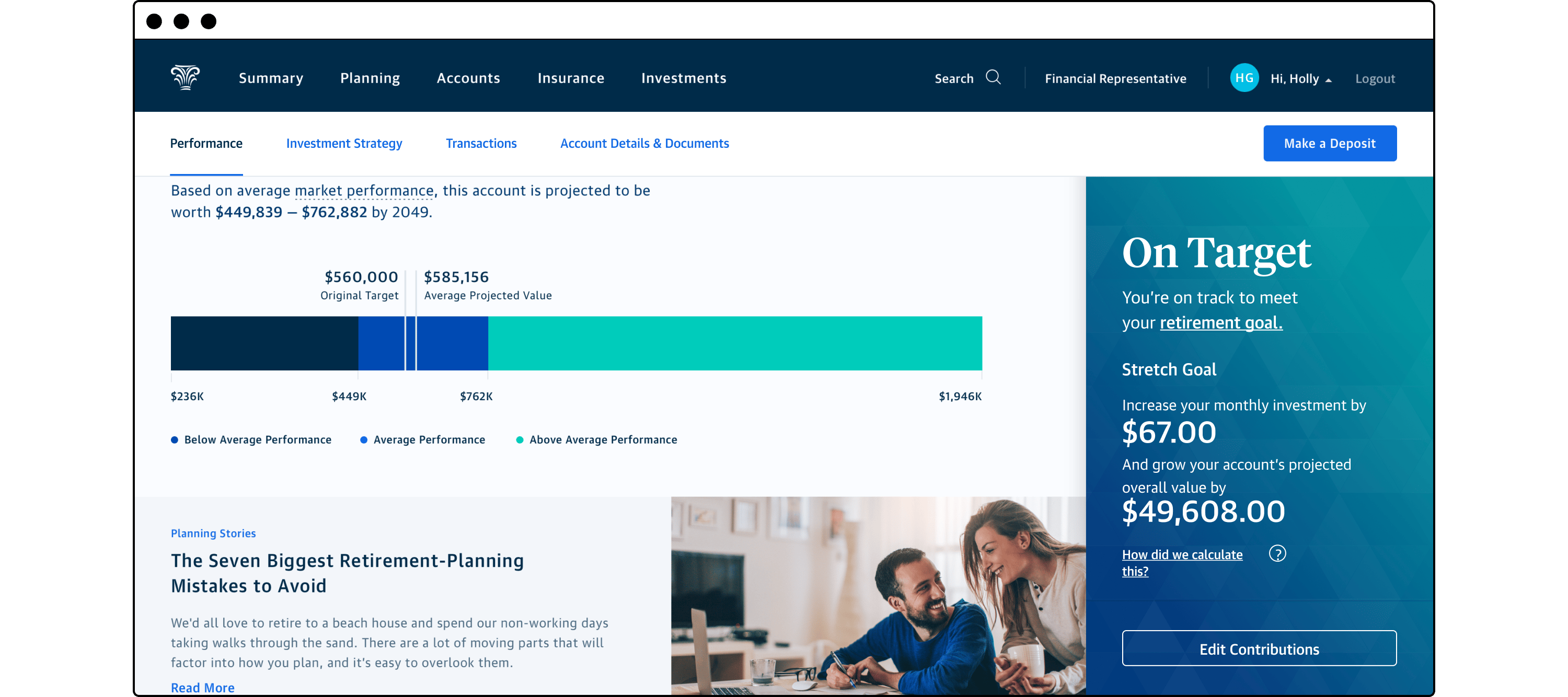
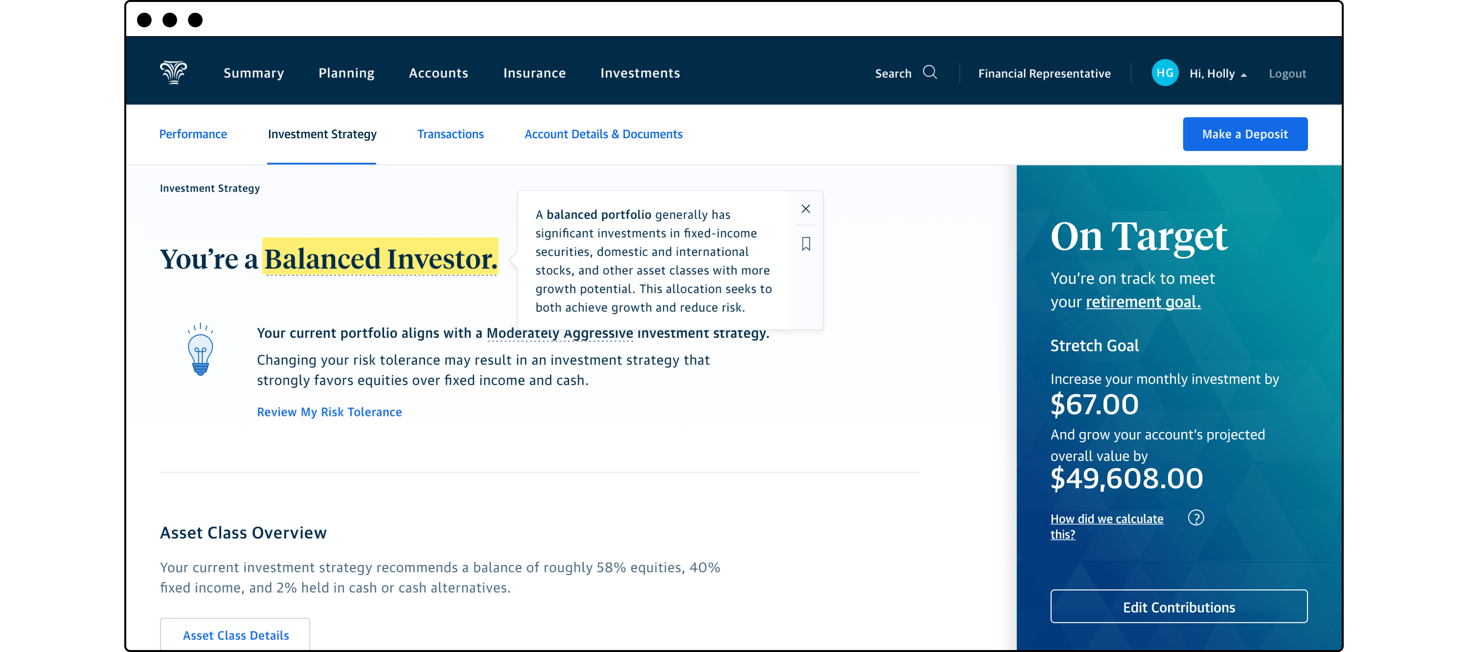
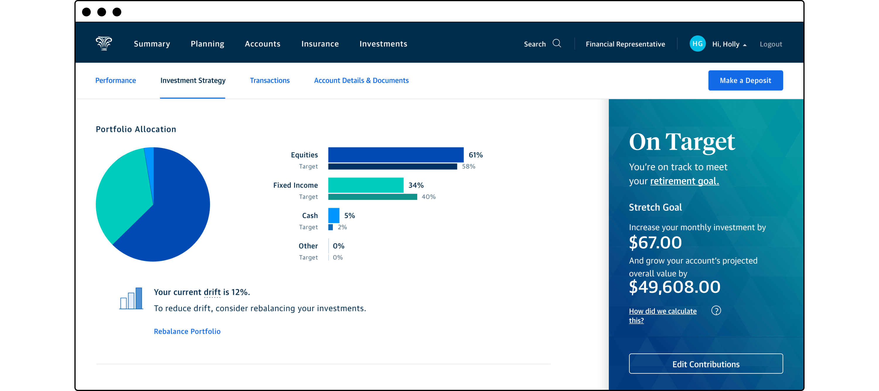
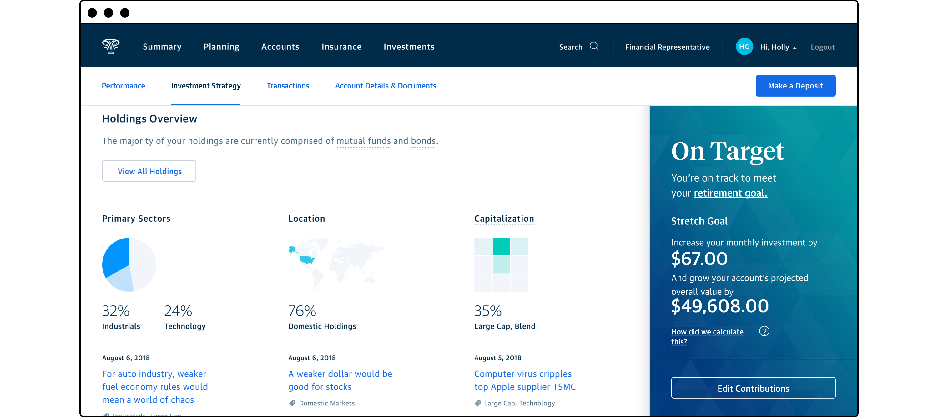
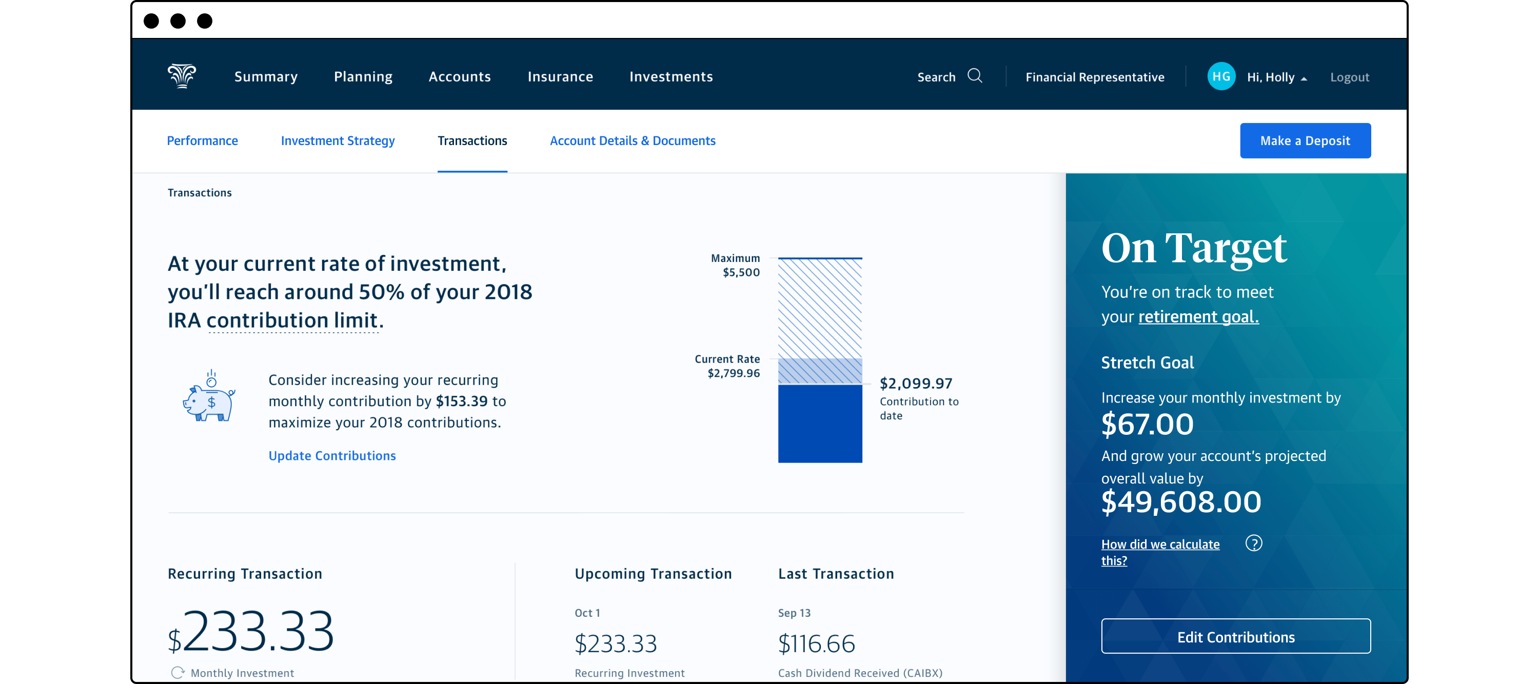
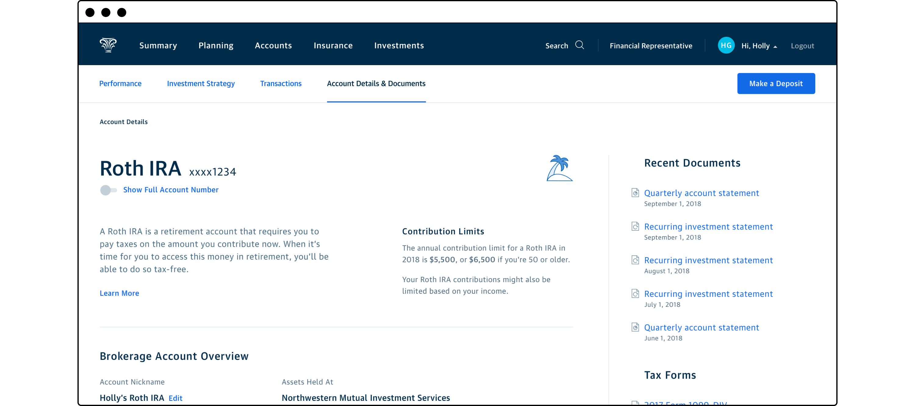
As the customer continues to explore their account details, I provided ample opportunities to explain common financial concepts by using tooltips activated from any dotted underlined content found throughout the view. Liberal usage of graphs and visualizations make otherwise bland financial data a little more engaging. Additionally contextual calls to action invite the customer to perform a transaction such as updating their contributions or set up time with their advisor to review their investment risk tolerance.
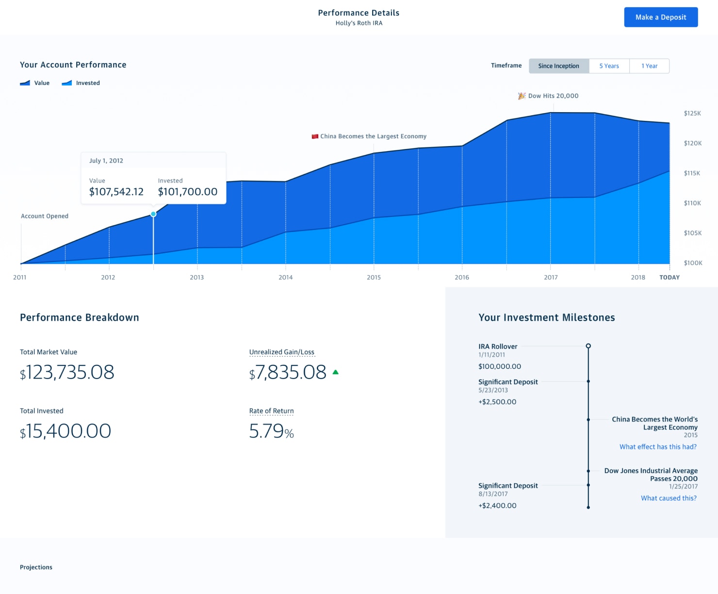
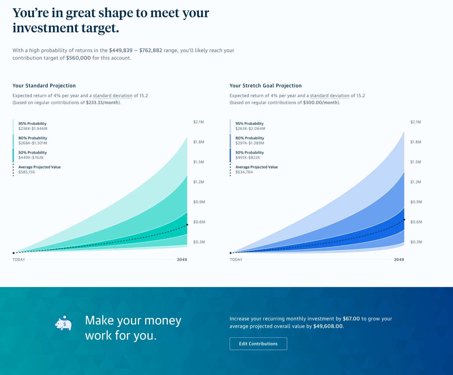
To show more details about investment performance, I continued to make the experience engaging beyond just the actual returns values. In keeping with the visual education theme, I provided broader financial market context to the customer’s returns. To show progress in a slightly different way, a timeline of their personal milestones plus macro factors that may have impacted their account’s performance is paired with numerical data. In the lower half of the details view, I use standard fan projection charts to visualize the potential impacts of increasing recurring contributions to the customer’s IRA.
A vision for welcoming new customers
Throughout my tenure on the Enterprise Experience Design (EXD) team, I worked with executives across the the financial products, digital produce, and marketing departments. These engagements typically focused on helping business leaders define, evaluate, and communicate their product vision to the C-suite, their teams, and other cross-functional partners.
Much of the product design work was intended for concept evaluation aimed at helping these executives confirm viability, secure funding, and ultimately build roadmaps for their product, design, and engineering teams. Although purely meant for research, some of the designs were implemented with only minimal modification.
Modernizing application tracking
The application process for a life insurance product could be time-consuming affair for both prospective customers as well as their advisors. While the advisors did their best to communicate and collect the required documentation for the application, unexpected delays and hiccups during the underwriting process could lead to frustration.
Application Tracking: Collecting documents and scheduling a medical exam
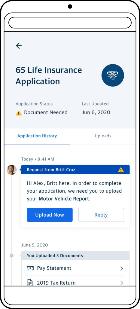
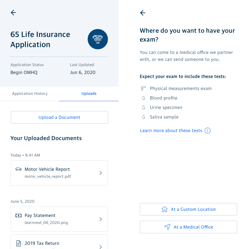
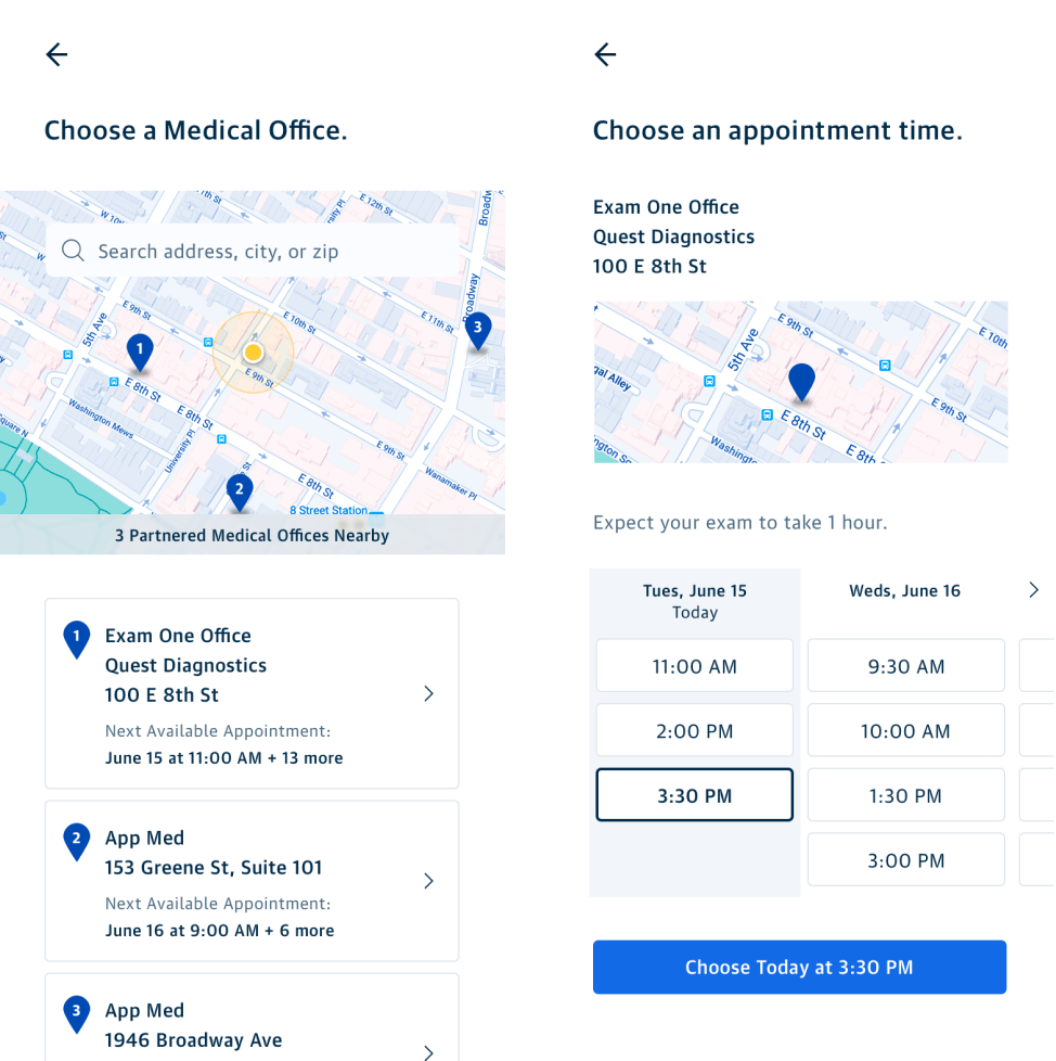
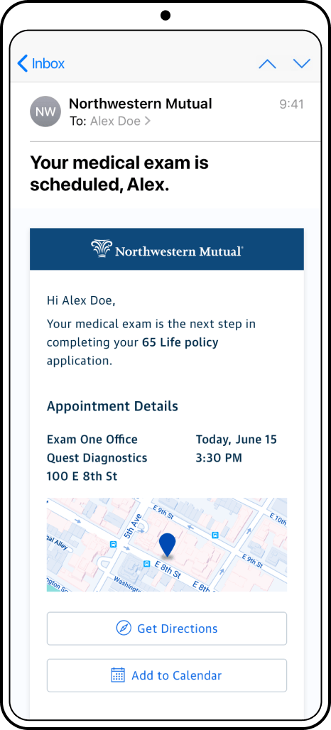
This concept for connecting both the financial advisor and the prospect with the home office’s underwriting team via our digital platform was designed to streamline communication, create transparency in the process, and hopefully speed things up all around. The two scenarios focused on were related to collecting additional documentation from the prospect and scheduling a medical exam to ascertain health risks. By allowing direct upload for documents, the prospect wouldn’t have to awkwardly deal with scanning and emailing or faxing sensitive documents to their advisor who would in turn just send it along to the home office underwriter. Medical screening could be a sensitive topic that a prospect might not want to discuss with their advisor. Allowing a prospect to schedule directly with a lab that would send the results to the home office would provide privacy and also speed up the process by not relying on their advisor to handle those logistics.
Orienting new customers
Upon delivery of a prospect’s insurance policy they entered the “Onboarding” phase of our customer journey. This mainly consisted of getting this new customer’s online profile set up as well as familiarizing themselves with the digital experience for their owned products. Two concepts were developed to move customer’s through this critical customer phase.
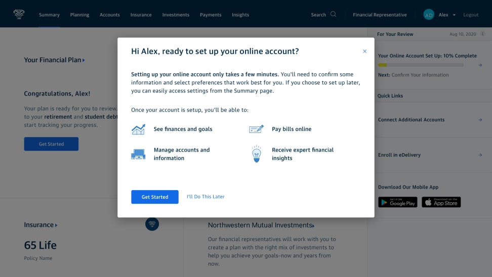
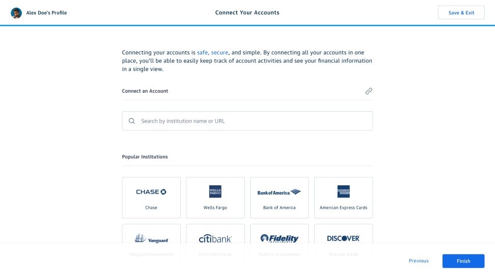
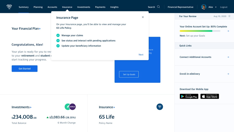
Onboarding: First time login
Education and engagement
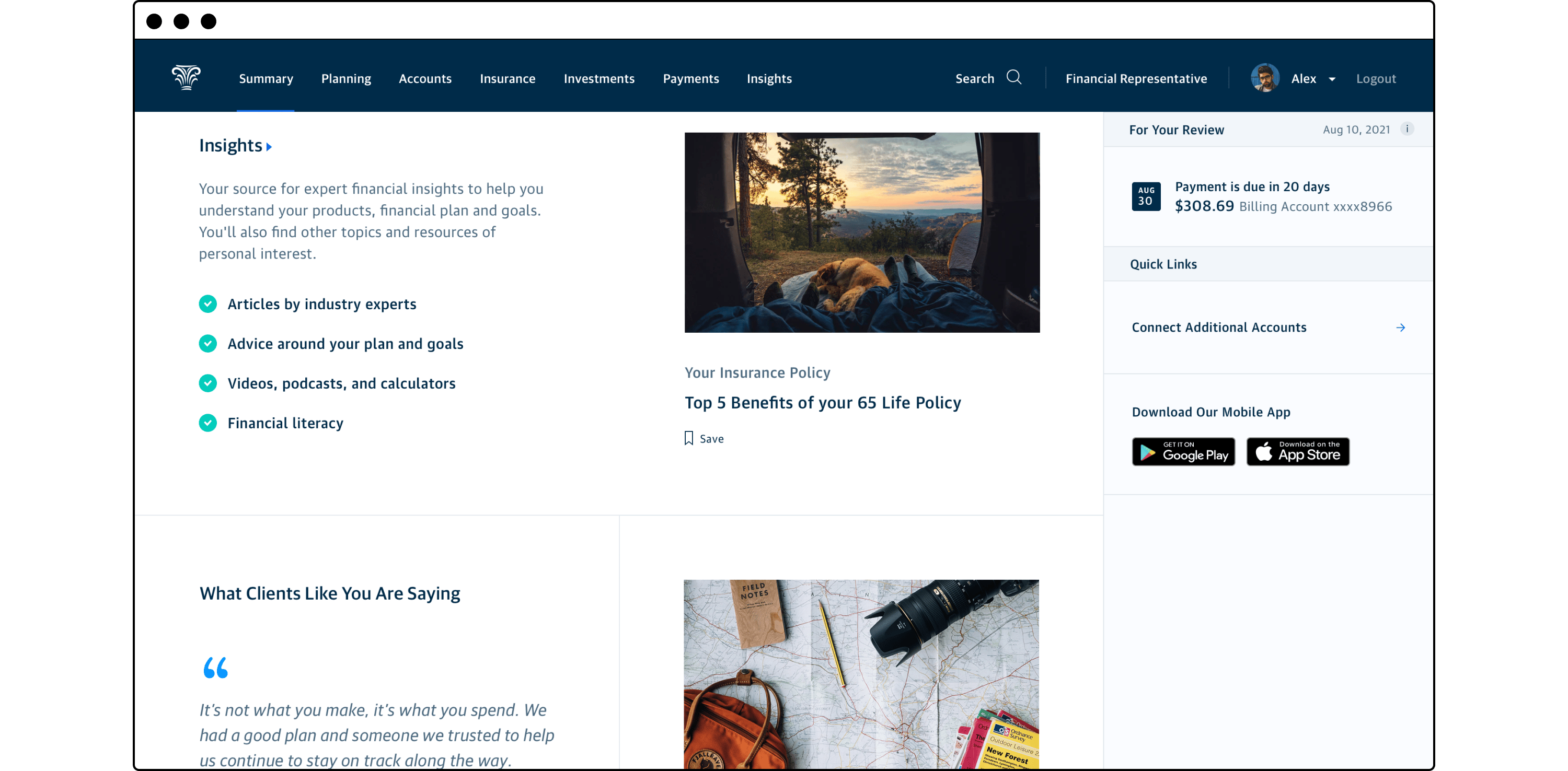
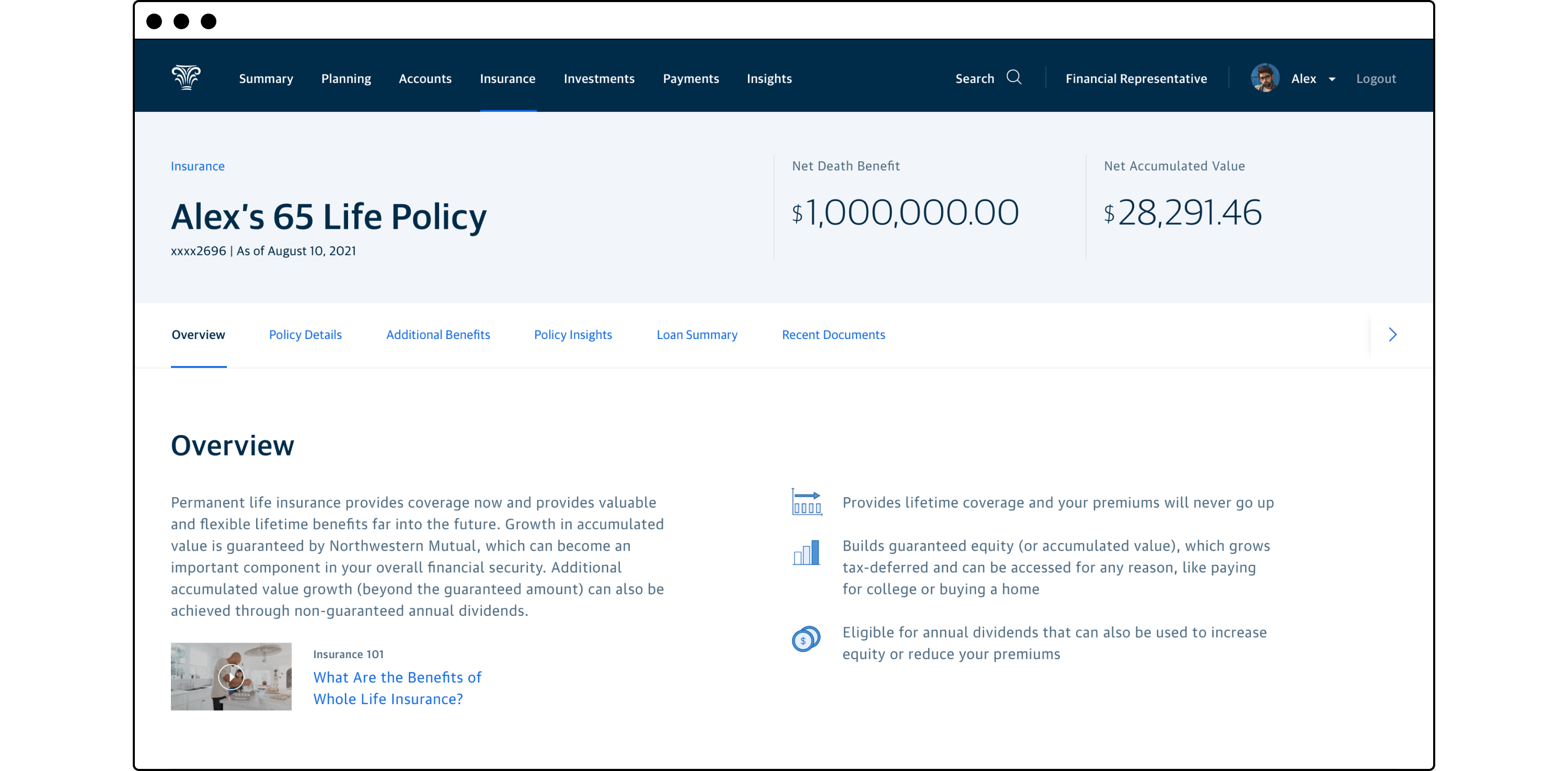
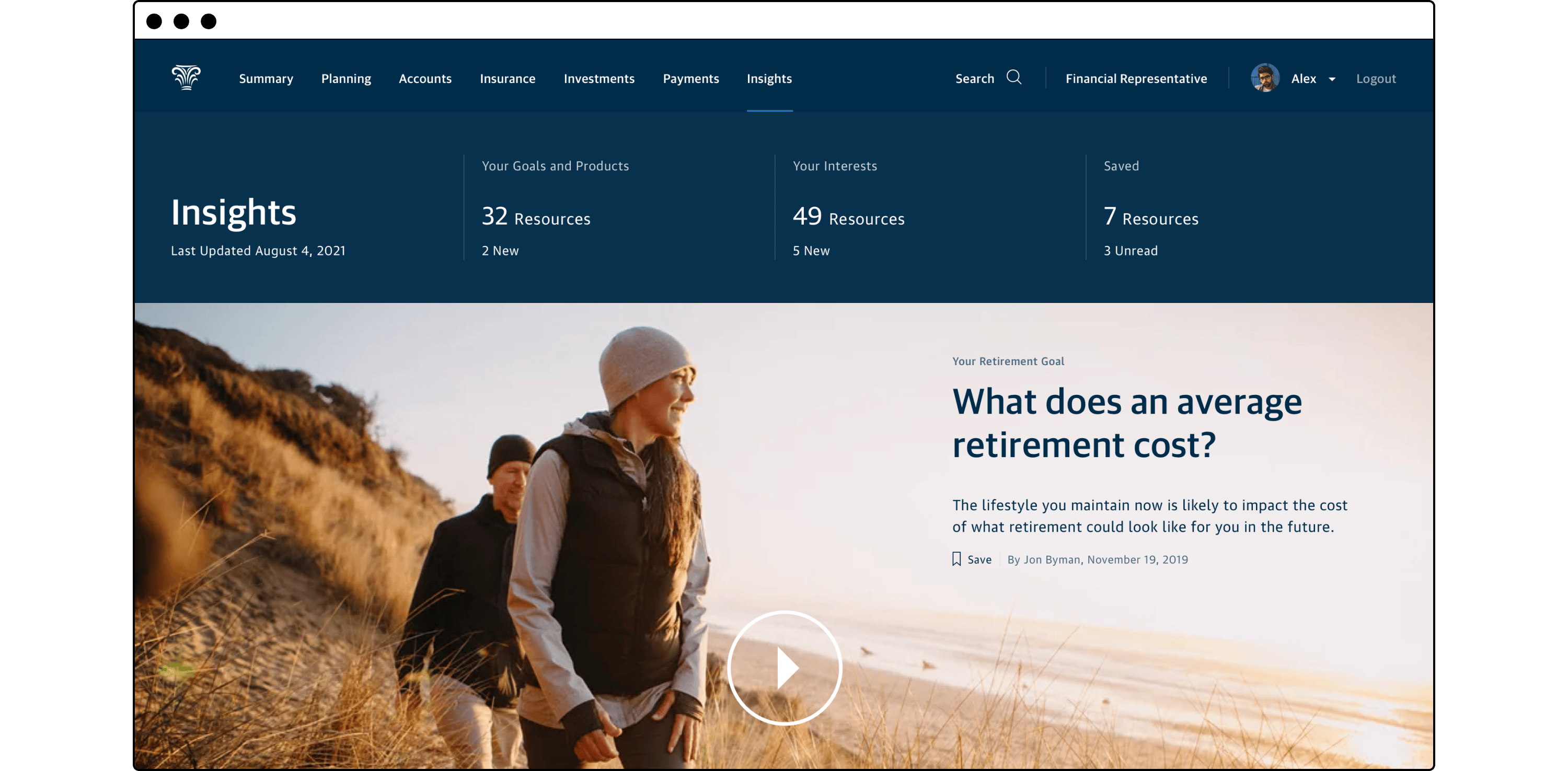
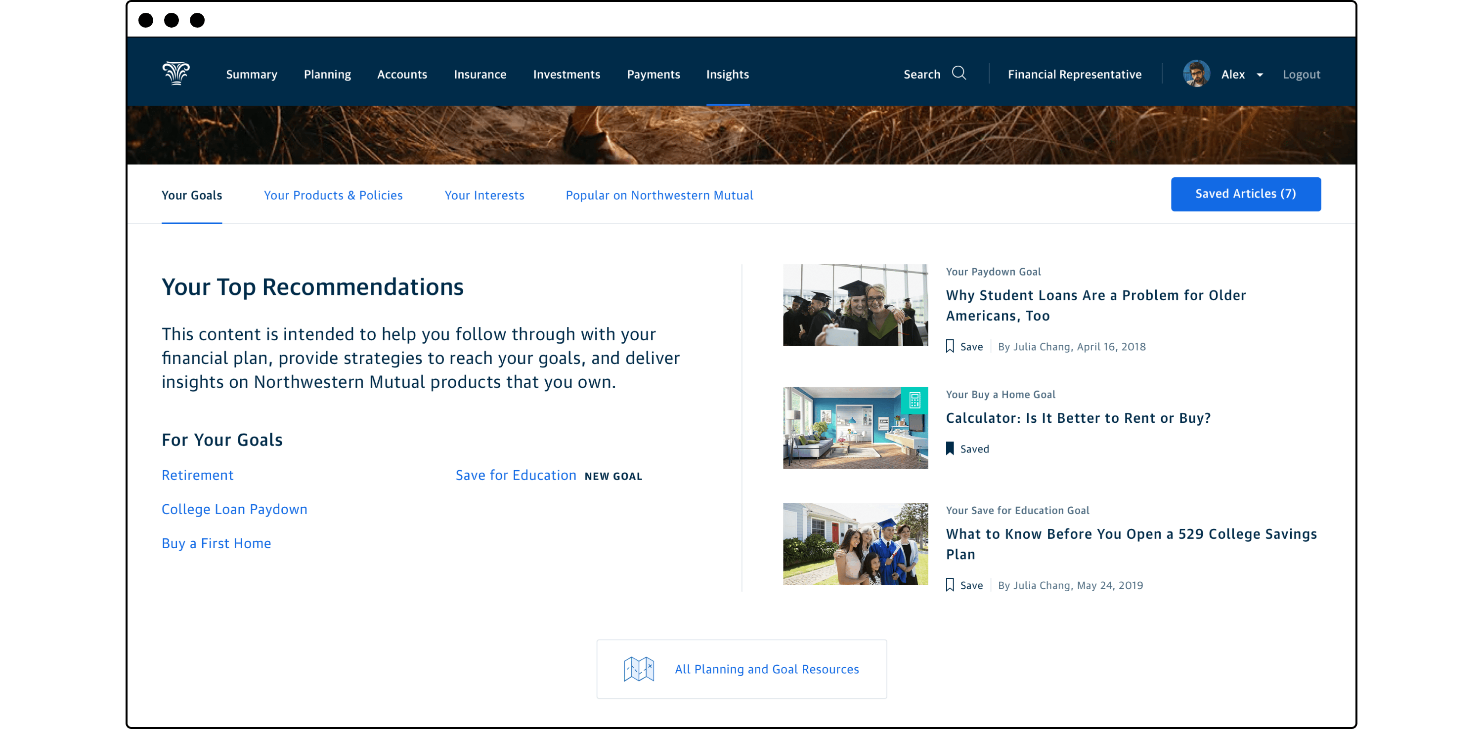
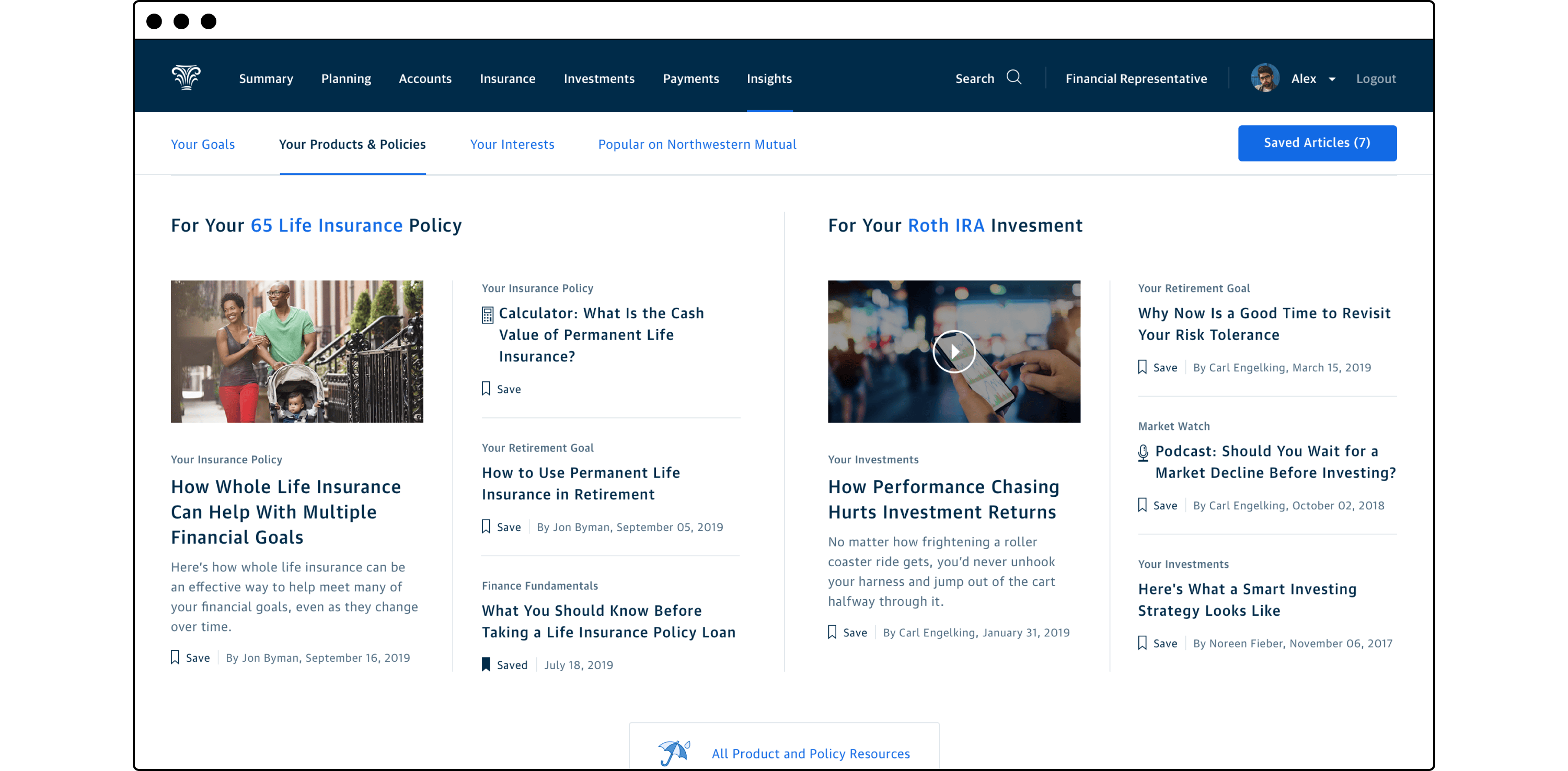
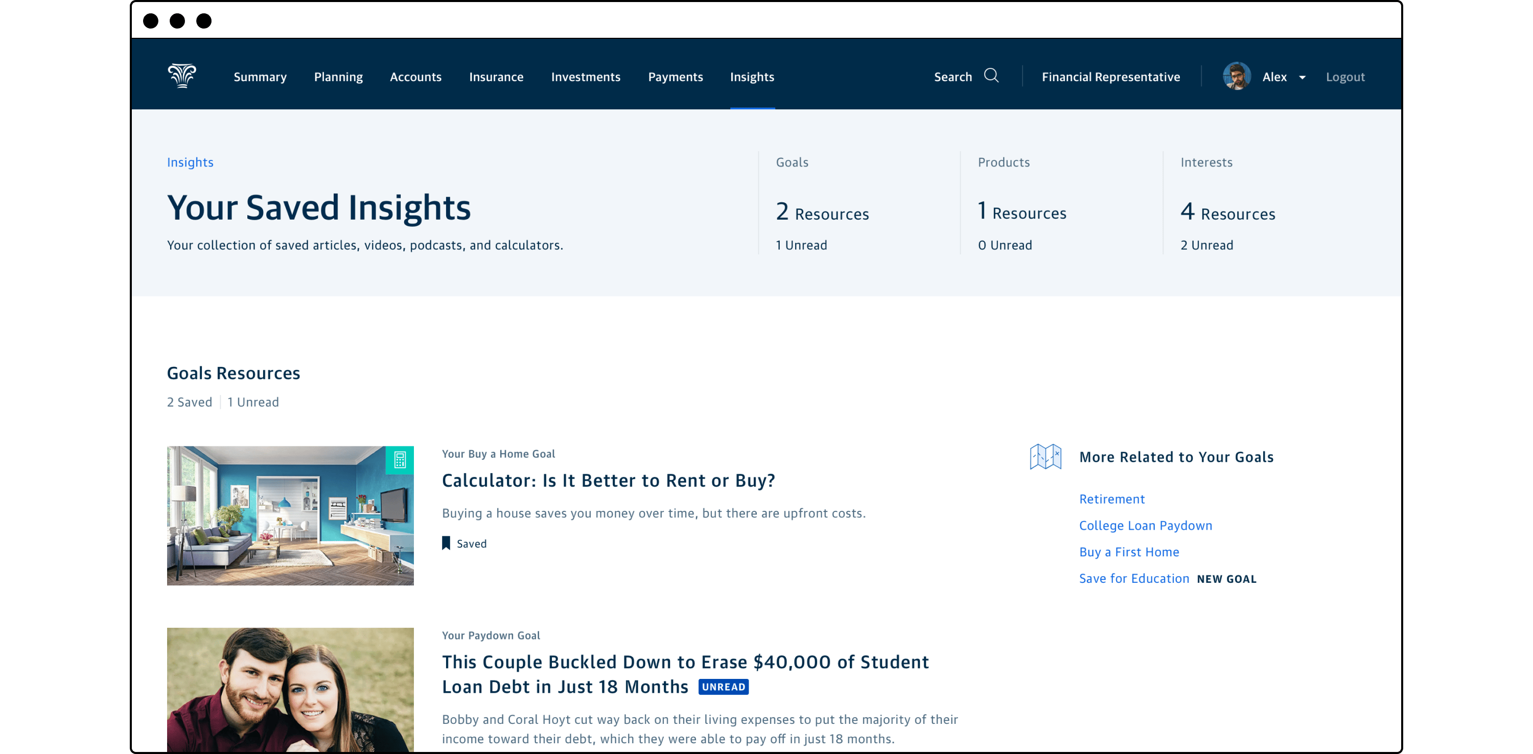
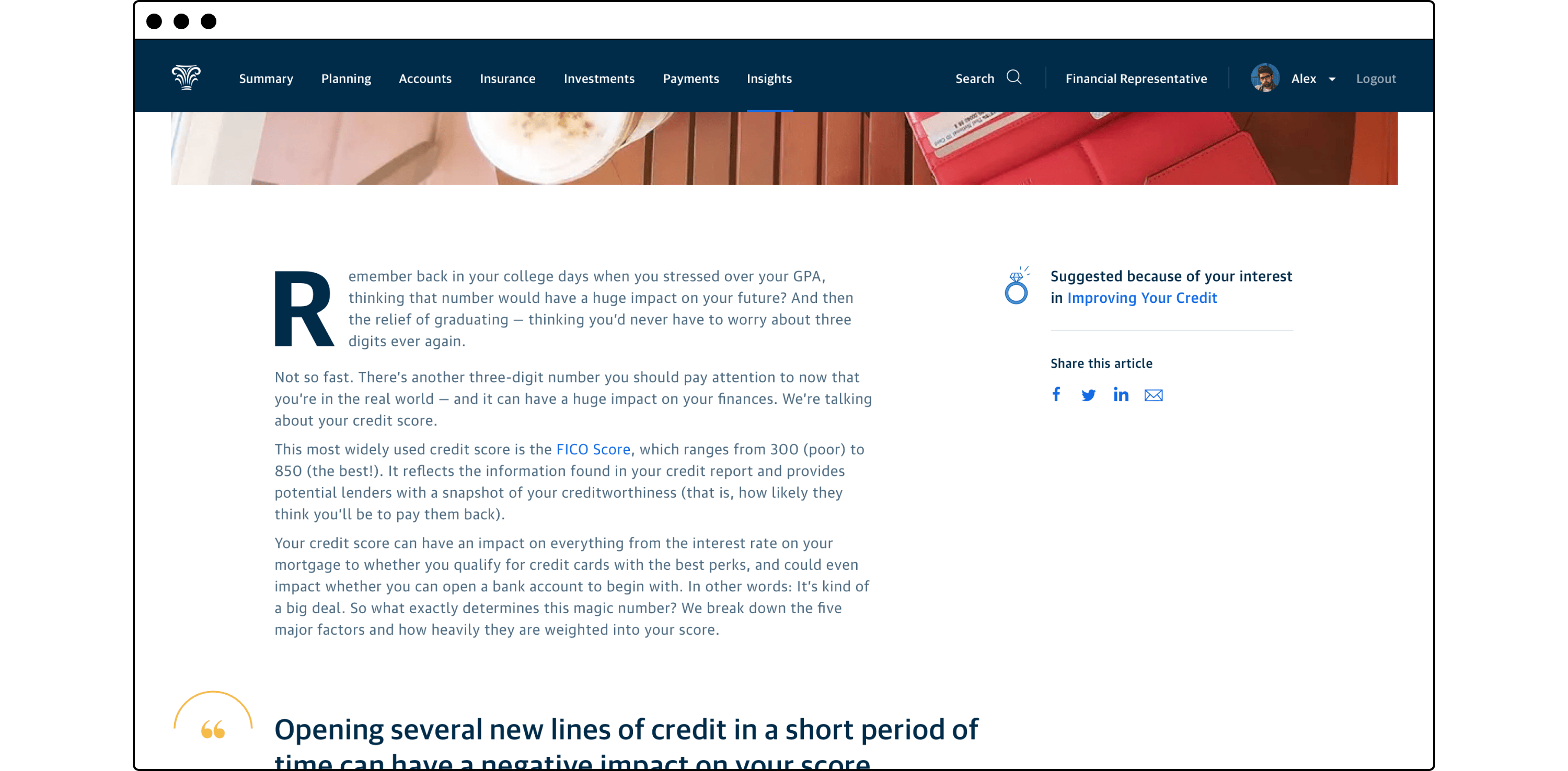
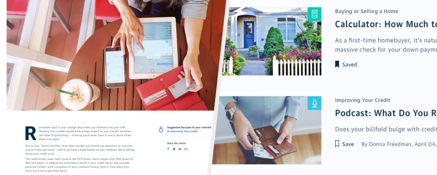
In addition to helping new customers find their way around the customer portal, we also wanted to ensure they remained engaged with Northwestern Mutual and committed to achieving their financial goals through us. To that end, this concept centered around providing personalized financial education curated by customer owned products, formalized goals, and expressed interests. This content was curated in a new area of the experience labeled “Insights” and could be accessed via the global navigation or contextually from the customer’s Summary view or from their owned product account views.
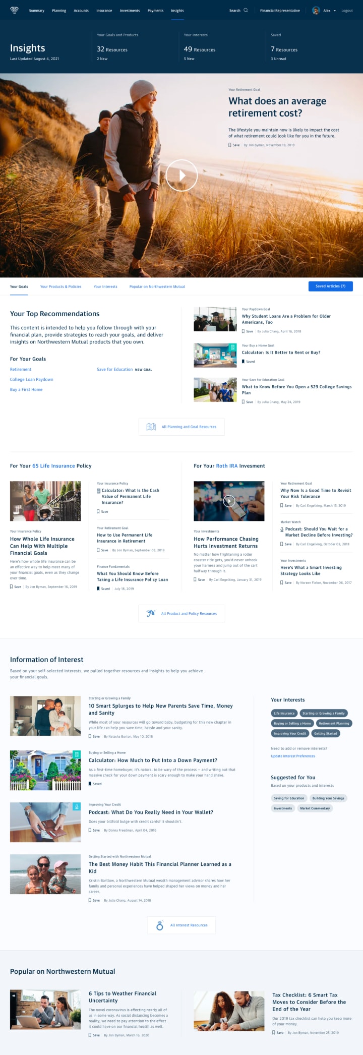
Insights Hub
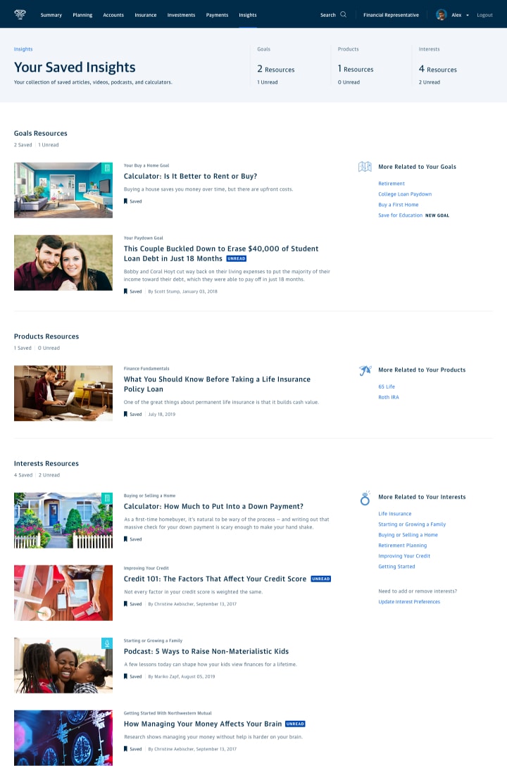
Your Saved Insights

Article Page
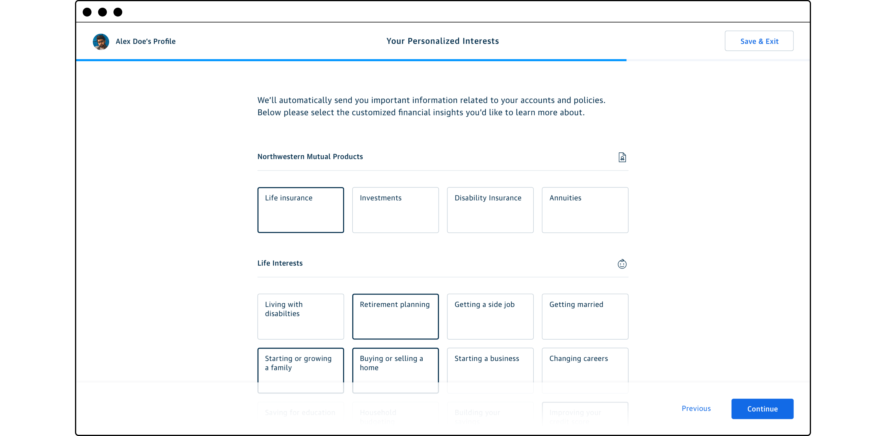
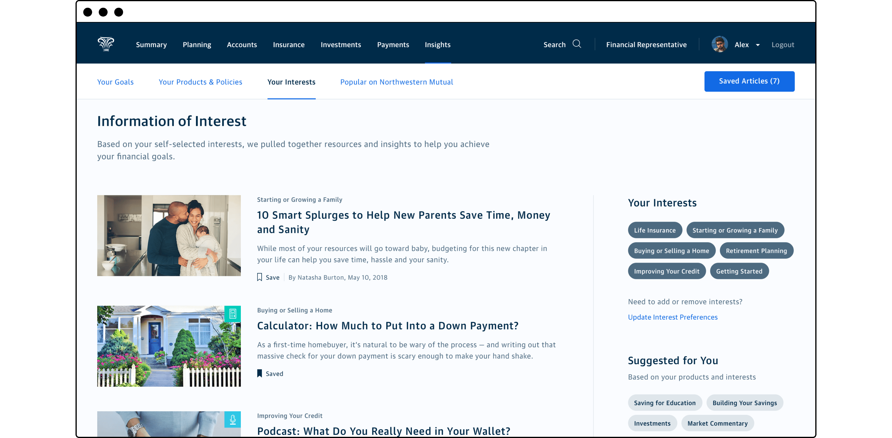
As part of the first time login onboarding flow, the customer is prompted to select financial topics they’re interested in learning more about. These topics could be product oriented such as explainers on annuities, or related to financial life goals such as saving for education, starting a business, or growing their family.
The Insights hub was set up in an editorial style prioritizing customer goal related content first, then content related to owned products, followed by content related to self-elected interests, and finally seasonally popular general interest content at the bottom. The content could manifest as long-form articles, videos, calculators, or even podcasts. As Northwestern Mutual already had a very active content production team writing articles and producing videos for the marketing website, we would already have a comprehensive library to populate for customers.
Customers interested in consuming any of their served up content at a later time could easily save it for later where it would be stored in their Saved Insights collection.
Evaluation and outcomes
The above concepts were evaluated with the assistance of our UX Research team. A takeaway deck for our executive sponsor was co-authored by myself, the researcher, and another member of my team. We represented the user affinity for each of the concepts and outlined the risks of moving forward with each item. The application tracker concept was well received, while the onboarding concepts were more mixed in reception.
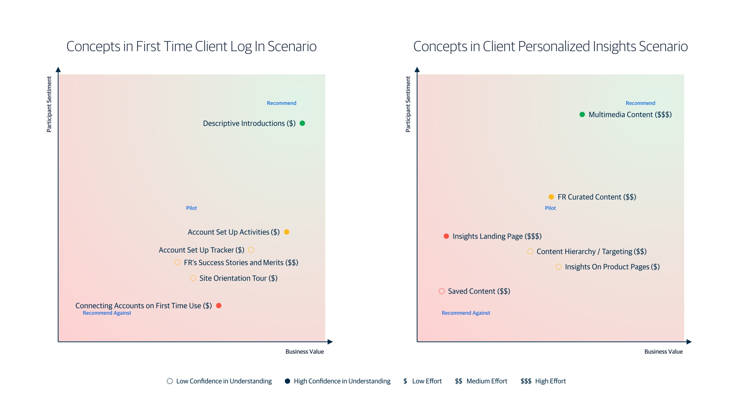
Concepts recommendation matrix slide from evaluation research deck
By the time I moved on from my position at NM, a number of those concepts had found their way into the roadmap or were launched for our customers. In particular, the lower effort onboarding ideas were rapidly developed, mostly based on the designs we used for the evaluation research. The high effort editorial and content ideas were slated for the roadmap, but due to their long time horizon, I’m unaware of the status of implementation.
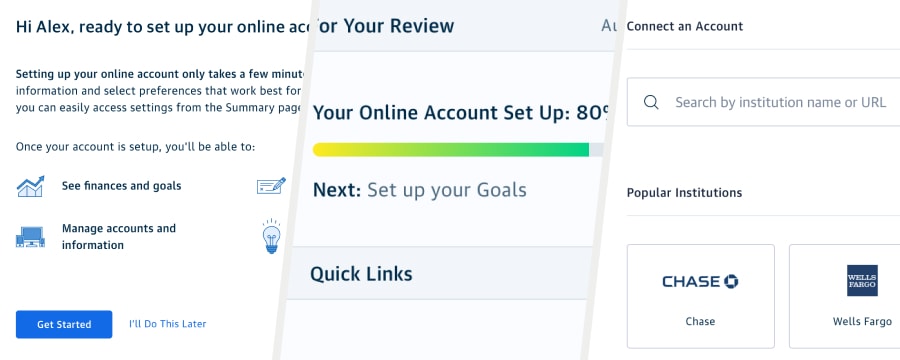
🚀 Launched or piloted features
Descriptive Introductions
Account Set Up Tracker
Account Set Up Activities
Connecting Accounts on First Time Use
🗺️ Future roadmap features
FR Curated Content
Multimedia Content
Related Work
Financial Products and Money Movement
Assorted projects from the product work streams that I led with my design portfolio partner.
Enterprise Experience Design
Supporting end to end product strategy and promoting user understanding.
Design Team Identity
A collection of team identity digital artifacts, collateral, and swag.
© 2024 Will Gabrenya
