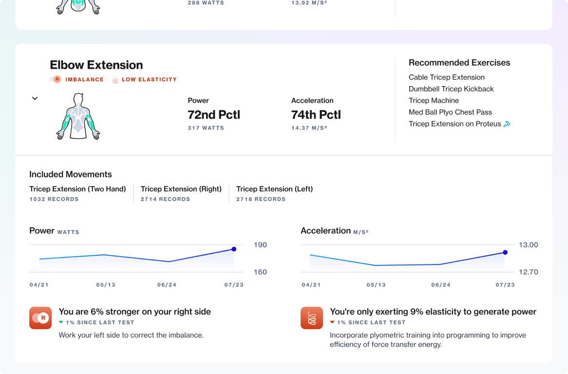
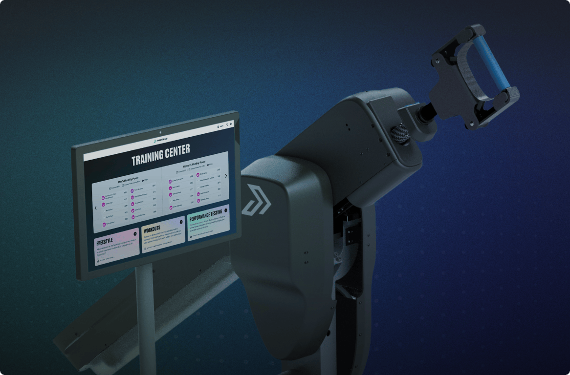
One of the most impactful updates to Proteus was the introduction of group testing. This was the biggest update to our testing functionality in years and required significant changes to our software architecture and rethinking some key user flows.
This feature made performance testing possible in group training environments, leading to a 32% average increase in assessments conducted across all customer sites.
Organization
Proteus Motion
My Role
Principal Designer
The Team
Andres Gonzalez, Brendan Kelly, Justin Maskell, Doug Moore, Jason Shaev, Jaskar Singh, Will Waterman
A bottleneck on the training floor
Proteus is primarily an assessment tool for measuring peak power production in the human body. It is used by personal trainers and physical therapists to track progress on their clients’ physical attributes, inform training program design, and to safely develop power and acceleration. Their clients range from teenage athletes aspiring to compete at a higher level, to professional athletes, up to the older adult population looking to maintain wellness into their retirement years.
Trainers administer a relevant test for their client from our Performance Testing catalog, during which hardware sensors record data on power, acceleration, velocity, and side imbalances. This data, crucial for expanding our database of performance norms, is only collected during testing.
My CEO believed that to increase testing mode usage and potential sales to larger performance gyms we needed to provide the capability to test multiple athletes in a session. Our testing mode was designed for a trainer to administer to a single athlete at a time. That worked very well for 1:1 personal training or physical therapy sessions. However, it was wholly incompatible with how trainers manage group training sessions.

Arriving on testing day
Waiting to test on Proteus
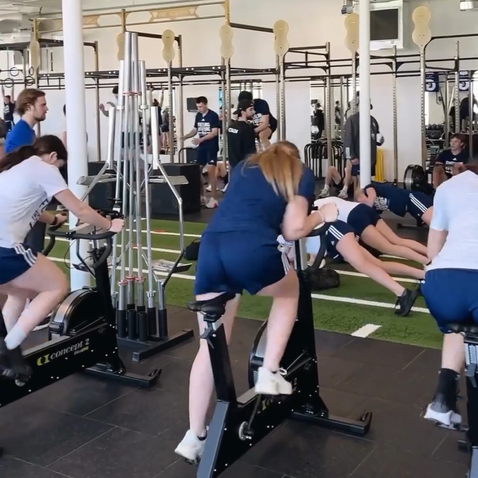
An active training floor
Many of our customers train athletes in groups where they continually cycle between stations on the gym floor. A Performance Test initiated in this setting blocks access to Proteus for the rest of the group until the chosen athlete completes the entire test. This breaks the flow of circuit training and prevents using Proteus for testing in this environment.
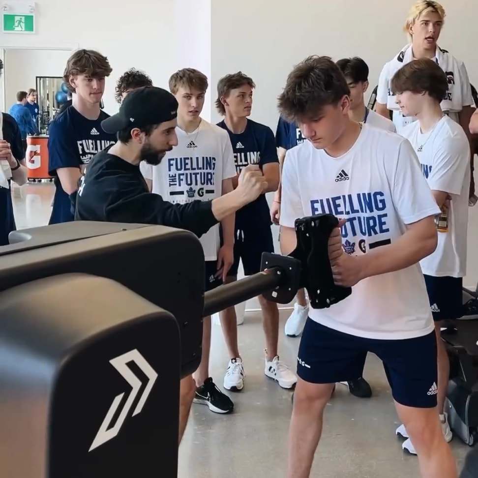
A less common but still important scenario is the whole day testing combine. In this situation a coach brings an entire team to a testing site to run each athlete through a performance test, one at a time. Aside from the inefficiency of setting up a new testing session for each individual athlete, teammates who aren’t actively testing must impatiently await their turn. This was understandably boring for the other athletes and stressful and tedious for the trainer administering the tests.
Without a great solution for these two scenarios, training groups of clients became an annoyance for existing customers and a concern for prospective buyers. And it limited our ability to collect valuable performance data.
Three key challenges
It was clear that we needed to introduce testing for groups in order to increase usage of that mode and support sales efforts. The goal wasn’t to completely rethink how testing worked, but to build upon existing core functionality. This would save design and development time and not require users to relearn how to administer a performance test. When our CEO tasked myself and the software team to develop this capability, he was unaware of limitations in the software platform preventing any sort of multi-user functionality. While writing a project brief for the team, I identified a few key experience challenges that needed to be solved in order for this feature to be effective:
How do we initiate a multi-user test in our software?
How do we move athletes through a test in a chaotic group session?
How do we provide access to each athlete’s full testing results upon completion?
Helpfully I could address these challenges mostly independently of each other as they were compartmentalized in different areas of the software. The path to a successful launch required that I rethink several critical flows in our software, propose an approach to group usage that fit the realities of a chaotic training environment, refresh the testing UI, and introduce new views necessary to complete the end-to-end experience for users.
Initiating a group testing session
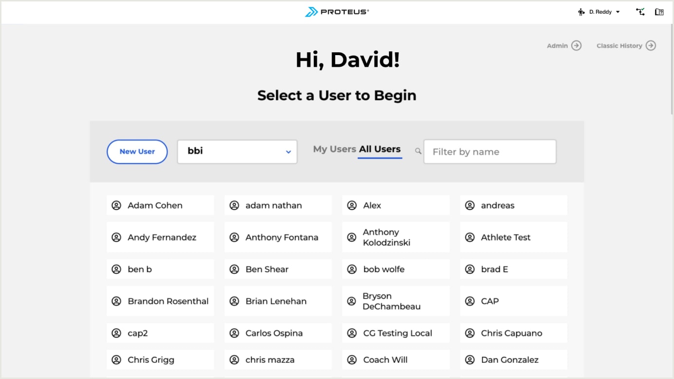
Due to how our software handled user selection at the time, assigning multiple athletes was not a trivial problem to solve. When a trainer wanted to work with an athlete on Proteus, they would begin by selecting the athlete on the “home view” which was a list of every athlete account at the facility. This would create a dual-authenticated state between the logged in trainer and the chosen athlete, labeled “working as”. Any test taken would associate results with that athlete’s profile.
This wasn’t ideal for a few reasons:
- Only testing mode records data and requires selecting a user, so this is an unnecessary step if the intent is to use the other modes.
- It’s too easy for anyone to walk up to Proteus, choose an athlete, and peak at their test data or edit their profile.
- It’s an underwhelming “front door” to our software experience, to put it charitably.
Old pathway to testing

Old pathway to testing
Rethinking activity mode entry
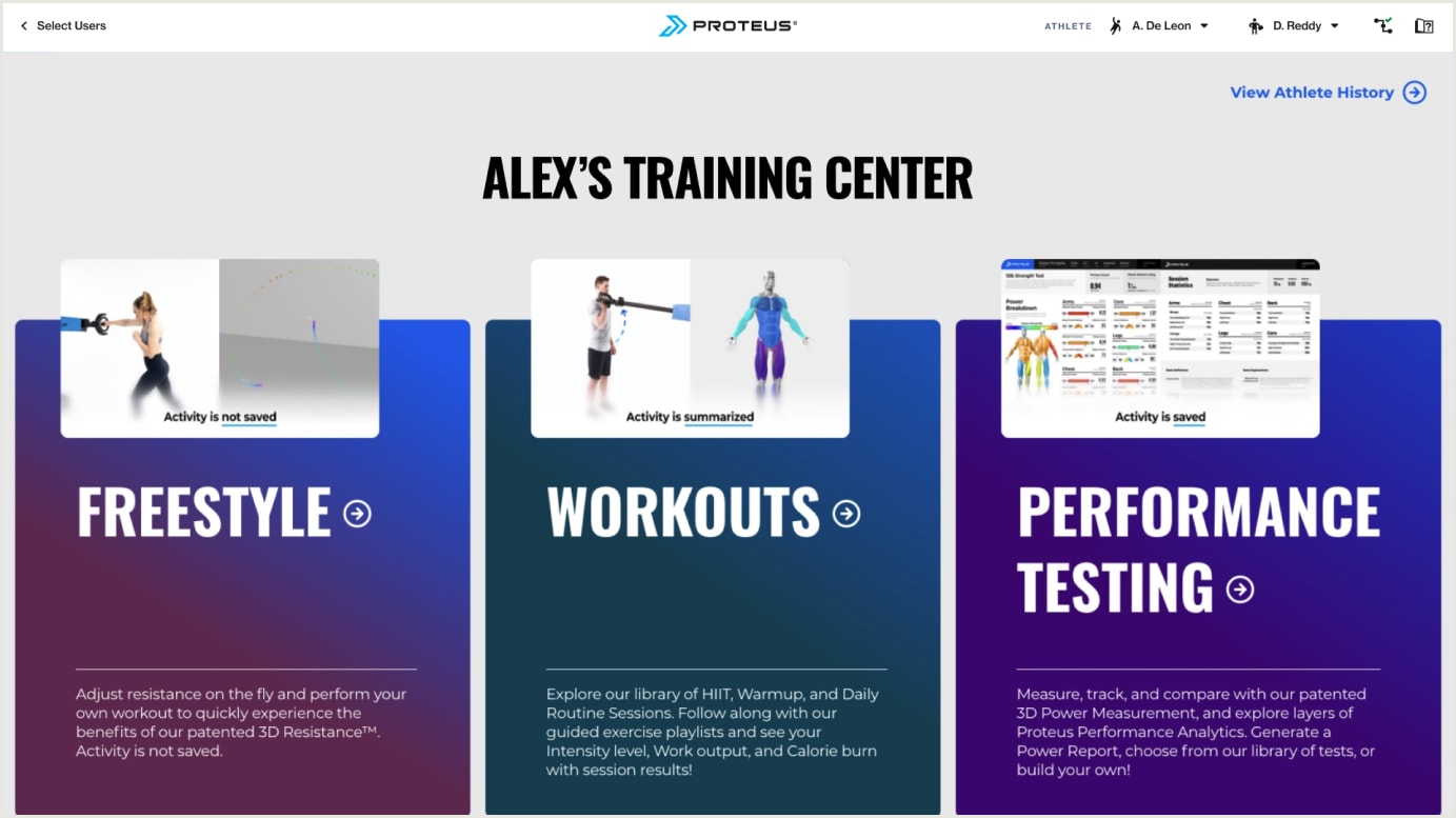
I considered the above three issues with the current pathway to the testing mode when proposing options to the stakeholders. I could take a more status quo approach (Option 1) and shoehorn some method of selecting multiple users into the existing select user view, or propose changing the order of steps (Option 2) to selecting an activity mode and participants for a performance test.
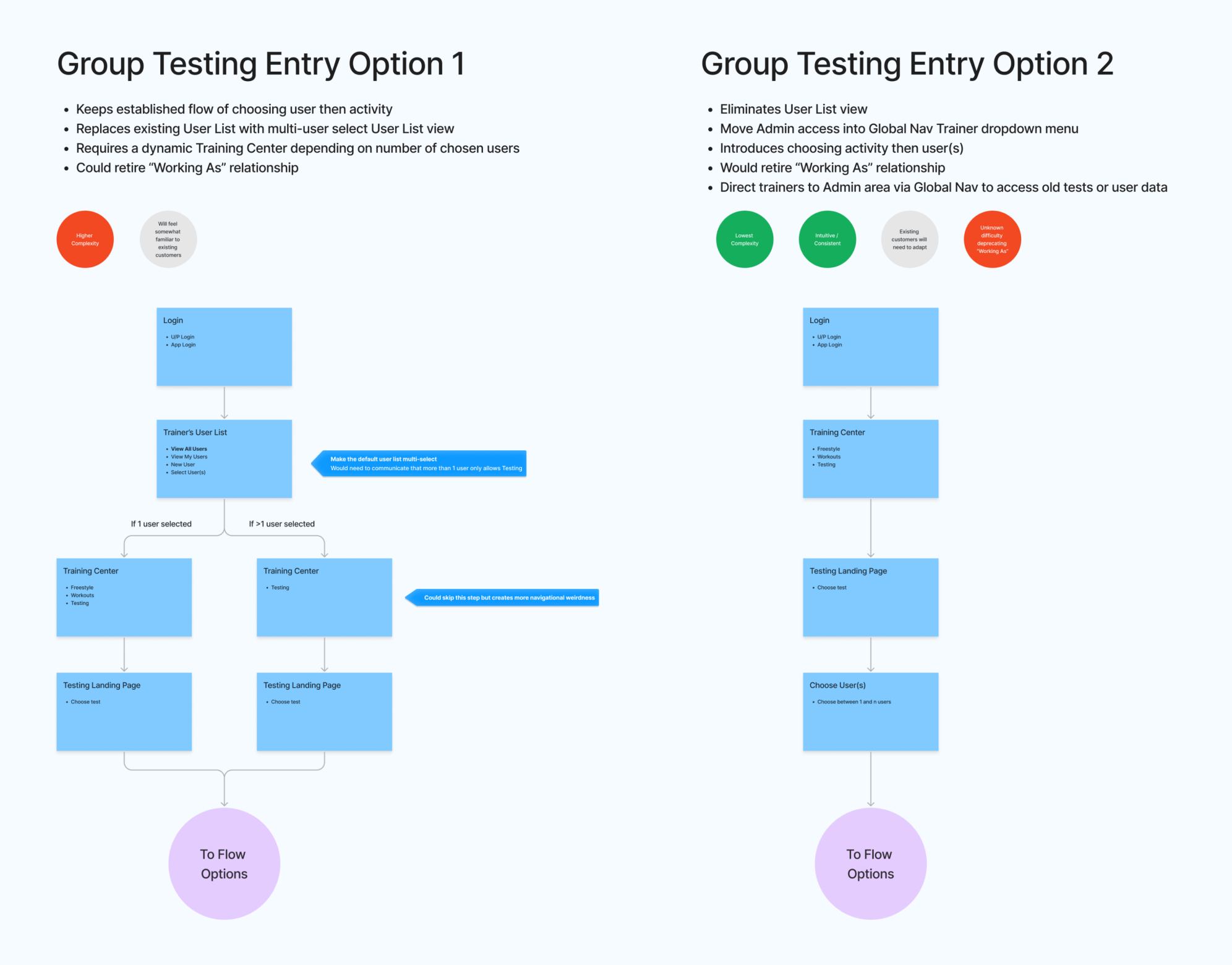
Option 1 would drive to different versions of the Training Center depending on the number of athletes selected. With a single athlete selected, the user would see the standard, three-mode Training Center and choose their activity as usual. If more than one athlete is selected they would arrive at an abridged version of the Training Center with only Performance Testing as an option. Alternatively, we could also skip past the Training Center and drive directly to the testing mode, eliminating a redundant selection. This first option was not ideal for several reasons:
The privacy issue of anyone easily selecting another user’s account remains.
Multiple versions of the Training Center view are required, creating an odd experience for users and more long-term developer effort to maintain.
It introduces technical complexity regarding how to treat a multi-athlete “working as” relationship, with high potential for user confusion.
The user selection “home view” is still an ugly front door.
Option 2 proposed making the Training Center the new “home view”. Only when a trainer decides to use Proteus for Performance Testing would they need to worry about selecting athletes. I presented this as the ideal solution with the following justifications:
There is a much lower likelihood that a random person can access an athlete’s data.
Only a single version of the Training Center needs to be maintained.
An athlete can more easily enter any of the activity modes.
It presents a more ideal “home view” showcasing the functionality of Proteus rather than a user list.
Despite the temptation to stick with the more status quo Option 1, it became clear to the stakeholders that it was clearly a sub-optimal band-aid approach and potentially more work to maintain in the future.
The new athlete selection view
With an agreement on the new entry point, I set about designing hew new athlete selection view. As the current “home view” user selection had been around for years, it made sense to not radically change how it functioned. I kept the tiled layout while proposing a few quality of life improvements. Over time customer sites can accrue a large number of users with some older sites easily surpassing 300. Due to the seasonal nature of athletes training at a particular gym, customers rarely deleted user profiles. I proposed a toggle to hide infrequent athletes (those who haven’t used Proteus in the past year) to pare down the available users in the list. I kept the live search bar that already existed in the current view, and chunked out users alphabetically by first name to increase readability.
Wireframe states for user selection
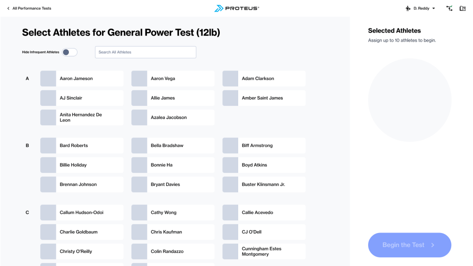
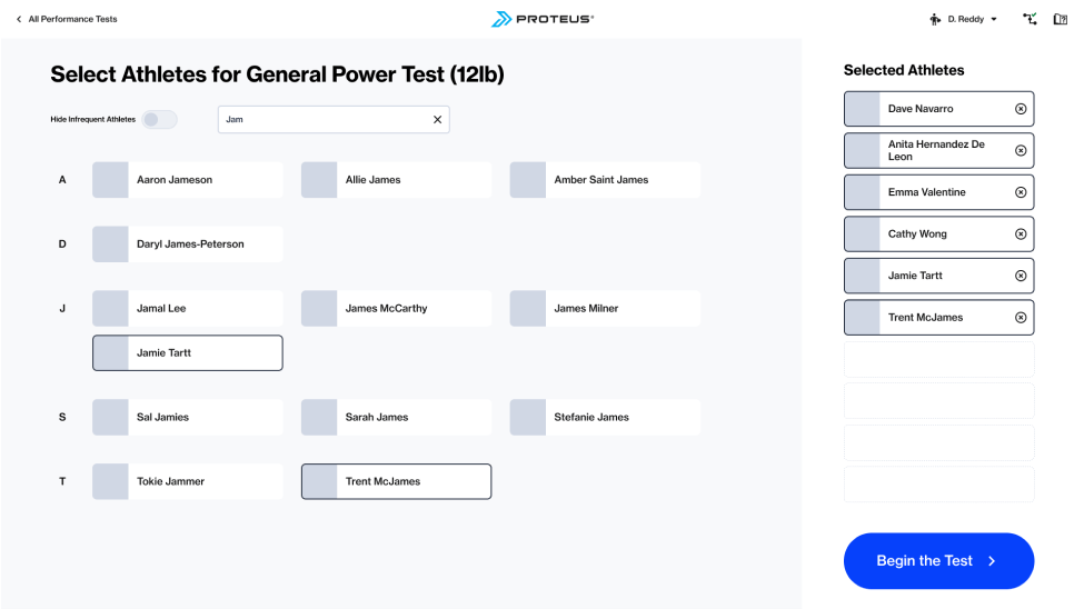
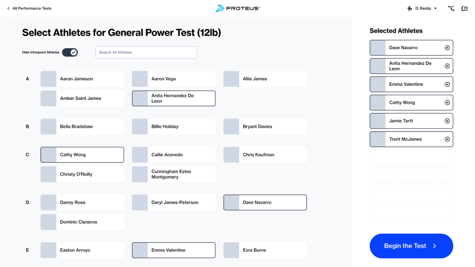
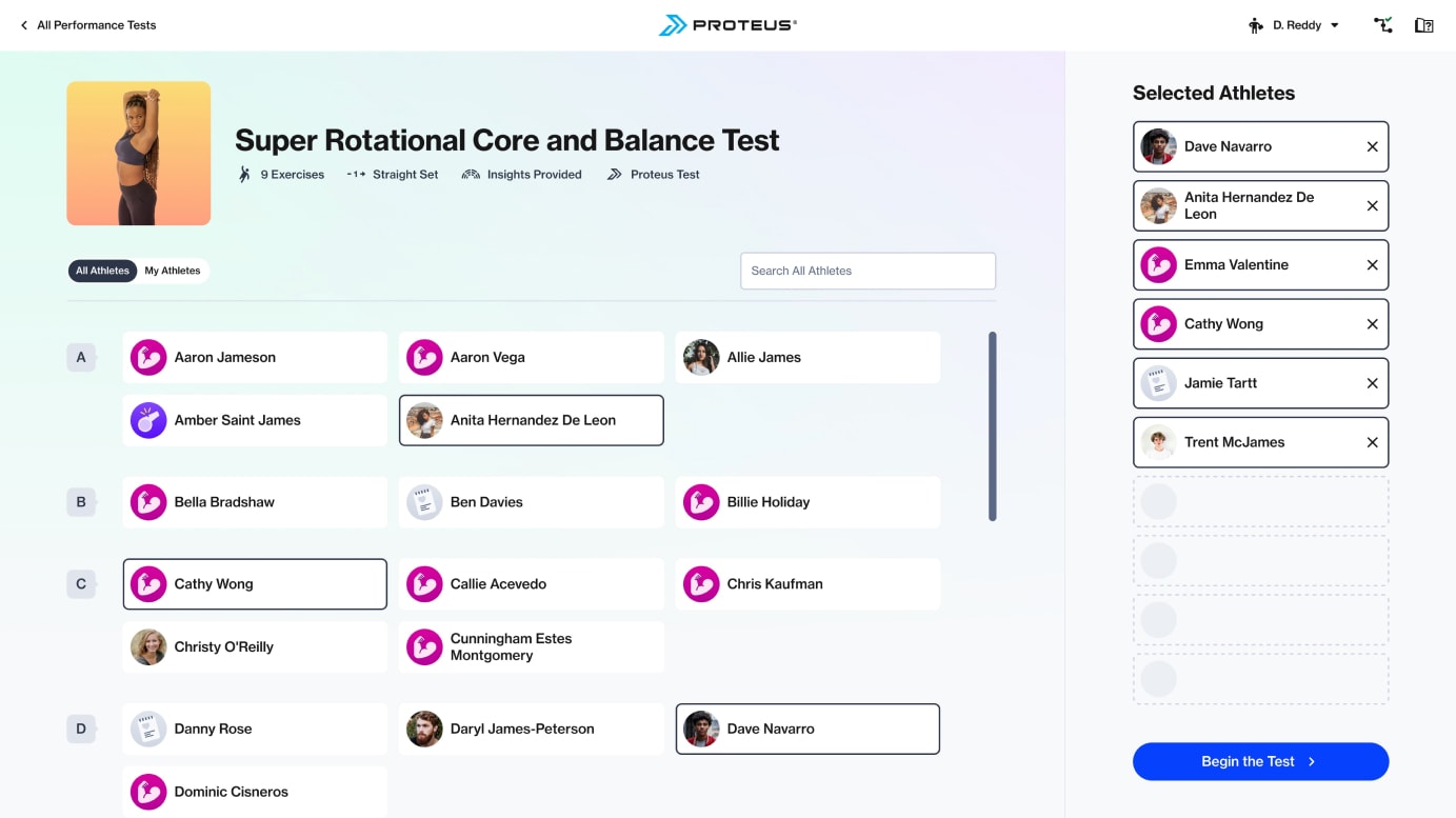
The high fidelity versions deviated slightly from the wires. Due to the backend effort of identifying and assigning an inactivity status to users, I swapped that for a toggle that would filter out accounts not personally created by the logged in Trainer as that functionality was already available. As I further considered the nature of a group training session, with athletes cycling through their turn on Proteus, I added a contextual test information header to this view (and on other views in the testing flow). This would provide a reminder of the test length, set structure (single/multiple straight sets vs circuit style sets), whether the test generated advanced reports, and if the test was a standard catalog test or customer-created.
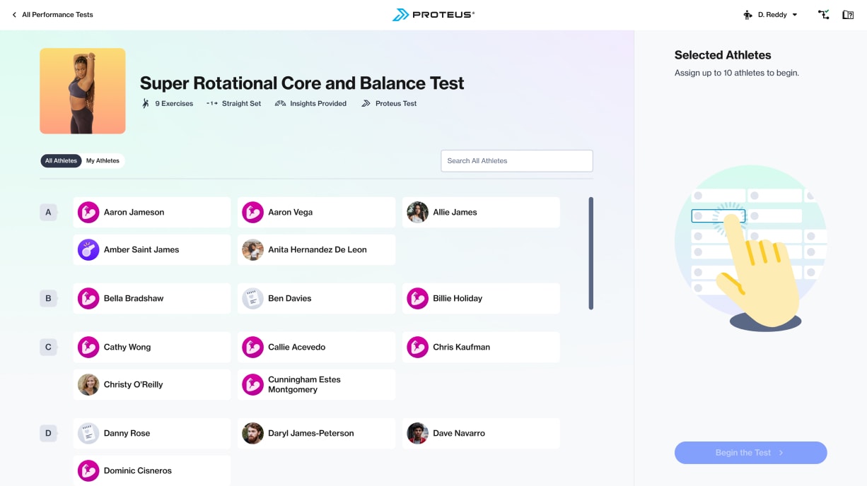
Empty state

Athletes chosen
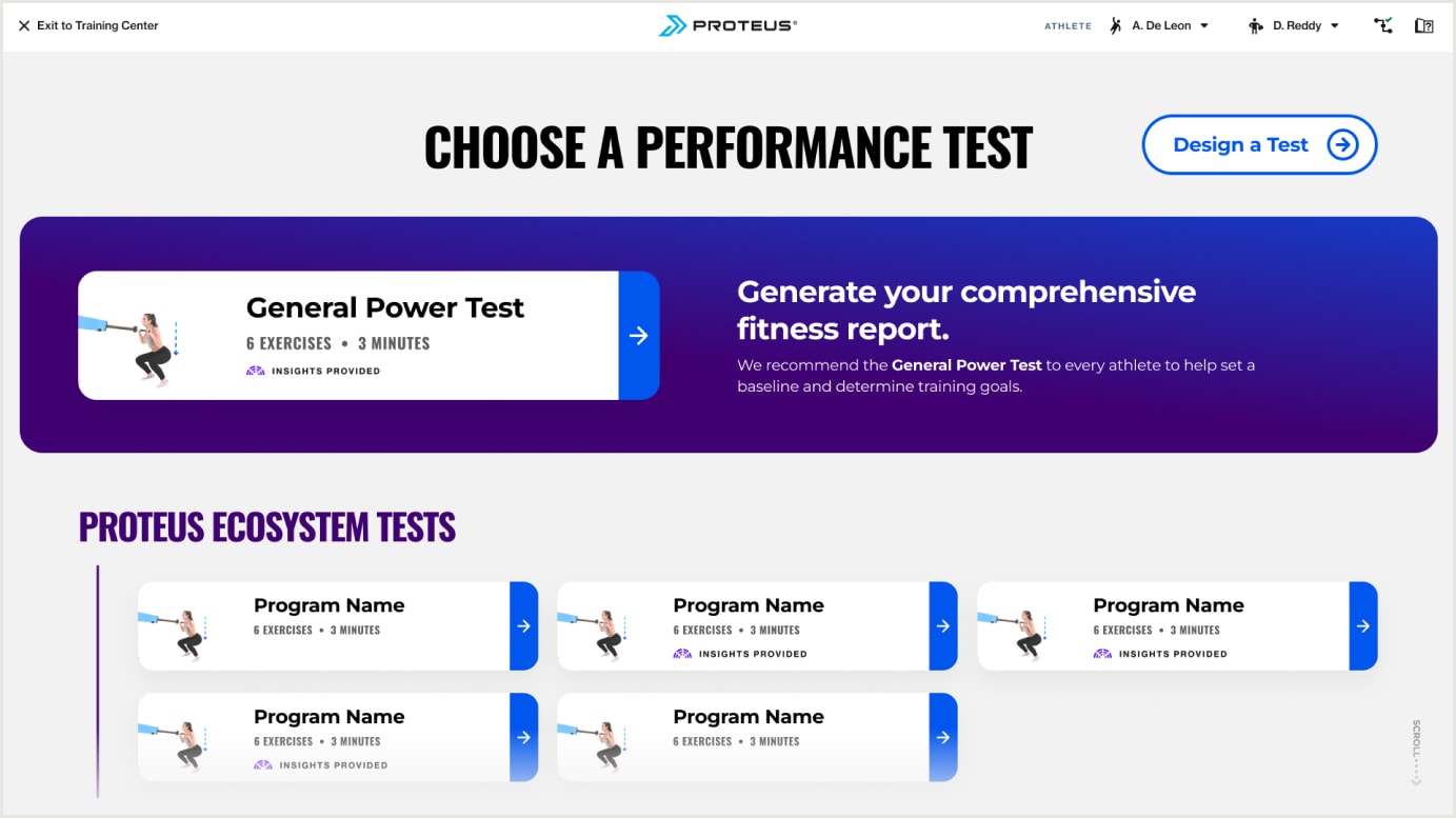
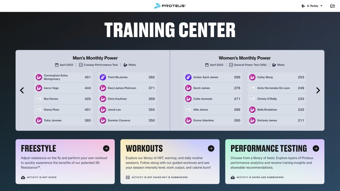
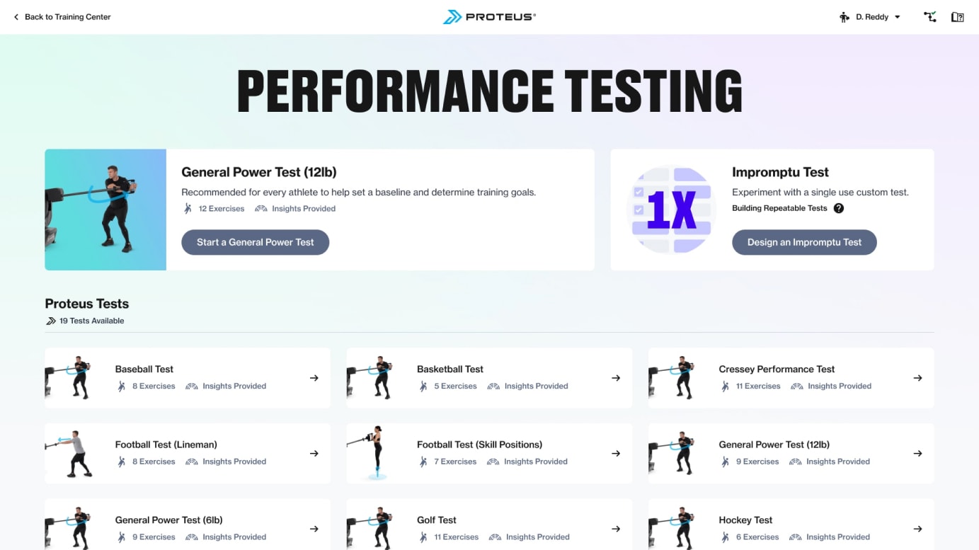
This is how the flow looks today shown with updated views for Training Center and the Performance Testing catalog, leading to the new test athlete selection view.

One little wrinkle...
While I solved the direct issue of selecting users for a testing session, this had a knock-on effect regarding where users were directed upon logging in. Trainers can log into our software via a web portal on their own device. This is typically to create new user profiles or examine athlete data. While using Proteus software away from the hardware, it doesn’t make sense to land trainers on the Training Center. They need to be on the hardware to use those modes. Instead I proposed redirecting them to the Site Admin panel containing trainer tools and administrative functions. The most logical view within Site Admin was Users, an index of all users at the site, providing easy access to their profile and test data.
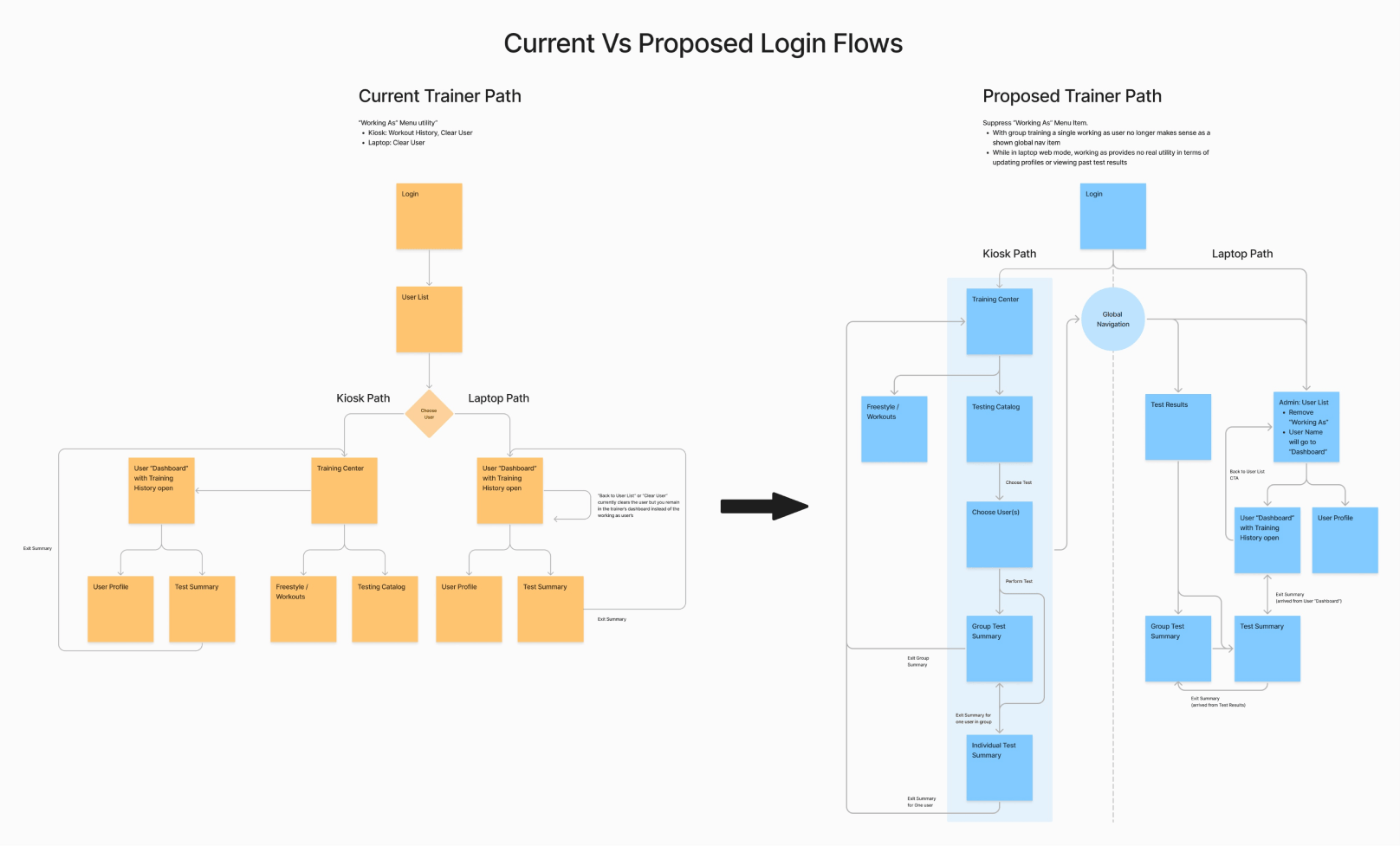
Kiosk: Login to Training Center

Kiosk: Login to Training Center

Moving through a group session
I approached the core experience challenge by considering the two scenarios described earlier; circuit training sessions and testing-combine days. I diagrammed three testing flows weighing flexibility against efficiency. When considering flexibility, I needed to provide accommodation for the chaos of the training floor where athletes might arrive at the Proteus station “out of turn” or an athlete got distracted delaying their arrival.
I measured efficiency by the number of user interactions outside of performing a measured movement. This would include moving through states on the touchscreen or swapping out a handle attachment. Using a hypothetical test with five athletes performing five sets and one handle swap, I calculated the number of interactions for each option.
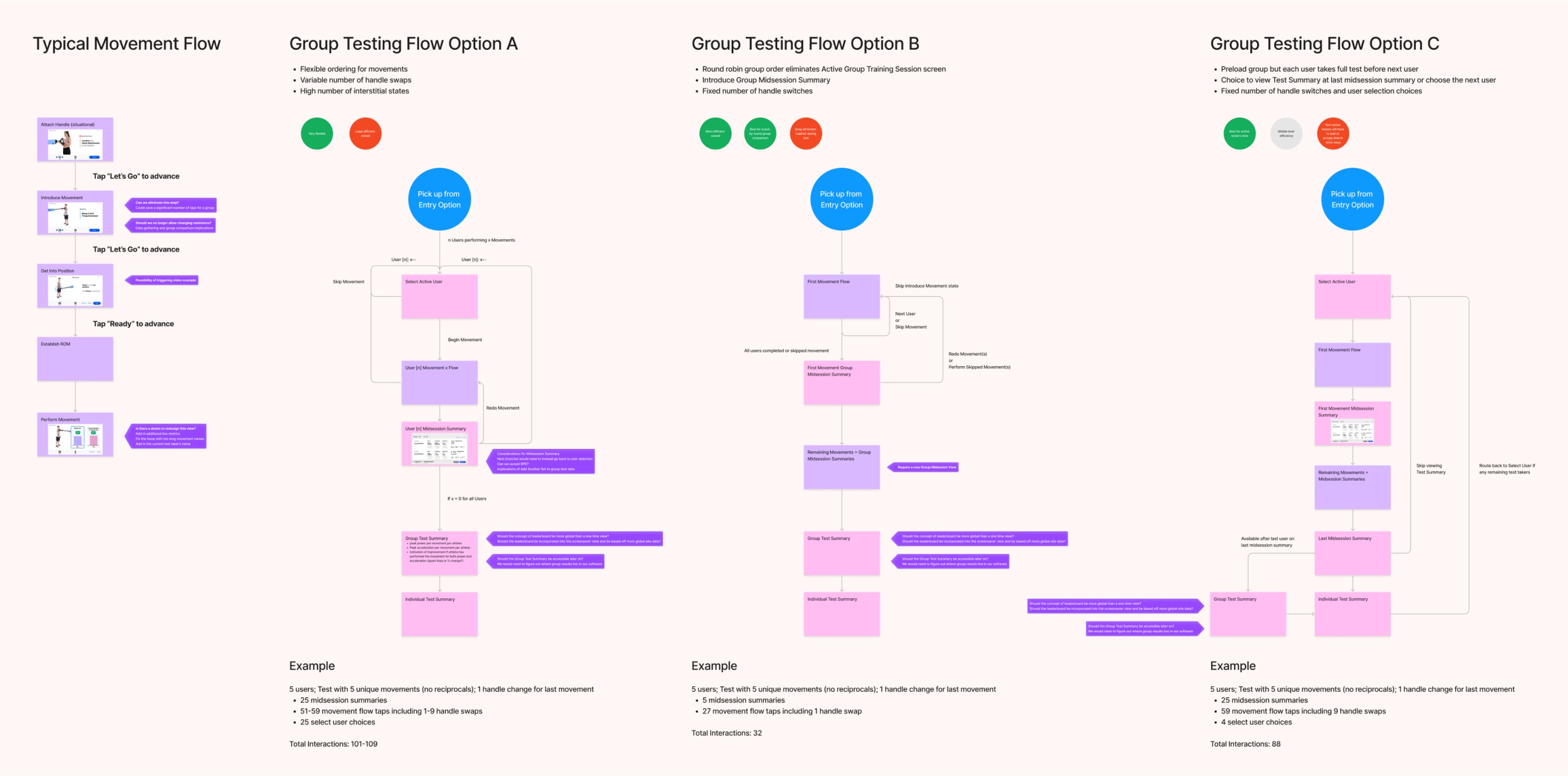
Option A (101-109 interactions): maximized flexibility to the detriment of efficiency. This approach required selecting the active tester for each exercise set. This would best serve a circuit training group scenario.
Option B (32 interactions): was completely inflexible but very efficient. This was basically a round-robin loop where each athlete completes the current set before moving on to the next exercise. This would be the most efficient approach for the testing combine scenario.
Option C (88 interactions): was just queued back-to-back solo tests for each member of the group. It was inflexible and only slightly efficient due to not needing to initialize a new test session for each athlete.
The project stakeholders decided that Option A was the best solution due to their understanding that circuit training occurred far more frequently than testing combine events. The detailed flow functions like this after selecting the group:
- Select an athlete to begin their exercise set.
- The athlete will perform through the exercise movement flow.
- Review their set data to ensure proper execution.
- Return to select the next athlete. This could be the same athlete or another in the group.
- Loop through the flow until everyone has completed or skipped all sets.
- View the group’s results in an overview. Optionally drill into an individual’s detailed test report.
Choosing the next athlete
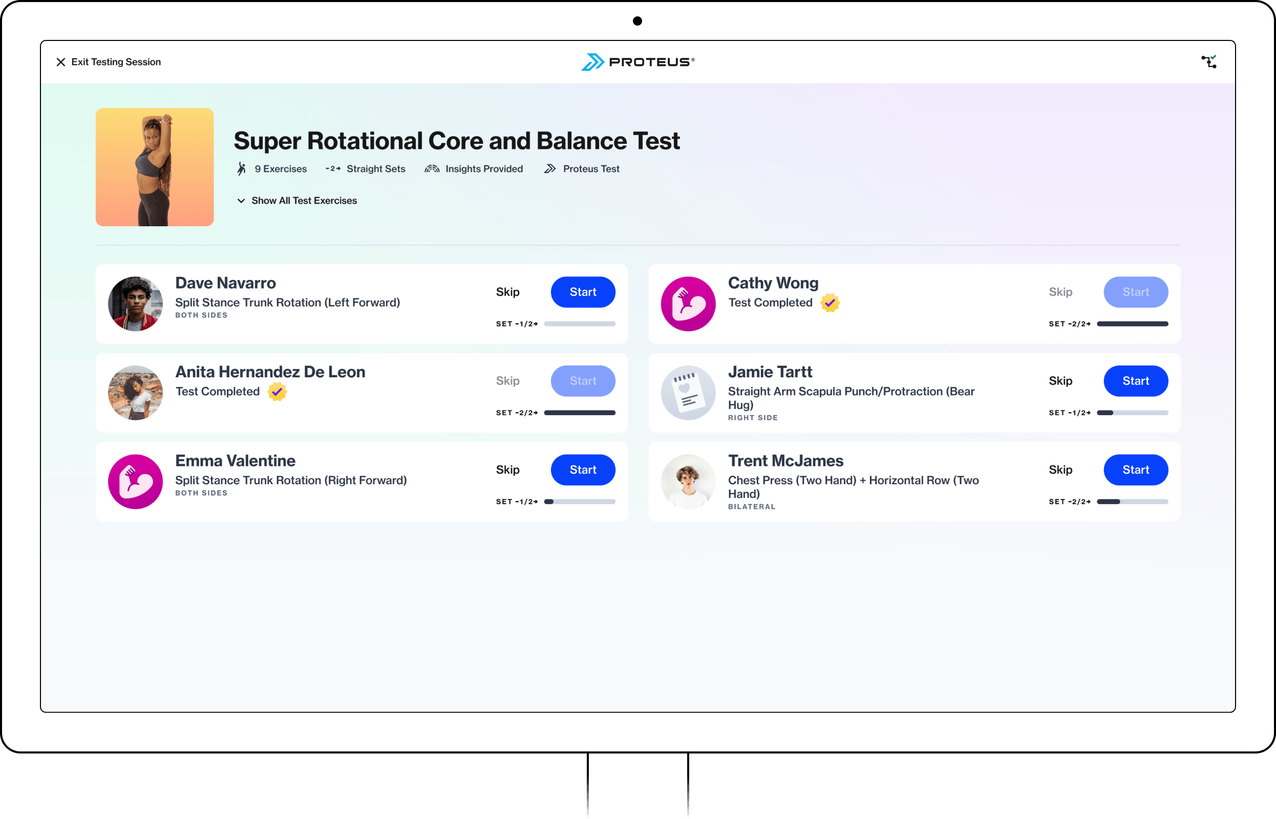
Once a test has been initiated with the chosen group, the “next athlete” screen serves as the hub for choosing the next active tester to run through an exercise set. With the stated goal of offering maximum flexibility to our users, I initially designed this state allowing athletes to perform sets in any order they desired. Each athlete card displayed the exercise to be performed, their progress through the test, and the call to action to start or redo the selected movement. Below the test name, an expandable drawer showed all of the included exercises, providing an overview for those unfamiliar with the test.
The engineering team had concerns about the complexity involved in implementing total flexibility for set selection when considering tests set up as circuits or multiple sets. I simplified the selection interaction so that users could still test in whichever order they wanted, but had to follow the original exercise set order. If they couldn’t perform a movement due to injury, they could skip the sets that involved the affected areas of their body. Besides easing development, this reduced the amount of user decisions, potentially increasing efficiency over the entire group test.
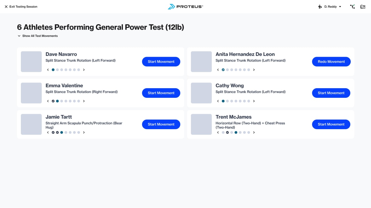
Wireframe for “next athlete” selection
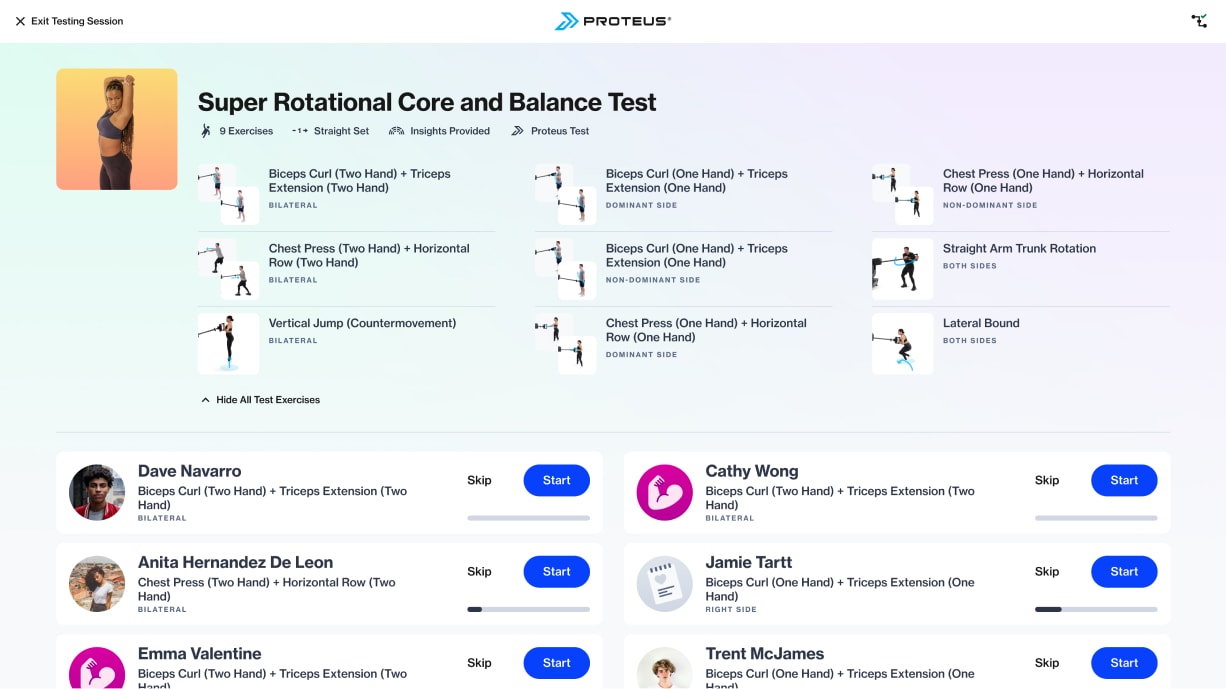
High fidelity design with expanded exercise list
The active test flow
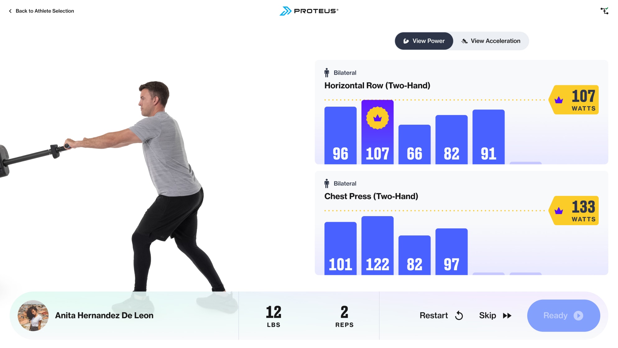
Rethinking the core test flow was not in scope for this project, so I refrained from major changes to these views. I primarily made quality of life UI updates such as higher visibility on-screen cues, displaying the active tester to avoid incorrect data association, and providing live power and acceleration rep values for the complete set.
When starting a set, the experience cues the tester to set the start and end points of the exercise so that Proteus knows the “shape” of a rep. Setting up the point-to-point range must be completed by each athlete for every exercise they perform.

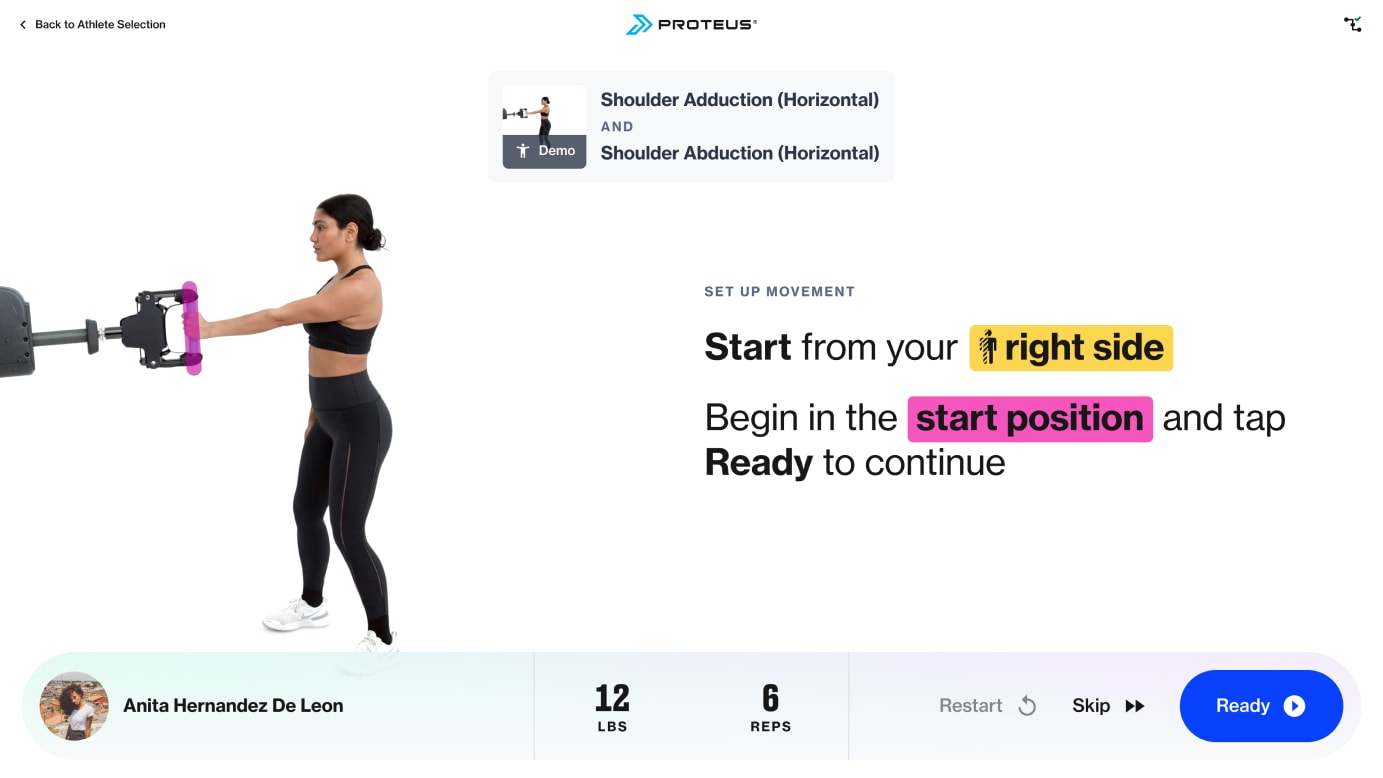
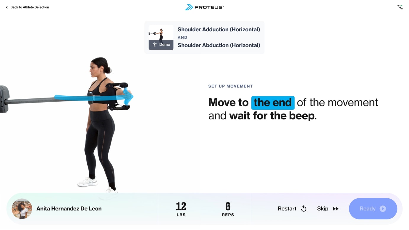
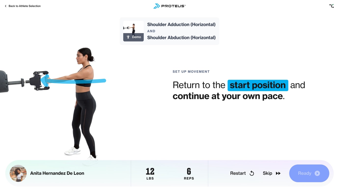
After setting the exercise boundaries, the tester performs the movement at maximum effort for the prescribed number of reps. A running display of efforts provide immediate feedback on how the athlete is performing. Personal records are prominently displayed as added motivation for both the individual tester and the larger group. A video loop helpfully provides a demo of proper form to ensure accurate results.
Post-set data review
After completing the full set, the post-set review provides a summary of that set’s results. This view displays key metrics with progress (if available) to provide a gut check to ensure the tester performed their set correctly. The athlete has the opportunity to retry the set if they believe that their data wasn’t accurately collected. Besides refreshing the visual design, I updated the data display by re-weighting the metrics according to new understanding by stakeholders. To make this view group testing friendly, I added the active tester’s name and reversed the countdown timer (which would stop when reaching zero) to a rest timer that counts up instead.
Exiting the review screen returns the user to the next athlete view if there are remaining sets for anyone in the group. Otherwise the test will be completed and the group will be provided with an overview of their results.
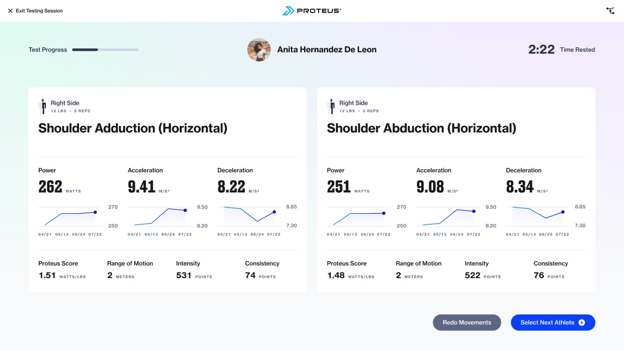
Post-set review
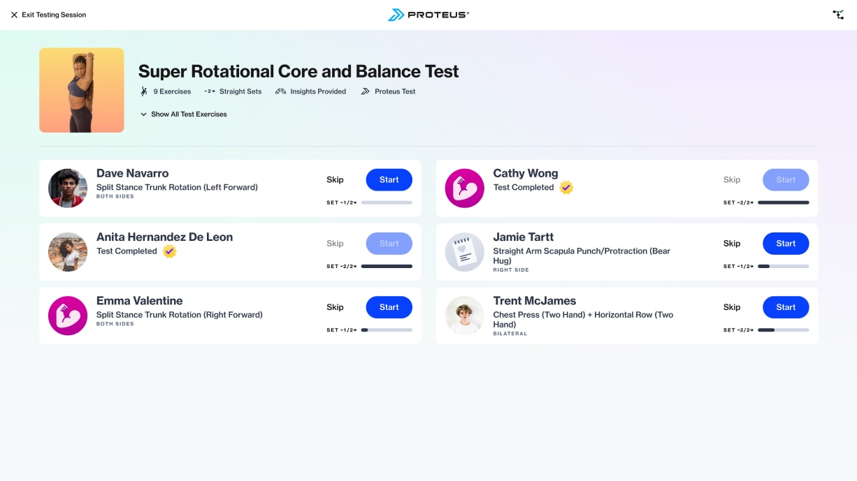
Nearly complete group test
Accessing test results
While partaking in a group test may be enjoyable in its own right, the detailed reporting that Proteus provides is the real payoff (see the Performance Testing Insights case study for more detail). Prior to this project, we were already delivering robust test reports for individual athletes. At a minimum I needed to provide a pathway for each athlete to access their individual report. The CEO expressed a secondary goal of promoting friendly post-test competition within the group.
The subject matter stakeholder and I identified two main scenarios for when a trainer might review a group’s test results:
- To give the group a top line summary of their results immediately following a test
- To later review each athlete’s detailed report in order build training programs
To support these use cases, I needed to design an overview for the group’s test results and an index of completed tests within the Site Admin portal.
Reviewing results as a group
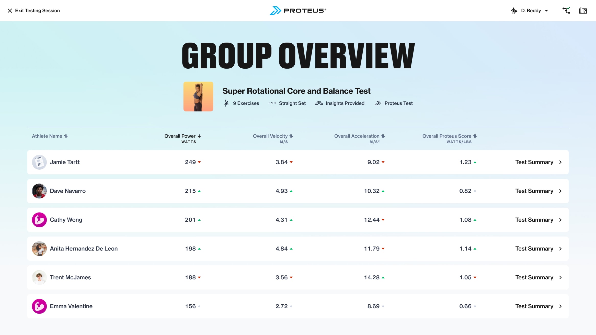
When trainers wrap up a performance test with an individual athlete, they typically only have a few minutes together to review their results. I anticipated this to be true with groups as well. I believed that a format providing quick comparisons between athletes would address trainers’ time constraints and the ask for promoting inter-group competition. Starting higher level, the Overall Results segmented view displayed each athlete’s overall scores across key metrics; power, acceleration, Proteus Score (power to weight ratio), and their most improved movement if relevant. Switching to the Individual Movements view allowed the group to see their power and acceleration scores through the lens of each individual exercise, creating focused “leaderboards”.
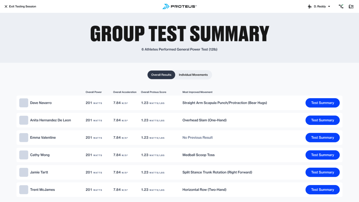
Overall results
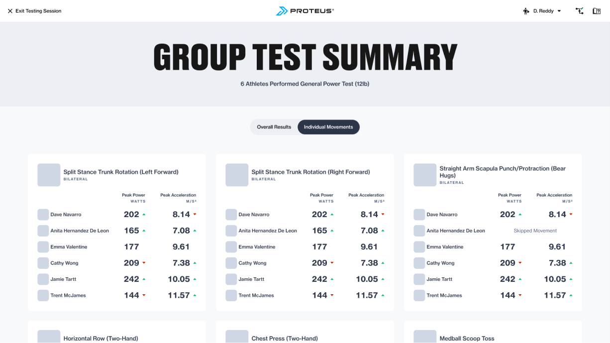
Individual exercise “leaderboards”
Time constraints prevented us from building out both views, so we prioritized the overall results state due its relative ease of implementation and it serving as an index for accessing detailed reports. The final design incorporated the test information lockup shown throughout the flow and introduced sorting via the displayed metrics. I tweaked the table data, replacing the most improved movement with overall velocity, as first time testers would not have an improved movement, nor would they be guaranteed one after retesting. Arrows indicate whether the athlete improved or declined in a metric upon retesting, giving a glimpse at progress. Finally, tapping Test Summary would drill down to an individual’s in-depth report featuring metrics by exercise, performance insights, and training recommendations.
Accessing results later
When trainers test athletes with the intent of building training programs, they need focused time to review test data and decide how to use it to inform program design. This work is frequently done after hours, on weekends, or in between training sessions with clients. Trainers are likely using their own device to log into our web portal to delve into reports or export data.
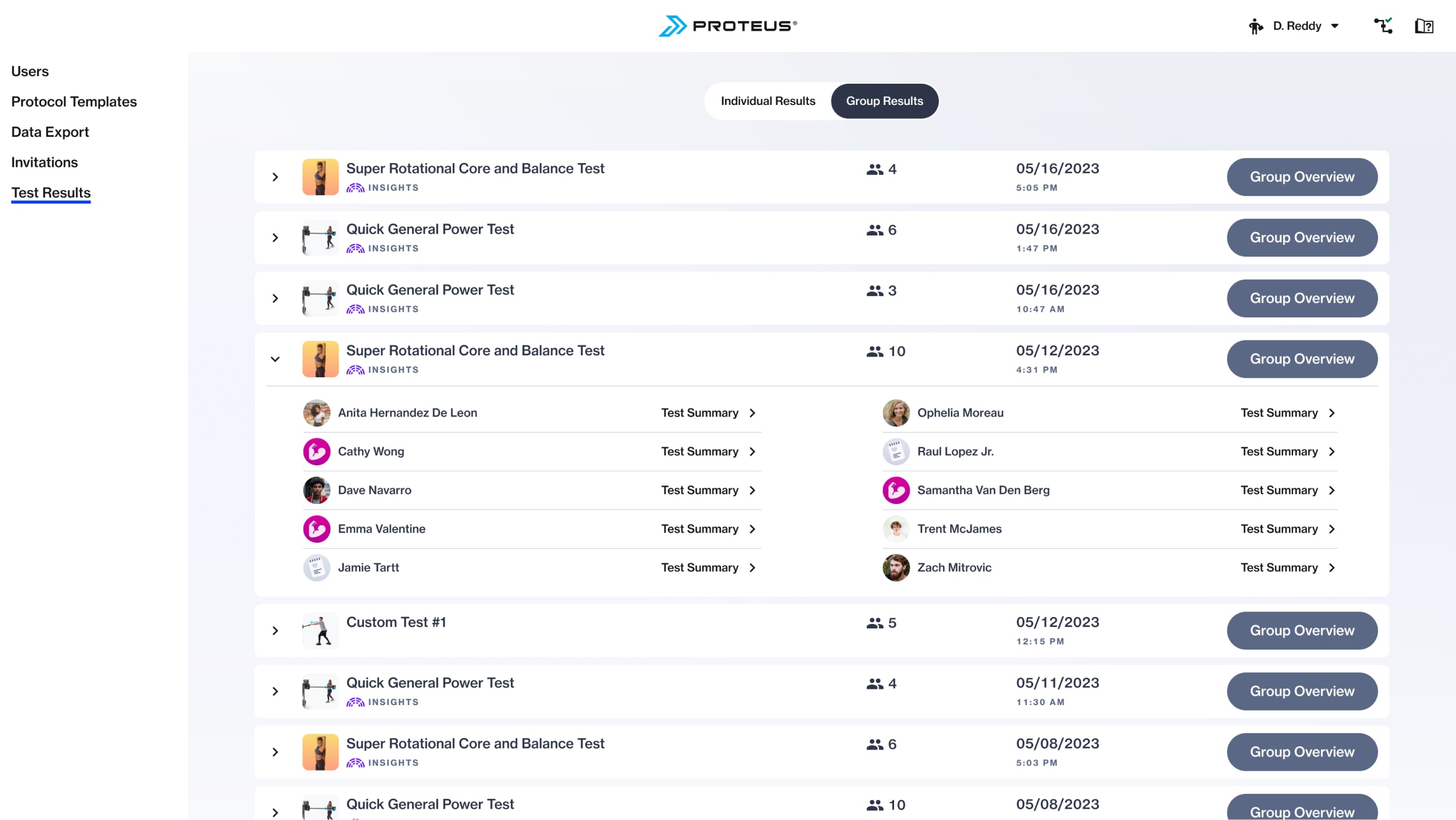
Within the Site Admin area Test Results, trainers can access all individual or group sessions. These sessions are listed reverse chronologically and provide basic information at a glance. A trainer can quickly see which test was performed, whether it generates advanced reports, how many athletes participated, and a timestamp of the session. At this point that trainer can jump into the Group Overview shown above, or toggle open the session row. At that point they can directly dive into each athlete’s detailed report to examine the data they require to build a program or write a training report.
This high fidelity design closely resembled the original wireframe
Impact and customer reception
As a low sales volume business, it is difficult to link the direct impact of this feature on signing new sales contracts. However, it was very evident that Group Performance Testing had a significant impact on our testing mode usage and ability to collect performance data.
15%
Of sites use group testing on a weekly basis
23%
Of all tests performed as group tests
32%
Increase in testing per site overall
Trainers were very enthusiastic about this feature after launch:
“They [golfers] were excited to come in and do our post-summer testing all together… It was cool having them compete but also cheer each other on the whole time!”
“Oh it’s sick, it’s exactly what I envisioned it’d be. Super easy to use”
“The one thing I’ve noticed is that every athlete is sort of comparing themselves to the next guy. I know this sounds bad because we’re always teaching our athletes to make sure that they focus on themselves and focus on their own development, but in all actuality, this has been huge for power development.”
In addition to the clear improvement in usage metrics, the updates made to the software flows and architecture addressed various long-standing experience oddities. Perhaps equally important, it sets the software up for future multi-user training applications.
Related Work
Performance Testing Insights
Helping prove the value proposition for both Proteus and it’s customers.
Proteus Software Experience
A collection of software features designed for a one-of-a-kind hardware product.
© 2024 Will Gabrenya
